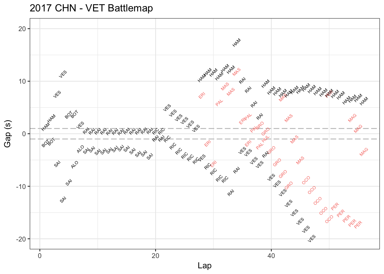
 This is Vettel’s race battle map in China Grand Prix in Apr.9 2017. This map shows who’s ahead or behind Vettel and how much the seconds in each lap. The red data represents the players lapped by Vettel.
This map is not beautiful to me. Showing the player names again and again in the charts causes me dizzy. Also, I took over 3 minutes to understand what it is talking about, even I am familiar with Formula one and watched China Grand Prix.
It’s not functional to me, either. This graph only shows the closest one player ahead of Vettel and one behind Vettel, which makes me hard to compare key players (for example, Hamilton was the key player compared to Vettel in that game but he “disappeared” in some laps). Also, it did not show when Vettel stopped and how many times he stopped, which is very crucial because you may misunderstand the data (for example, BOT (Bottas) was ahead of Vettel around lap 3-4 because Vettel stopped but Bottas did not).
I got a functional viz in my mind: compare the lap time of two close players (for example Hamilton and Vettel), including tire types and its condition changes (mid, soft or super soft) using gradually transparent color when we show the lap time bar. This will give us a lot valuable information and reasonably to guess when and why there’s a lap time difference. Also, we can tell the difference of team strategies (Ferrari and Mercedes). Besides, there would be other interesting thing to watch like when they had similar tire conditions, who was the faster one? Or we break lap into three sections and do some precisely comparison.
Sadly I cannot find players’ lap times data in that game, but I think they did – http://www.f1datajunkie.com/. Hope you can build some interesting viz to our F1 fans!