Use your own shapes on Tableau

As I was doing the redesign project the other day, I found the need for me to introduce some new shapes into the sheets. Therefore I designed my own vector graphs through online tools like Vectr, and followed this article inserted those graphs in “png” file type into Tableau. The final result was displayed in designated color.

Also I discovered a tip, that when you want to make a parameter into shapes, you just simply drag it across the shapes feature in “marks” to the blank board below, choose the shapes from multiple categories, including the one you have just inserted(if it’s not there, try the reload button).

You can also look for existing png files online and insert them to Tableau instead of making them by yourselves. Using customized shapes will make your visualization more unique and specific to the data you want to present. Below it’s a simple example from me:

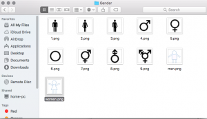
(The png files are located in “My Tableau Repository/Shapes/Gender”)

screenshot1

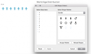
(This is where to find the customized shapes and use it in sheets)

screenshot2

Hope it helps!

How To Make A Waterfall Chart In Tableau

A waterfall chart helps understand how positive and negative values of dimension members are contributing to a total.

Here is an example visualizes how each Sub-Category in the Sample – Superstore dataset is contributing to total profit:

  • Create a vertical bar chart, make profit as measure, sub-category as dimension. Add a table calculation to the Profit measure so that it calculates a ‘Running total’ on ‘Table (Across)’.

  • Change the mark type from ‘Automatic’, which is currently bar, to the ‘Gantt Bar’ mark type, like below:
  • In order to get the Gantt bars for each dimension member to properly line up, you first have to create a new calculated field which takes the measure in the waterfall chart multiplied by negative one. (e.g: -[Profit])
  • Once this calculated field has been created, this is the measure that you drag to the Size Marks Card to create the waterfall effect as we showed in the beginning.

Reference: http://www.evolytics.com/blog/tableau-201-make-waterfall-chart/

5 Steps to Better KPI Graphs

In the business community KPI graphs are often shown to represent important metrics related to performance. Here are few important tips to remember while making KPI graphs-

  1. Don’t have distracting backgrounds: While showing important statistics it is important to not have background which may distract the viewer from the underlying message. Bright colors should be avoided while creating graphs as they might be distracting. Use of gridlines should be done wisely as they might make the chart feel too clustered.
  2. Use titles and labels: Efficient use of titles and labels can help the viewer understand the chart better. With proper labeling the user can immediately understand what is being measured against a certain parameter. Chart titles give the overall description of the issue being addressed in the graph.
  3. Use dual axes: The use of two axes is that it allows the user to measure two values against each other with proper measures. If the two metrics have different scales it is important to show them on different axes. Showing them on the same axis can give an altogether different meaning to the graph.
  4. Too much data is bad: If too much information is added to the graph, it may confuse the user. The reader can get overwhelmed by the amount of information and the meaning of the graph may not get through. Hence the graphs should be separated and only relevant information needs to be shown.
  5. Pick the chart wisely: While deciding on the graph, the designer should be careful on the chart selection. Pie charts and donut charts must be avoided as they might not communicate the correct values of the data. They can create a wrong impression on the viewer and can be misleading. Simple bar charts and line charts should be used instead to convey information.

Source: https://www.targetdashboard.com/blog/125/5-Steps-to-Better-KPI-Graphs.aspx

Virtual Reality for Data Visualization

We are living in the age where there is so much abundance of data that we have started referring as ‘Big Data’. With such tremendous amount of data, it is the need of the hour to visualize this data using cutting edge technology which will help Big Data visualization easier.

One such technology is Virtual Reality. With VR as the medium to visualize data, we will be able to immerse ourselves in the data, have more natural interactions and view multi-dimensional data in a much easier way. Some of the reason which conveys the exact reasons to use virtual reality for data visualization are mentioned below –

  • More Space –

Imagine yourself completely surrounded by the visualization of the data. It’ll give you a 360-degree view in which the data can be visualized in a more visceral way.

  • Lesser Distractions –

When your all your vision is covered with the visualization there are lesser possibilities of the distractions to deviate your attention from the main objective.

  • Multi – Dimensional Data Analysis –

By adding different senses of sound and touch we can visualize data in various dimensions. With the current technology development, it is actually achievable to feel data by wearing the haptic feedback gloves.

  • More Natural Interaction –

Keyboard and mouse interactions would be replaced with touch and movements. This will help us better perceive the data as we will be using more than one senses to visualize and analyze data.


Reference : http://pwc.blogs.com/analytics_means_business/2016/08/5-reasons-to-use-virtual-reality-for-data-visualisation-.html


Make Dashboard Readability

A major factor to keep in mind when creating a dashboard is where it will be viewed. Will it be on a TV screen in an office or conference room?

Some design elements that affect readability are:

Excessive precision – Depending on the end user, precise figures can be distracting or overwhelming. Rounded metrics and simplified details may be more appropriate for the dashboard.

Consistency – With dashboards, consistency is key for easy navigation. Keeping functions, filters and other options in the same areas for each dashboard will allow users to find features quickly and easily. Applying the same font, color palette and style will give your dashboards a more cohesive look.

White space –  Without any white space between objects or widgets, your dashboard will look cluttered. This makes it hard to distinguish what information is the most important, as well as difficult to understand the information.

Visualizations – When visualizing metrics, don’t use multiple visualizations just because you can. Choose the best chart or graph to portray the information clearly.

  • Number + Secondary Stat – To display a single measure
  • Bar Charts –  Showing data over a related series of data points
  • Line Charts – Showing the relationship of data in the same series of data points
  • Sparklines – To display a trend for single data point
  • Bullet Graphs – To display multiple data points in a small space
  • Pie Charts – NEVER USE PIE CHARTS

https://www.betterbuys.com/bi/dashboard-best-practices/

Valuable Sports Franchises

This visualization is about the Top 50 Most Valuable Sports Franchises. This visualization has a unique contribution in the sports space.

  • The visualization has taken into consideration the data sets of years competing and a number of championships which is the best thing about this visualization because the serious fans will be able to recite about their favorite team.
  • Another great thing about this visualization is that the creators have tried and distributed static visual content, but mixed in engaging formats that journalists are excited to share.
  • The brand value or the franchise value is shown as the circles having the size equal to the franchise value.
  • If anyone is interested in watching any sport, then the sort by sport functionality helps anyone to view franchise value for that particular sport.
  • The bottom axis highlights the number of years a franchise has been competing.
  • On hovering over the circle gives us the details about the franchise such as the name of the franchise, Forbes rank of that franchise, franchise value, number of championships won and number of years competing

This interactive visualization has gathered huge engagement numbers, sparked passionate conversation among fans around the world. Visualizations like this help any journalist teams to inspire stories across top-tier and targeted sports blogs.

Reference – https://www.columnfivemedia.com/work-items/interactive-most-valuable-sports-franchises

Image Reference – https://www.columnfivemedia.com/work-items/interactive-most-valuable-sports-franchises

Customer Segmentation using RFM Model


While planning for marketing spend, or formulating a new promotion, retail marketers need to be careful about how they segment and target customers. The idea is to identify customer’s needs or issues and use them as a solution via various campaigns and promotions. One of the techniques for targeted campaign is to do RFM Analysis (Recency-Frequency-Monetary)

Recency: Recency of who is more likely to respond to an offer. Customers who have purchased recently from you are more likely to purchase again from you compared to those who did not purchase recently.

Frequency: How frequently these customers purchase from you. The higher the frequency, the higher is the chances of them responding to your offers.

Monetary: Amount of money these customers have spent on purchases. Customers who have spent higher are more likely to purchase based on the offer compared to those who have spent less.

How it works:  Divide each parameter into various ranges depending on your data and assign scores to each parameter. By combining 3 scores, we get the RFM scores.

Steps: http://gain-insights.com/solutions/retail-analytics/customer-segmentation-using-rfm-analysis/

Insights:

  • Customers with overall high RFM scores are loyal customers and need to provide loyalty points and offers to continue their engagement.
  • Customer who have high recency but low frequency score are ones who look out for offers. For these customers, the company needs to run different discount offers.
  • Customers who have a high frequency score but a low recency score are those customers that used to visit quite often but have not been visiting recently. For these customers, the company needs to offer promotions to bring them back to the store, or run surveys to find out why they abandoned the store.

RFM analysis is one of the most powerful technique to help you identify your best customers and create better targeted campaigns.


The Trends in Adult BMI in 200 Countires

The Trends in Adult BMI is an interactive visualization which show the changes in BMI (body-mass index) in 200 countries for the past four decades.

The visualization conveys its meaning effectively by using appropriate marks and channels. The X-axis is the timeline, from 1974-2014. The Y-axis is the percentage of population, from 0-100%. It uses only one marks and two channels, with the area as mark and the color/hue as channels. All population were categorized into 7 different levels of obesity, with the deep red as highest BMI level and deep blue as the lowest.

The visualization has two filters, one is filtering by gender and another is filtering the order of countries by different ways, such as obesity or underweight. Since the main audience of this visualization shall be some one like researcher, it will be better it could provide more ways of interaction which allows user do some further discovering. For example, a practical filter is filtering the data by people’s age. It could also filter the data by countries or continents.

Reference:

https://public.tableau.com/en-us/s/gallery/four-decades-prevalence-adult-bmi


NYC Street Trees

NYC Street Trees

The NYC Streets Trees is an interactive visualization created using jcanvas and jquery.

The visualization shows the numbers of different trees present in the five boroughs of NYC. The reason I wanted to talk about this visualization is because its creativity and use of customized idioms which i believe is mainly possible due to the usage of  jquery and jcanvas.

The visualization shows the different variety of trees present in NYC streets segregated by boroughs. Each borough is represented by a bar, the length of which represents the number of trees and  each bar is in turn is divided by the volume of different trees. The visualization is also interactive, if we select one tree then that tree is highlighted across the visualization.

Each tree is represented by a picture of the tree which would help the audience in identifying the tree when they walk the streets of NYC. We can clearly see that Queens has the most number of street trees and Manhattan the least which can be expected. Most street trees are Maples.


I believe that the visualization is unique in its usage of idioms which are customised by using jquery and jcanvas. I believe a similar visualization in Tableau would have restricted the author.


To Summarize even though the visualization is missing some key elements of claim, action, audience the author has done an excellent work in visualization using jquery and jcanvas and I could relate this with the discussion in class about using programming languages and separation of tool and task.
Source – http://www.cloudred.com/labprojects/nyctrees/#about

What’s next? What lies on the future of visualization

As we are approaching the end of this class, we have had insights on what data visualization exactly means, how to create a good data visualization, how to distinguish between types of data and where to use which visualization. It brings all of us to a very logical question- what next? What more is to be explored in visualization and presentation of data? Industry experts and analytics enthusiasts feel like Sociograms and 3-d or multidimensional visualization will be the most sought out thing in the future. Sociograms in terms of data analysis, are essentially graphs that depict great amount of interactivity and relativity between its elements and understanding the way elements are connected to each other. Network theory has been an integral part of data analysis and Sociograms and coming-of -age network diagrams have made it easy to understand co-relation between seemingly non-related elements – for example crime and spread of diseases.

Another visualization that I can predict to take on the future of data visualization would be multi-dimensional figures and charts. Some of the research institutes are currently working on this technique that visualizations data in more than conventional 2-3 dimensions to show an in-depth insight into things. One such diagram that I found very interesting was a 5-D colorimetric diagram of the brain activity that can be seen on the page of  the reference link  below. Combined with interactive diagrams and high-level processing functionalities we might be able to predict and understand data patterns like never before.

References: http://analytics-magazine.org/data-visualization-the-future-of-data-visualization/
https://en.wikipedia.org/wiki/Sociogram