Parameters and Filters in Tableau: When to use them

Global Quick Filters

Global quick filters are very useful when creating dashboards that contain worksheets that all use the same data source. For example, in a dashboard that displays the dataset in both text and visual forms, global quick filters give the flexibility to present the filter in a variety of formats: single value dropdown, multiple values list, wildcard match, etc. They also allow the user to show an aggregation of all marks with the “(All)” filter.

Disadvantage of global quick filters is that if the analyst has a dashboard with worksheets that each use a different data source, they do not work.

Filter Actions

Filter actions are best used when the user should interact with a specific sheet that acts as the “control. A filter acts directly on a dimension or measure and restricts the domain of the field.

There are a lot of options for filters. You can include or exclude members of a dimension, use a wildcard for the member name, choose the top N, given another measure, or use an condition (essentially a true/false calculation) to choose what is in and what is out. You have a fair number of UI options for filters: radio buttons, check boxes, drop down lists, sliders, and more. On top of that, you can choose what sheets the filter applies to.

Parameters:

Parameters are more powerful and more complex. A parameter, is like a variableYou can then use that variable inside calculations to change the calculation. If you filter by a calculated field, you essentially have a parameter controlling a filter. Parameters have almost the same UI options as filters, but they are single valued, so you have options for radio buttons, but not check boxes. There are also sliders and drop downs. Parameters are global, so can affect calculations for all data sources and connections in a workbook.

Unfortunately, parameters have their own limitations. Whereas global quick filters have seven ways to be represented on a dashboard, parameters only have four. Parameters cannot make multiple selections in a filter, e.g., with a list of checkboxes, and they do not have the “(All)” aggregate choice of quick filters. While the inability to select multiple items in a filter cannot be circumvented, the data can be structured to include an “All” row that aggregates the relevant data for that mark. This is not optimal, since the analyst must make this consideration when preparing their data for use in Tableau, but it is the only workaround we have come across.

Sources:

http://stevensanne.com/tableau-tutorial-3-filters-and-parameters/

http://www.wmanalytics.io/blog/filters-and-parameters-tableau-when-use-them

https://community.tableau.com/thread/144158


Student Debt at Colleges and Universities Across the Nation

This visualization provides a complete picture of the student debt across different universities in the USA. Firstly, this visualization provides two chart options – a scatterplot and map to visualize the same data. I feel that the map representation is better than the scatterplot as we can identify the universities by their location and it helps us to have e better perspective of the different universities in each state.

Things I like:

  • Firstly, the visualization is interactive and provides data for a five-year period when the play button is used.
  • A lot of filters are present to drill down the universities thus helping to get insights on different categories like type o institution, enrollment size, graduation rate, graduates with debt%. We can easily identify the universities with high tuition fees and high graduate debt rate which should be avoided.
  • The size of bubbles is depicted by enrollment size.
  • An option is provided for searching a particular university.
  • A detailed description of graduate’s debts appears when clicked on a particular university

Room for improvement:

  • Filtering cannot be performed on the basis of more than one category at a particular time. This hinders in providing a detailed analysis of the different universities.
  • Also, an option should have been provided to depict the bubble size based on graduate debt.

Reference: http://www.nytimes.com/interactive/2012/05/13/business/student-debt-at-colleges-and-universities.html

New York Taxis Rides

This interactive visualization made using Tableau visualizes the preferences of NYC residents when it comes to commuting either using the old fashioned yellow cabs or Uber. This dashboard consists of two visualizations.

The first visualization shows a detailed view of the traveling habits of NYC residents. It is further divided into two subparts. Part A is a bar graph showing the average taxi rides for each one hour in a day and we can see that 6 pm to 7 pm is the busiest hour with people returning from offices. Part B focuses on the average taxis rides per day in that particular hour. The interconnectivity among the two graphs is excellent. Also hovering over each bar or point shows the details.

The second visualization focuses on the percent difference in rides of Uber, yellow taxis and other services over time. There is an evident shift in preferences of the NYC residents towards Uber. The curve for Uber is rocketing compared to yellow taxis and All other which are plummeting. One excellent feature of the visualization is that the audience can see the value for all the three line curves at a point in time when hovering. But this visualization only focuses on data of a short period of July to September of 2014. More insights can be gained if we can have the recent data on this as it might be possible that the craze for Uber has subsided.

Overall, we get a complete picture of the traveling habits of NYC residents.

Reference: https://public.tableau.com/en-us/s/gallery/new-york-taxis 

Using heat map for tracking a website

Heat maps are useful for a website tracking mechanism. These days it is the analysis of eye versus mouse tracking. Here is an interesting fact, analysis shows that only 10% hovered over a link and then continued to read the page looking at other things. A heat map is used to show which areas of the page are viewed most by the browser user.  Following are some interesting types of heat maps on a website:

  1. Algorithmic heat maps – gives low traffic sites and idea of how people use their site
  2. Click heat maps – gives an idea where people are clicking and where they aren’t
  3. Attention heat maps – help you see which parts of website are most visible to users
  4. Scroll heat maps – Scroll maps are interesting way to till what limit users scroll down and where users tend to drop off. This helps business to prioritize the content.

Heatmap tools are used with interesting algorithms to analyze the user interfaces. Analyzing user interface takes into account colors, contrast, visual hierarchy etc. The analytics tells the business what is working and what is not, further, helps them to optimize their website. If business wants to introduce something new on the website, the heat map can be used what could be the best place for it. This is helpful for business to enhance the areas that are getting more clicks and removing the areas not getting enough clicks.Text can be altered to see what is holding the attention of visitors

Disadvantages:

  1. Business uses it for support instead of illumination
  2. Ignoring some data inaccuracies can open up to a completely different results
  3. Heat maps can be helpful at a high level and as a way to communicate problem areas to less analytically savvy in the organization.

Overall, this is a great tool for optimization of a web page but should not be used as the only source of determining project and test planning.

References: https://conversionxl.com/heat-maps/

https://www.linkedin.com/pulse/20140915173712-76871428-what-are-the-benefits-of-using-a-heat-map-for-a-website

How Visualization Fool You

Abstract: Evolutionary pressure has made us visual beings. Because we respond so strongly to visual cues, charts and graphs have the power to move us in a way that other ways of presenting data can’t match. Therefore data visualization as one of the most important tools we have to analyze data can be misleading as well. In this blog post we’ll take a look at 3 of the most common ways in which visualizations can be misleading.

Charts can mislead us into believing things that aren’t true. Sometimes this is accidental, but other times we are being deliberately manipulated. Sometimes it’s easy to spot what’s wrong, but other times the sleight of hand is very subtle.

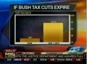
Dodgy Diagrams: The most notorious of the data visualization deceiver’s tricks is to use chart axes that don’t start at zero. We’re very good at comparing the lengths of objects, so choosing a non-zero axis can greatly magnify small or meaningless differences. Taken to an extreme, this technique can make differences in data seem much larger than they are.

misleading1_fox


Cumulative Graphs: Many people opt to create cumulative graphs of things like number of users, revenue, downloads, or other important metrics.

Ignoring Conventions: One of the most insidious tactics people use in constructing misleading data visualizations is to violate standard practices. We’re used to the fact that pie charts represent parts of a whole or that timelines progress from left to right. So when those rules get violated, we have a difficult time seeing what’s actually going on. We’re wired to misinterpret the data, due to our reliance on these conventions.

misleading3_deaths

Conclusion: Here are some simple rules we should use to keep our work virtuous.

    • Always start your plots from zero, unless doing so would be misleading.
    • Use a linear axis scale – avoid different sized categories and log plots unless there are good reasons to do otherwise.
    • Never, ever forget that correlation is not causation. No matter how tempting it is, don’t do it. Bear in mind that your audience will almost certainly see correlation as equaling causation, so be careful.
    • Maps are beautiful, but they can be powerfully misleading. Never use them alone and always consider the unintended message you might be transmitting.

References:

http://data-informed.com/whats-wrong-picture-art-honest-visualizations/

http://www.cs.tufts.edu/comp/250VIS/papers/chi2015-deception.pdf

http://avoinelama.fi/hingo/kirjoituksia/misleadingvisualizations.html

http://www.citylab.com/design/2015/06/when-maps-lie/396761/


Is your marketing dashboard lying to you?

Marketing dashboard could be misleading when you analysis all the different variables and get the data visualization towards your direction in mind. Here are a few ways your dashboard may be lying to you.

Ambiguous or poorly captured metrics: There’s nothing more dangerous than a dashboard that does a poor job of collecting data. Data integrity is the key to dashboard success and ambiguous inputs can send an entire company into a tailspin. What’s most dangerous is the fact that ambiguous data can easily pass for accurate insights.

Oversimplification of data: There’s something to be said for simplifying data so it’s easy to digest, but there’s immense danger in oversimplifying the information that matriculates through the dashboard. In most cases, this is the result of a lack of context.

Hidden biases in the design: Humans design dashboards and the algorithms that cause them to function. Humans make mistakes all the time. This occasionally leads to hidden biases in the way dashboard systems are designed. The result is skewed data that causes you to act in a certain way.

In my option, it is very important to keep eyes on those points that could makes dashboard lying. There are a variety of dashboard technologies to make data more honest and accurate. We shall apply models to clean our data from the source and then try different methods to discover the data. When we design the data visualization, we should minimize our biases by switching positions and claims.

http://www.campaignlive.com/article/marketing-dashboard-lying-you/1424653#1eehRyDuqIpYzAVY.99

Google Analytics & data visualization tips from it for Tableau

Google Analytics is a free web Analytics service that provides statistics and basic analytical tools for search engine optimization and marketing purposes. Its main features are Segmentation for Analysis of datasets like transformations and conversions, Data Visualization tools like dashboards and Scorecards, custom reports and communication through email-based sharing. It’s integration with other Google products like Adwords, Public Data Explorer, and Website Optimizer makes it very suitable for small and medium sized retail websites.

Google Analytics dashboard allows users to save profiles for multiple websites and see details for default categories or select custom metrics to display for each site. One of its advantages is that it is available through a plugin or widget for embedding into other sites. google-analytics

There are many practices that are followed in Google Analytics that should be followed while creating a dashboard and are particularly helpful in Tableau:

  • Use a maximum of 12 dashboard objects or widgets so that designers and analysts are able to focus on the relevant KPIs and pertain to the Story of the Dashboard. “Keep it Simple.” “Less is more.”
  • Improve User experience by leveraging Dashboard actions like highlighting sparklines to display underlying trends and show extra detail for respective data points.
  • Allow End users to change the Date aggregation of Line Graphs: Hourly, Day, Week, Month.
  • Keep Crosstabs width to a maximum of Ten Columns.
  • Use a vertical navigation in the left column to display the prioritized content to the top-left view of the dashboard.

Source: http://www.evolytics.com/blog/10-tableau-data-viz-tips-i-learned-from-google-analytics/

IDENTIFYING MISREPRESENTATION IN DATA VISUALIZATION

Data representation has evolved significantly in the past couple of years. There has been a monumental increase in the use of different visualization methods to depict data in efficient and more lucid ways. This has revolutionized the field of data representation beyond measure. But there is a flipside to this – an increasing number of visualizations that knowingly or unknowingly mislead the audience. To exploit this ever-improving field more, it is imperative that the viewers have a fair idea about the ways data representations mislead them so as to avoid the potential landmines.

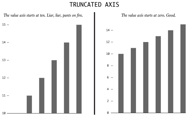
Truncated Axis

trunc

There is a high likelihood of the viewer being misled by the bar graph above if he/she was looking just at the bars and not at the axis. The one on the left has been truncated so that the values start from 10 instead of 0. Implication? Values larger than it actually is.

Dual Axes

dual

Typically used to represent correlation and causation, the take-away information from the representation above may not be an accurate depiction of the data since the scales to which the lines are drawn are different on either sides.

More than a 100% ?

This is usually seen in pie charts and wedge diagrams. The sum of all the wedges might show a value which is more than 100%. A perfunctory glance might not be enough to make out the error and as such, like in bar charts, the data represented might actually be more than it actually is.

Absolutes and Relatives

absol

Another major flaw in representing data can be seen in the representation above. The darkened areas purportedly show the number of crimes(and by extrapolation, the danger levels) of various cities of the USA. A casual glance at it misleads the viewer into thinking that the darkest areas are the least safe because of an increased number of mishaps but in reality, the map has not been adjusted to account for the population in the cities.

Taking things out of context

taking

The bar chart on the left, in isolation, says a vastly different(and obviously deceptive) story to the actual context. A casual glance shows an increasing trend, but in reality, the data shows a minimal increment in comparison to the time period before and after it.

Using illusions to deceive

dimen

The area of the third box is actually three times the area of the smallest box. But a data representation involving these boxes seem to give a vastly different picture as the area of the biggest box seems to much more than the actual three times.

Source : http://flowingdata.com/2017/02/09/how-to-spot-visualization-lies/

Data Visualization process in D3

The visualization in D3 (or basically any visualization tool) is carried out in the following steps:

1. Data acquisition – Obtain the data from a source (disk or over a network).
2. Parse – Give it a structure for its meaning and then order it into categories. The amount of data might be immense, but it is necessary to put it in a structure to make it easier to convey the message to the others.
3. Filter – Only keep the data that matters, which is in the interest of your claim.
4. Mine – Apply methods from statistics or data mining as a way to discern patterns or place the data in mathematical context.
5. Represent – Choose the idiom that fits to represent the data. Eg – bar graph, scatter plot, map, etc.
6. Refine – Improve the basic representation to make it more clear and which better give the insights by looking at it. You can change the color scheme or change the entire idiom.
7. Interact – Add methods for manipulating the data or controlling what features are visible. D3 is very powerful in this section.

To start implementing in D3.js, you can follow the tutorials given on the website:
https://www.dashingd3js.com/d3js-first-steps

Reference:
https://www.dashingd3js.com/the-data-visualization-process

Solving problems with patternicity during visual confirmation.

Problems in visual confirmation arises when there is no clear and specific claim defined for ending, and having no claim to start with. One of the typical problems in taking this approach is with patternicities.

Patternicities are finding meaningful patterns in meaningless noise. Proximate cause of this is due to priming effect, in which our brain and senses are prepared to interpret stimuli according to expected model. If we fall into this trap, we land up in visual discovery. During this process, we proceed towards the claim by comparing it with our mental model. This is a random approach with a hope of finding a meaningful pattern in a meaningless noise.

Therefore, we find ourselves in investigating and exploring the problem, instead of investigating and exploiting the problem. Solution to this problem is that we have to proceed systematically by first clearly defining the claim-the visual confirmation, and the claim to start with. Then we approach this way in a continuum basis by finding the differences in between those claims.

If there is no differences then this leads to confounding situations that need to be addressed systematically as well. We have take the divergence approach by first listing out all the options that can possibly lead to our claim, We have to then test each of those claims by matching to our final claim. Now we prioritize all the options we have tested and converge to the final claim to give the final visual confirmation.


Source: https://www.scientificamerican.com/article/patternicity-finding-meaningful-patterns/