How Deceptive are Deceptive Visualizations?

Data visualization is a powerful communication tool to support arguments with numbers in a way that is accessible and engaging. However, the influx of poorly designed and misleading deceptive data visualization can be dangerous and we have to be careful of the pitfalls.

So what makes a deceptive visualization to be deceptive? I am happy to share with you a blog about deceptive visualization I read recently when I tried to find some inspiration on my own project work.

  1. manipulation of axis orientation/scale

as you can see here, the right side visualization has been truncated in Y axis, which makes the audience has the wrong impression about the difference between X and Y.

2. Area as Quantity (Message Exaggeration)

Alway be careful when you encoding quantitative data with size. If you map the data (quantity ) into the wrong way, say, use radius rather than areas, the result can be exaggerated seriously.

3. Inverted Axis (Message Reversal)

The x and y-axis are put upside down. This distortion leads to reversal of the message rather than an exaggeration or understatement.

Reference: https://medium.com/@Infogram/study-asks-how-deceptive-are-deceptive-visualizations-8ff52fd81239#.bi0qi7zax


Visualization Critique: Graph published by Wired Magazine

For my last blog, I have picked a visualization selected by Bill Gates to be printed in Wired Magazine that he guest edited. He might have his own reasons for choosing this visualization but I see many downsides with this graph.

To start, the audience can infer that the green section representing injuries is significantly smaller than the other two, but it is difficult to judge the relative sizes of the other two sections. Similarly, inside the yellow/pink/green box, it is easy to spot the larger rectangles and get a sense of their relative sizes but again we cannot accurately compare the diseases.

Also, it is easy to read names of diseases in large rectangles but it is straining to the eyes to read inside the small boxes. In addition, few rectangles do not even have a reference label. Even though they appear to be minor causes of untimely death, a designer should not leave out information just for aesthetics of the graph.

Next, I do not understand the need of three different colors. All three colors are segmented similarly in the legend so what is the real need for using too many colors? The same could have been achieved by using just one “stepped” color scheme and separating the three major segments with borders.

Lastly, the 3-D effect doesn’t provide us with any information and on the contrary makes the treemap harder to decode. Another problem induced by this effect involves the darkened colors that appear on the sides of the treemap to represent shadows, which are meaningless and misleading

Solution:
My recommended solution would be displaying the information that appears on the treemap in a simple bar graph. This would convey the story accurately, clearly and would be equally engaging.

References:
Article: https://www.wired.com/2013/11/infoporn-causes-of-death/

Note: Refer article for the visualization

All News Around The World In 1 Visualization

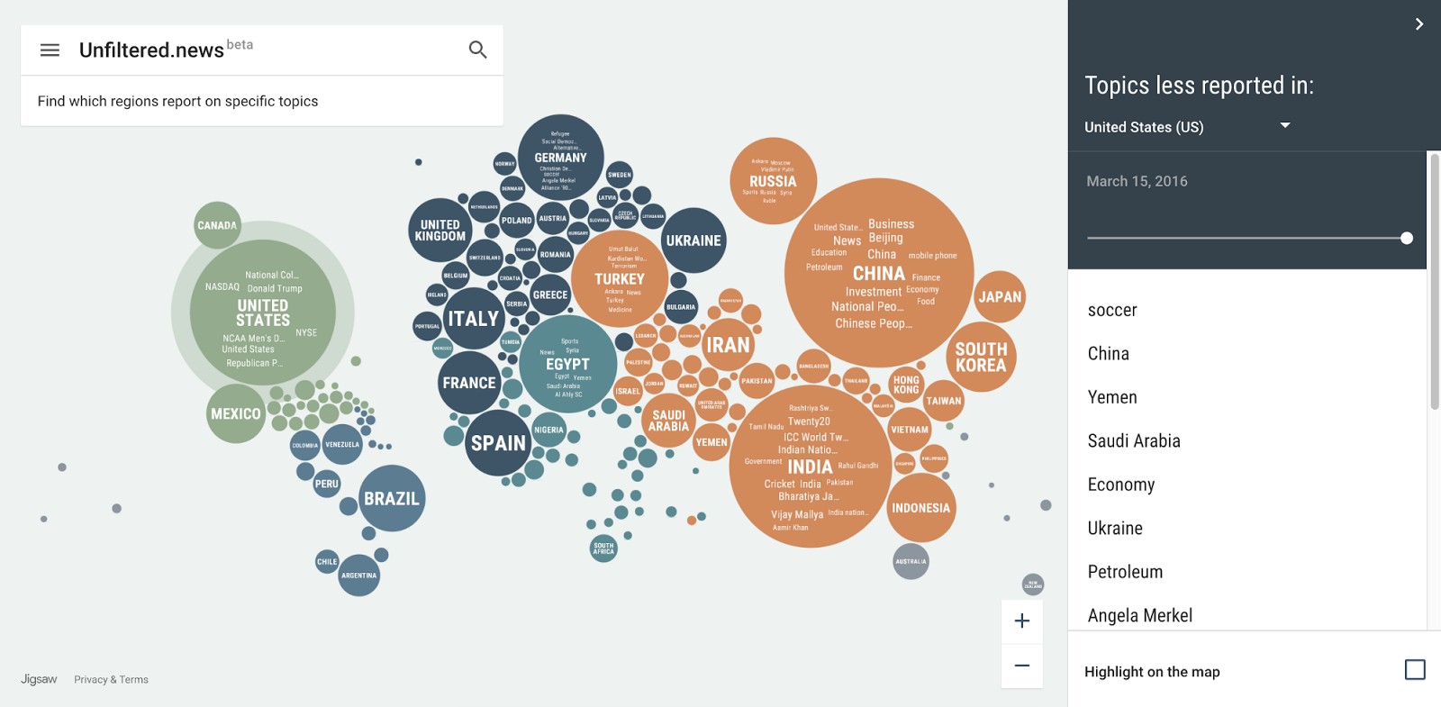
Unfiltered.News is an online interactive VIZ which visualizing the data from Google News, which watches more than 75,000+ news sources writing in 38+ languages worldwide. The goal for this visualization is to allow you exploring the news worldwide to find the topics and viewpoints that may not be covered in your location.

The visualization adopts an innovate idiom which combines the classic idiom of word cloud and bubble map. Each bubble represents a location or a country in the world and each word within a bubble represents a news topic in that location. Both the mark of circle and word has the channel of size. The size of a word represents the number of times that a topic has been mentioned in the specific date within a given location. The size of a circle is determined by the total number of topic mentions from publishers located in that location.

I believe the viz could help anyone to better know what’s happing around the world. However, the news topics shall be categorized and applying filters on it, which could help user target the news they interest in more easily.

Reference:

https://medium.com/jigsaw/if-you-are-reading-this-we-might-be-in-the-same-news-bubble-cb697270c698#.p2njeouxy

https://unfiltered.news/about.html


Average Income and Education

Introduction

The interactive visualization appeared in Washington Post. It aims to understand the average income and the number of people with colleges in different neighborhoods searchable by postal code.  It shows the comparison between US national average and selected zip code average in the fields of income and education.


What I like


  • Usage of both map and a text box to select the zip code for which I need information
  • Usage of colors to differentiate different ranking of zip code based on income and highest level of education. Yellow being the highest to blue being the lowest


  • The information is present for the entire US which is a good thing as I can compare any zip code
  • Zoom out and zoom in feature which helps in easy maneuvering of the map


What needs improvement

  • Wastage of space for the map
  • Information present is less
  • No comparison between different zip codes, you can only compare selected zip code with national averages
  • A lot more information can be added like race, ethnic backgrounds, crime rate etc, this would have given even more insights to the income/ education to other factors.


I would like to conclude by saying that although the visualization does not talk about a claim or action or audience, it is a excellent data discovery tool for anyone who is interested to make targeted decisions based on the income/education details like a new marketing or development activities.


Source – http://visual.ly/washington-world-apart?view=true


The Snowball of Debt

With varying debts across the countries after global recession, people have been questioning its implications. To answer this question, blogger Simon Kuestenmacher created the Snowball of Debt. The visualisation measures the amount of debt for a country divided by its population, indicating the amount every individual owes to his country’s national debt.

From the figure, we can see that Simon has cleverly combined colours and visual aids to illustrate varying data. The maps of the countries have been carefully placed around the centre based on the amount its individuals owe to the country. Since, the people of Japan owe the highest debt, this country has been placed in the centre. Similarly, with the lowest debt owed by its people, Liberia occupies a position in the far end of the circle.

The countries have been given different colours based on public debt as a percentage of GDP. This also helps to categorize each country based on their economy and an individual’s capacity of payback. The trend in the chart is pretty clear: Wealthier nations have higher debts with its people owning more to their country. the countries with lowest debt owned per person are relatively poor. The reason for this could be the lack of opportunity for these nations to take national debt due to the unwillingness of investors to offer them loans.

A lot of conclusions can be drawn and a lot of information can be retrieved from this figure. The user has aptly applied the principles of aesthetics to his idiom by keeping the visualisation attractive and equally informative.

Reference: http://www.freshplaza.us/article/7756/The-snowball-of-debt.


Things to know about Data Storytelling

Data analysis doesn’t only involve making visualizations and quantifying data. The data analyst should be able to tell  a story through all the analysis he/she has done. The story made should be credible and should convince the reader about the story tellers expertise.

  1. Story teller is the expert: While designing any visualization, the designer should be well aware of the data. Even if the visualizer is manipulating the data, he should be aware where to draw the line and keep the data relevant. There are people relying on the information the story teller is giving so the accuracy must be kept intact.
  2. Know your audience: It is important for the story teller to know his audience. The information that can draw the attention or keep them engaged should be present in the story. The information representation should be simple so that they don’t have to be experts on the subject being discussed.
  3. Story should have context: While creating a story the story teller may assume certain things and forget to give context for the analysis. The audience does not have the complete information regarding the subject and may not understand the context behind the story. While stating any co-relations the story teller must make sure to give information on why he felt like relating two values so that there is no doubt in the audiences mind.
  4. Design matters: The brain can understand visualizations faster than numbers hence the visualization design should be simple but effective. The audience should not be bombarded by information and the dashboard should have only similar pieces of information. Comparative charts are useful while story telling as it helps the audience understand the meaning behind it faster.
  5. Use visualization Strategically: The order of visualizations in a story telling is crucial. The order in which the visualization is presented determines the effect of the story. The sequence should be logical and make an impact on the viewer’s mind.

Source:http://blogs.sas.com/content/customeranalytics/2015/06/15/6-things-learned-data-storytelling/

How to create a simple Bar chart using D3.js? Part 2

In the previous post we saw what an svg element is how to define it, what the domain through the xAxis and yAxis and range through xRange and yRange are how to fit it according to the data set.

Next is to transform the xRange and the yRange into the plotting space and draw a line across the plotting space.

This function d3.svg.line() is used to draw a line graph for which we need to create a line generator function which returns the x and y coordinates from our data to plot the line. How is this line generator function defined?

var lineFunc = d3.svg.line()

.x(function(d) {

return xRange(d.x);

})

.y(function(d) {

return yRange(d.y);

})

.interpolate(‘linear’);

The .interpolate(‘linear’) function call tells d3 to draw straight lines. Next step is to set the ‘d’ attribute of the svg path(as mentioned in the xRange and yRange) to the coordinates returned from the line function.

vis.append(‘svg:path’)

.attr(‘d’, lineFunc(lineData))

.attr(‘stroke’, ‘blue’)

.attr(‘stroke-width’, 2)

.attr(‘fill’, ‘none’);

As we can see above the line color is set using stroke, line width set using stroke-width, fill is also set to none so that the graph boundaries are not filled.

Next step is to create the bar chart. As seen earlier the axes has already been created hence we just need to modify the exiting code a bit.

yAxis = d3.svg.axis()

.scale(yRange)

.tickSize(5)

.orient(“left”)

.tickSubdivide(true);

The yAxis starts at 5 because 5 is the minimum y value of the sample data. Hence yAxis needs to scaled from 0. Hence the yRange function needs to be modified like this:

yRange = d3.scale.linear().range([HEIGHT – MARGINS.top, MARGINS.bottom]).domain([0,

d3.max(barData, function(d) {

return d.y;

})]);

In case of bar charts ordinal scales help maintain a discrete domain hence we will be using ordinal scales instead of linear. rangeRoundBands helps in dividing the width across the chart bars. The spacing between the bars are set to be 0.1 can be altered according to user’s preference. Hence the final xRange is defined as:

xRange = d3.scale.ordinal().rangeRoundBands([MARGINS.left, WIDTH – MARGINS.right], 0.1).domain(barData.map(function(d) {

return d.x;

}));

Next step is to create rectangular bars for the chart data. Our sample data will be bound to the rectangles using x and y coordinates to set the height and width of the rectangular bars.

vis.selectAll(‘rect’)

.data(barData)

.enter()

.append(‘rect’)

.attr(‘x’, function(d) {

return xRange(d.x);                    // sets the x position of the bar

})

.attr(‘y’, function(d) {

return yRange(d.y);                    // sets the y position of the bar

})

.attr(‘width’, xRange.rangeBand())                         // sets the width of bar

.attr(‘height’, function(d) {

return ((HEIGHT – MARGINS.bottom) – yRange(d.y));                    // sets the height of bar

})

.attr(‘fill’, ‘grey’);                           // fills the bar with grey color

Final step is to set the CSS properties of few of the elements.

.axis path, .axis line

{

fill: none;

stroke: #777;

shape-rendering: crispEdges;         // provides hint on what tradeoffs to make as the browser renders the path element or basic shapes

}

.axis text

{

font-family: ‘Arial’;

font-size: 13px;

}

.tick

{

stroke-dasharray: 1, 2;                     //this property helps css in creating    dashes in the stroke of the Svg shapes

}

.bar

{

fill: FireBrick;

}

Finally our bar chart from the sample data is ready, with all the styling elements. A detailed version of the code base is available here:

http://codepen.io/jay3dec/pen/fjyuE

Hope this post encourages you all to try a simple bar chart on D3.js.

Reference : https://www.sitepoint.com/creating-simple-line-bar-charts-using-d3-js/


Pie Charts and Interactivity?

For this blog, I want to go back to the first class and talk about one of the first things we learnt – Pie Charts are a big No No for visualization.

The visualization I picked talks about countries from where the highest immigrant populations are coming into US from a time period starting from 1960 to 2015. While the data that is analyzed is huge and shows diverse and a changing trend over time, using a pie chart to represent it has made it less intuitive and informative. What makes it worse is using interactivity with pie charts to show the data change over time.

The interactive visualization, by using the slider underneath it, we can see how the immigrant population is changing or is for a particular year. But,

Firstly, This visualization violates the very basic – Eye beats memory rule of thumb. When I use the slider to move from one year to another, it is very difficult to remember and compare how the trends have changed for different countries.

Secondly, what makes it even more difficult is that since no actual numbers are mentioned for countries; the areas for some countries as displayed by the area on the pie chart look very close to each other and  it is confusing to compare.

Thirdly, I do not understand  how to order them. While I can make out what is perhaps the largest and the second largest values, rest everything is vague. Also, changing countries over time doesn’t help.

Fourthly, while they have tried to keep the use of colors in a consistent fashion, since immigration from countries is changing and some countries are getting added or removed over time, the color change is puzzling.

What I would do to change it?

I want to go back Hans Rosling’s version to display the data to show the countries that have the largest immigrant populations coming into US and how it has changed over different years. The interactive version will make more sense and by visualizing the data on one chart, it becomes easier to compare and analyze.

Or Keep it Simple – Since the MPI wants to show numbers over a long period of time across several countries – I will use a table. It is simple, straightforward and will provide for an easy comparison.

Source – http://www.migrationpolicy.org/programs/data-hub/charts/largest-immigrant-groups-over-time

Word Cloud vs Packed Bubbles: A Real Practice

In my redesign project, I collected data regarding the top 100 accounts on Instagram with the most followers. And then I grouped those accounts into different categories based on the account holders’ occupation. Turns out that most account holders are singers and soccer players. This is for revealing what do young people like on Instagram.
At first, I used word cloud to display the result. As you can see from the image link, word cloud would put the word with most records at the center, and word with more records looks larger. However, word with longer length, for example “Celebrity”, looks in similar size with “Soccer”, although celebrities have less records than soccer players. The reason for this confusion comes from words of different lengths that mislead the audience.
Later I changed this word cloud into packed bubbles, which used different sizes of circles to demonstrate the number of records of categories. With circles wrapping the word, we would not be as confused as before. Thus in my opinion, word cloud looks fancy, but is less useful to create a good visualization.
You can also check out the article here that detailed discussed pros and cons of word cloud for more information.
Thank you for this amazing quarter and thank you all!

After effects of redesign and deception.

Over the weeks, we have understood the ways to approach data, what to use, when to use and how to use charts to highlight your process, data and visualizations. So, this would be the last-run over the basics of what I learnt from this course, what I understand and how we could approach data and in result get the best visualizations to address it.

There are at least three key concepts we need to understand when starting a data project:

  • Data acquiring should begin with a list of questions you want to answer.

This is the part where we decide on the audience, the claim and the warrants that could prove your claim. Then it is advised to gather all the variables and records, rather than the subset that could answer the questions for the immediate story.

  • Data often is messy and needs to be cleaned.

Usually when we acquire data from a source we cannot confirm all the data is clean so there might a lot of time spent on cleaning the data. Also in cases of having multiple data sources, we could encounter fields that need to be joined have a mix of values, are misspelt or have variations that could get the standard down.

  • Data may have undocumented features

When we start to understand the data the first thing required is the data dictionary. There could be fields in the data that are addressed in different ways than the normal convention. For example, with gender addressed as M=1 and F=0. Also, there might be cases when a couple of fields in the data is not in the dictionary making it harder to understand it.

After the time spent on research and analysis of data to get the visualizations of the individual projects, this was the lesson I have learnt and will bear for all the future projects related to data.


http://datajournalismhandbook.org/1.0/en/understanding_data_2.html