How Visualizations really work

While creating visualizations we need to understand what is the purpose we are looking to get from the data. Usually the visualizations are based on the data that is being considered. The types of viz. are:

  • Conceptual visualizations focus on ideas and the goal is to simplify or teach
  • Data Driven visualizations focus on statistics and the goal is to inform or enlighten.

When I was working on my redesign project I understood the need to approach the data in a specific way and question if the information is conceptual or data driven. When I started out the question was whether I am declaring something or exploring something? With the declaring part, we usually focus on designing and documenting information to affirm something. With the exploratory part, we must focus on prototyping, iterating and interacting to confirm something.

But with today’s technology development it has become very easy to make visualizations that look good. The only drawback is that is boosts our impulse to “click and visualize” without thinking about the purpose or goals. This leads to charts that are inadequate or ineffective. And the path usually leads to visual discovery with no idea that what you are showing in a chart.

Visual Discovery is a complicated and as bigger and more complex the data gets, and the less you know going in, the more open-ended the work. And this was my journey to get to the visualization in my redesign project.
 

https://hbr.org/2016/06/visualizations-that-really-work

77 cocktail drinks recipes-information is beautiful

The typical old-school measures of writing cocktail recipes such as stating different base alcohol in ml and oz, can be teasing at the best.

This data visualization I found online is super interesting and creative. First, every recipe is presented in the forms of image, from the percentage to every different base alcohol you may use. Compare to the old way of listing different stuff in accurate amount, this kind of graph visualizations makes the recipes more obvious and intuitive.

http://www.informationisbeautiful.net/visualizations/cocktails-interactive/

The most important thing is that the interactivity:

As you can see, if you click the different base alcohol tab above, such as Champagne or Gin, drinks using such alcohol will be displayed, which means that you can use it as you guidebook of making your own cocktail parties!

reference: http://www.informationisbeautiful.net/visualizations/cocktails-interactive/

Using Visual Imagery in Charts

Eye beats memory. Visual Analysis. Visual Exploration.

These are a few keywords and jargon that we have been using and dealing with in our course. This week I came across a very interesting topic, the use of visual imagery in charts. The debate was, is visual imagery treated as junk or is it useful in charts?

The main question is, why do we visualize data? Why do we create visualizations? To convey a few facts, or to represent what is happening? To depict the data visually. But another question is, whom are we visualizing the specific data-set for? Is it for a niche audience, for an article that targets the general market or for some sales team to make some decisions?

When it comes to making visualizations for the general people, the concept of visual imagery kicks in. Consider for an example, a chart depicting the type of drinks consumed by Manhattan on a Saturday night. There are 5 drinks, Beer,Martini,Cocktails, Champagne and Wine.

If shown to the mass, are they going to remember simple bars and the figure depicting the number of drinks, or a chart which is representing the same information more creatively yet simple. For instance, icons of beers , wine glasses and martini glasses for each category instead of the normal labels?

From personal experience, some information is better remembered when associated with pictures. The below linked paper also mentions that people were able to recall the visual imagery charts in a better way after a longer period as compared to the normal conventional charts.

When it comes to visual embellishments , I feel  the audience of the visualization is very important. A marketing executive or a sales executive wouldn’t want to see images for monsters in monstrous costs or pictures of beer in the sales trends, but the general audience will be able to remember it in a better fashion.

References – View page 9 , figure 10 for the chart I am taking about here

http://hci.usask.ca/uploads/173-pap0297-bateman.pdf


The Middle East: Key Players and notable relationships

This interactive network visualization sheds light on the complex relationship between the different countries in the Middle East. Anyone willing to understand the relationship between these countries can have a good overview of the political situation in the Middle East. This visualization focuses on four different relationship factors: ‘love’, ‘hate’ ,’good’, ’strained’. At a first glance, the visualization seems to be overcrowded and clumsy, but it also provides a lot of factors for drilling down and filtering.

Things I liked:

  • Depicting the relationship with an interactive network graph is excellent.
  • Filtering on the basis or Country or group which helps the audience to have a better understanding of the position of each country. Hovering or clicking on each country provides the filtering.
  • Filtering on the basis of the relationship types.
  • A short description pops up providing details of the relation between two countries when one country is selected and other is hovered upon.
  • The use of different color and line type in depicting different relationships helps identify them easily when a particular country is selected.

Room for improvement:

  • The visualization also distinguishes the entity based on whether it is a country or group. But the colors used for ‘Group’ and ‘Non-Muslim’ has little difference. Also, there are no means of filtering on basis of this. So, it becomes ambiguous.

Reference: http://www.informationisbeautiful.net/visualizations/the-middle-east-key-players-notable-relationships/

In God we trust, all others must bring data

We all are facing different issues while completing our projects. I experienced myself losing an argument with professor because either the veracity of the data, where it came from, or how it was collected was called into question. Hence my data or my conclusions were not trusted. I learned that if I ever present arguments, back it up with data not story.

Hence after professor suggestions I made sure to have done my homework. That way, I can address any questions about data with confidence. Trust on correct data to consistently deliver meaningful, relevant results based on evidence and fact. Here are the tips in how to present data in era of alternate facts:

  1. Be impartial: Try not to have preconceived notions about what the data should show or how it should be interpreted in advance. If you go into an analysis without an agenda and present your results as objectively as possible, it won’t seem like your analysis takes a side or pushes a particular point of view.
  2. Provide Context: No analysis is done in a vacuum. There’s always a reason for conducting it, as well as a plethora of factors that go into what data is used, where the data comes from and the methodology you choose to approach it.
  3. Obsess over accuracy: Put yourself in the shoes of your audience and try to question your numbers the way they would question them. Does everything add up? Does everything make sense? Yes? Good. Now bounce your analysis off someone else for one final review before you take it to present.
  4. Admit your mistakes:Honesty is always the best policy, with no exceptions. If being accurate helps build trust, admitting it when you’re not reaps similar rewards. You will get far more respect for owning up when you are wrong than if you cover it up and are caught.
  5. Be Thoughtful About How, What and When To Communicate : How, what and when you communicate can have a major impact on how trustworthy you are perceived to be, too.  On what you communicate, it is important to know your audience and explain yourself clearly in terms they will understand. Talking too much or being long-winded can turn people off and be a sign that you don’t listen.

Source: https://www.linkedin.com/pulse/how-present-data-executives-era-alternate-facts-hint-aaron-maass?trk=v-feed&lipi=urn%3Ali%3Apage%3Ad_flagship3_search_srp_content%3BK45zLsFN7bdjFYCdvXf6pw%3D%3D

Data Visulization with Google Data Studio

Data Studio is the newest free reporting tool from Google. It’s great for doing analysis on a variety of data sets, including MySql databases, Google Sheets and several Google products like BigTable, AdWords, YouTube, Analytics and DoubleClick. As with most Google products, direct integrations with the other big players are sorely missing, and for agencies, that means there’s no integration with Bing Ads, Facebook Ads or others that compete with Google for advertising dollars.


In my option, this data visualization and analysis tool is very beneficial for business analyst to analyze advertising revenue and cost with data integration from Google products such as AdWords, Search Console , Youtube. It will be more beneficial to integrate with other ads sources. In all, I think it is a great tool to boost some daily work tasks for analysts.

A review of free PPC reporting solutions from Google

The Top 100 Defense Contractors in the US by Country and the Money US Pays them

You can find the data visualization here: https://www.reddit.com/r/dataisbeautiful/comments/5wzqtw/since_were_looking_at_defense_spending_heres_the/

Audience: Anyone is interested in How many companies are helping the US defense

Purpose: In the data list, the audience can only see the rank, and sort each column by clicking headers. Using charts or graphs to visualize confusing data is easier than poring over spreadsheets or reports. In this case, the visualization can easily show which company contribute the US defense.

Advantage: Audience can easily see which country has the most companies.

Disadvantage:  The audience can read only about 50% of the company names on here. Need a better way to label.

I know the color code represents the country. However, in the right bottom corner, it is a little confusing for the audience to extinguish the difference.

Some possible solutions:

I will switch the color code from country to continent, it will be easier for the audience to group them. Also. it will give extra information about US’s relationship among those countries. Also, put some company details in the graph will be good.

Reference:

http://people.defensenews.com/top-100/

Horizon Graphs – Yes or No?

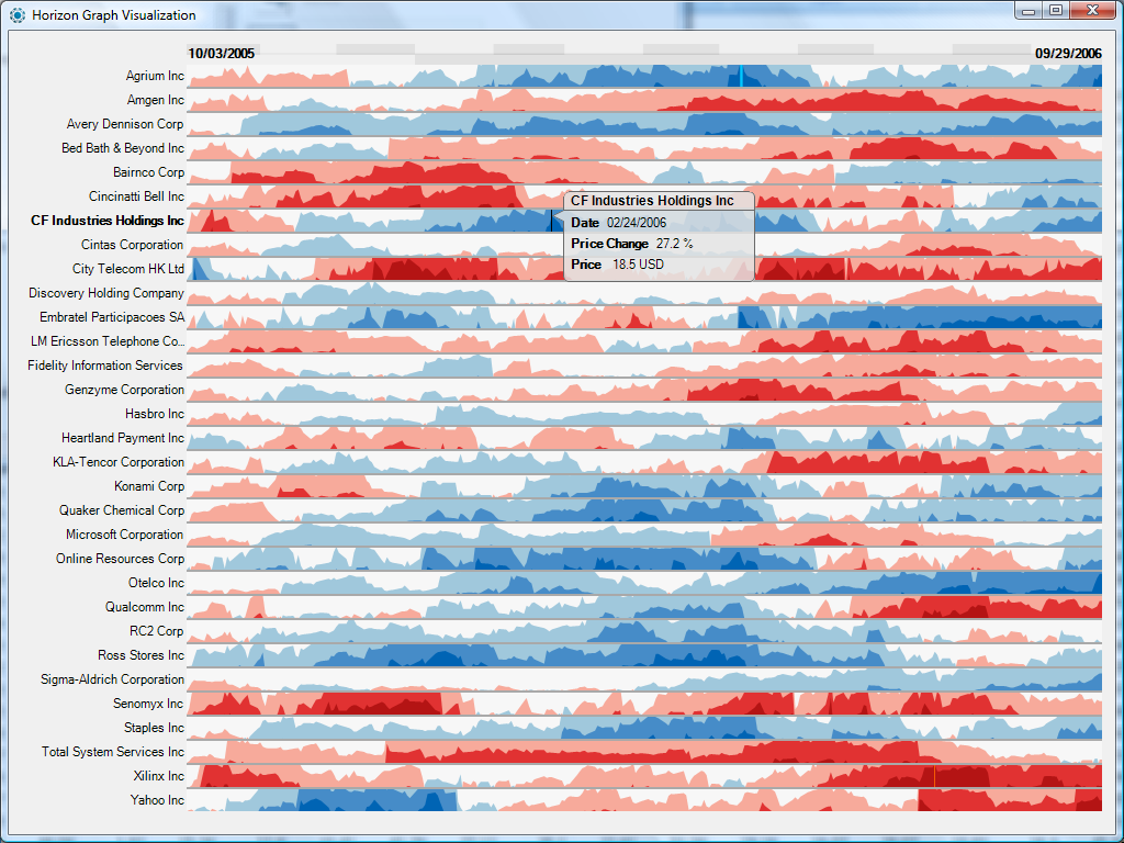
This week I found an interesting dashboard. Lets step back for a second and try to understand what’s going on here.

This is a Horizon graph. This is another way of representing time-series in a visualization. Created by a company called Panopticon, it allows users to display 50 or so sets of time series values that can be compared against each other. They are space efficient and quick to analyze once you get a hang of them (that’s what some people say)

Lets have a quick analysis –

  • The visualization uses different shades of blue and red colors to show positive and negative values and different shades of these colors to show bands.
  • By mirroring the chart, flipping negative values and using a different color the height of the chart is cut into half.
  • Using bands also reduces the height leading to the ability to show more data on one graph.
  • Easy comparison can be done between different multiple charts without scrolling, going to multiple pages etc. Remember, eye beats memory.
  • It can successfully deal with increasing data densities by adding bands (2,3 or more)

For me, It is extremely overwhelming. For a person who has never worked with Horizon graphs before they seem challenging to understand and analyze. I feel there is too much information that is being visualized here which can lead to lost clarity and incorrect interpretations. There can be errors in estimating data and how does one ensure accuracy? I feel I will be going back and forth a lot just to confirm that I am reading the right values.

But as many people have said, Horizon Graphs take some time getting used to but once you know how to use them, they works well!

What are your thoughts?

Source- 

Horizon Graphs Revisited

How to define KPI in visualization

Abstract: While KPIs are critical for every organization, they are often misunderstood or misrepresented, leading to inefficient decisions. In this blog post we will discuss about different types of KPIs that can help your visualization.

What is KPI:

A Key Performance Indicator (KPI) is a measurable value that demonstrates how effectively an organization is achieving key objectives. Organizations use KPIs to evaluate their success at reaching targets.

Various types of KPIs:

  1. Quantitative KPIs are straightforward, since they are made up of measurable numeric metrics and help you track clearly measurable progress.
  2. Qualitative  KPI: KPIs aren’t always about measuring quantitative aspects of your organization. You may also want to track some qualitative aspects.  quantifying qualitative data using the Likert scale or other similar tools, greatly helps in measuring and tracking qualitative KPIs.
  3. Process KPI: sometimes, when different processes feed into each other, a funnel view is a better way to understand the overall flow than tracking individual KPIs for each process.
  4. Combined KPI: when you have too many interdependent metrics to track, you can use statistical models to combine a bunch of similar metrics into a score and then visualize them in the form of scorecards. Scorecards give a quick snapshot of what is going right and what isn’t. Your dashboard could then have drill-downs into each scorecard to help you dig deeper into the root causes of the problems that need fixing.

Conclusion: KPI visualizations are becoming an essential part of the way organizations track their metrics and use those to develop nimble strategies for the future. Categorization of KPIs and finding what kind of KPI you are dealing with will help you make sure that you are getting the most value out of your KPI visualizations.

References:

https://www.klipfolio.com/resources/articles/what-is-a-key-performance-indicator

https://www.socialcops.com/kpi-visualization

http://unilytics.com/5-steps-to-actionable-key-performance-indicators/

http://unilytics.com/top-7-tips-for-dashboard-visualization/

Visualization Tool – QlikView

This blog is about comparing Tableau with another tool called Qlikview, for creating visualizations.

These days the performance driven executives only have a few seconds to convince a skeptical audience. The most effective way to convince an audience is by using graphs, visualizations and interactive dashboards that tell a story. The visual elements that one uses should have clarity and easy comprehension to complex business messages. These days with the intervention of big data, people do not want to just have the graphics, they want to create business insights from that data and analyze the trends and patterns.

For this, there are three tools in the market – Tableau, QlikView, D3.js which are worth mentioning. These are known to have gone beyond the average capabilities of the text and present ad-hoc reports. These tools have the capability of giving the user easy access to manipulation with the data and present some business intelligence advantage and create interactive analytics. However, I want to discuss more about QlikView as it has not been discussed during this course.

QlikView is a more specific Business Intelligence or BI tool which is now expanding at a rapid rate globally. It offers an integrated BI platform and comes bundled with demos, training manuals and tutorials. It also comes with the ease of deployment and configuration. It has a patented technology called ‘associative technology’ which can help in deriving intelligence and insights on demand. Another point of distinction is that it loads all the tables into memory to enable interactive queries and create reports. However, QlikView seems to lack the logical structure and GUI is not as impressive as Tableau. Also, the visual outputs are time intensive and not intuitive as Tableau.

Reference: https://www.experfy.com/blog/qlikview-vs-tableau-review-two-visualization-giants