The main purpose of visualization is to represent the data in such a way that it becomes easy for the viewers to focus on the important details. This allows for a fair amount of flexibility on deciding the type of data representation. Different situations call for different designs, but there are certain cardinal rules that shouldn’t be broken lest it leads to confusion and misunderstanding. A few important ones are:
Baseline should be zero for bar charts
The data represented in bar charts are always correlated to the length of the bars. Hence, it is imperative that the baseline always starts at zero.
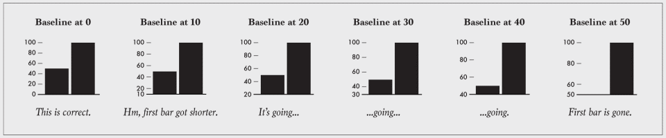
The picture above depicts the type of error that would creep in when the baseline is changed from zero. It is seen that the first bar is progressively shortening while the second one, though shortening, looks comparatively tall, giving a false representation.
Over-segmenting pie/donut charts
The general consensus is that the use of pie charts for data representation should be minimized. While that is a discussion for another day, pie charts, if not done properly face a lot of restrictions.
The picture shows everything that could go wrong while designing a pie chart. It tends to clutter if the number of sections goes past four or five. A pie chart like the one depicted above gives no information to the viewer. It would be a better idea to go for alternative representation types for representing data involving a lot of variables.
Respecting the parts of a whole
Data representations which are used to portray multiple distinct non-overlapping proportions should keep in mind that the final representation to do justice to the whole. Consider the given example. While the figure on the left adheres to the principle of respecting the parts of a whole, the one on the right shows exactly what could go wrong in such a representation.
Serve the main purpose
The main purpose of any data representation is to show the data in a lucid and appealing manner.
The whole purpose is defeated if the data representation doesn’t portray the data in a way that is not easily perceived by the viewers. Altering symbol sizes and shapes, using transparency and organizing data into subgroups are some of the ways to counter this problem of overplotting.
Explain the encodings/symbols
Never assume that the data represented is obvious and easy to understand. It would go a long way in increasing the quality and relevance of the representation if everything used is labeled and attributed to.
For example, a downward slope, as shown in the picture, could be used to any decreasing variable under the sky. It is only when the axes are labeled and the context explained that the representation starts making sense.
Source: http://flowingdata.com/2015/08/11/real-chart-rules-to-follow/