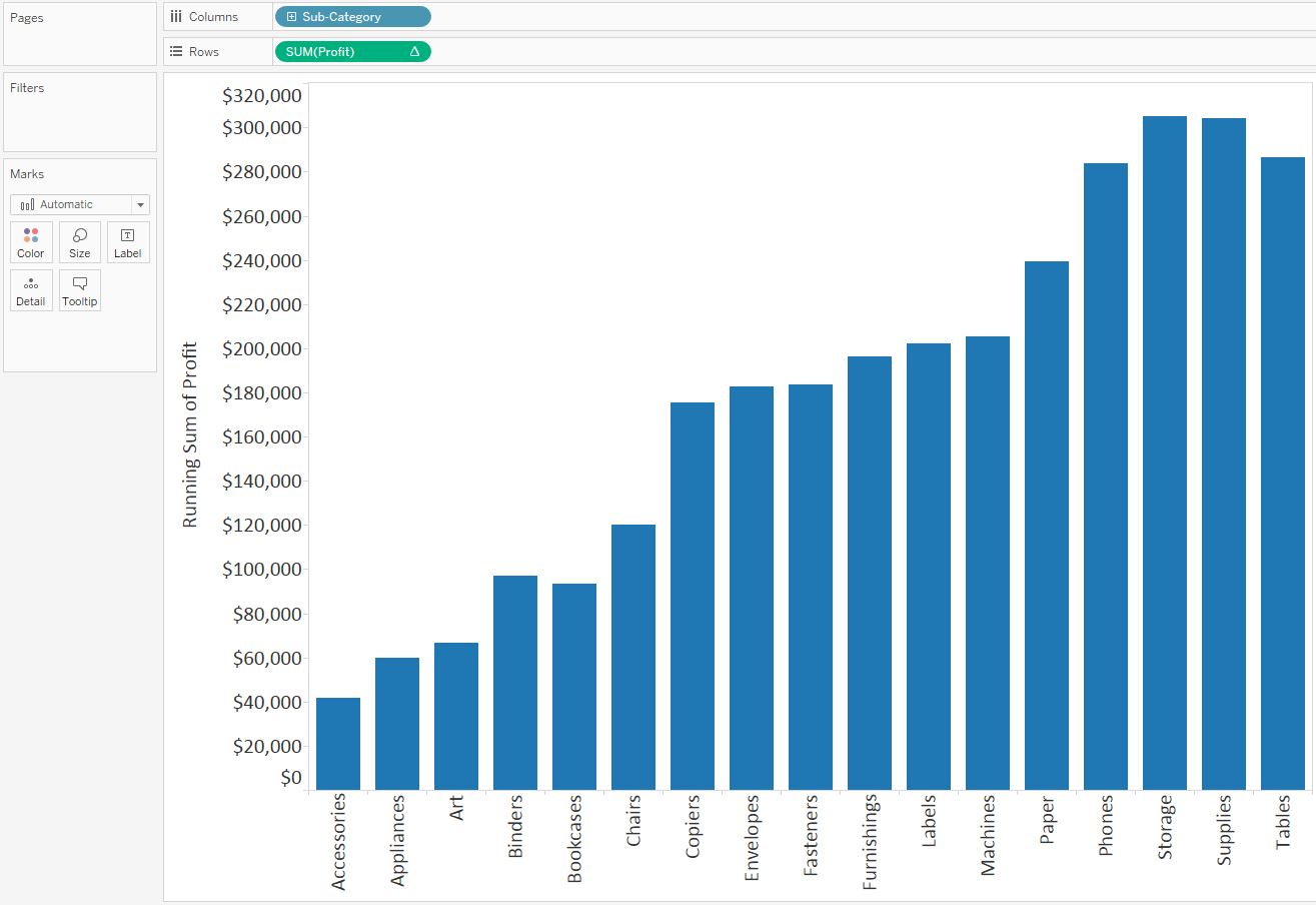
A waterfall chart helps understand how positive and negative values of dimension members are contributing to a total.
Here is an example visualizes how each Sub-Category in the Sample – Superstore dataset is contributing to total profit:

- Create a vertical bar chart, make profit as measure, sub-category as dimension. Add a table calculation to the Profit measure so that it calculates a ‘Running total’ on ‘Table (Across)’.
- Change the mark type from ‘Automatic’, which is currently bar, to the ‘Gantt Bar’ mark type, like below:

- In order to get the Gantt bars for each dimension member to properly line up, you first have to create a new calculated field which takes the measure in the waterfall chart multiplied by negative one. (e.g: -[Profit])
- Once this calculated field has been created, this is the measure that you drag to the Size Marks Card to create the waterfall effect as we showed in the beginning.
Reference: http://www.evolytics.com/blog/tableau-201-make-waterfall-chart/