Identify True Factors That Lead To Success

Key Performance Indicator is a measurable value that demonstrates how effectively a company is achieving key business objectives. Companies use KPIs to evaluate their success at certain action. Well designed KPI dashboard provide greater structure and context to the organization, and let them know how performance of certain KPIs impacts other KPIs. However, identification of right KPIs for the business is challenged. There are three bias that may lead to ineffective KPIs:

  1. Overconfidence: people are so confident in their judgments that their abilities are in conflict with the reality. For example, the managers of a fast-food chain, found customer satisfaction highly relating to profitability and believed low employee turnover can keep customer satisfaction, but when they made effort lowering overall turnover rate it didn’t help. The truth is that turnover only is relevant with manager position.
  2. Availability: people assess the cause or probability of an event on the basis of similar examples coming to mind, follow certain pattern, and overestimate other important information.
  3. Status quo: most people would stay the course rather than face the risks that come with change. Executives would stay on existing metrics instead of changing to suitable ones.

How to avoid those bias: just like designing dashboard, First, define the objective. Second, develop cause and effect, and identify the drivers of objective. Third, identify the specific that the audience can do to achieve that objective. Last but not the lease, regularly reevaluate the statistics.


Reference:

https://www.smartsheet.com/all-about-kpi-dashboards

https://www.klipfolio.com/resources/articles/what-is-a-key-performance-indicator

https://hbr.org/2012/10/the-true-measures-of-success


Modern Approach for Data Visualization

There is a variety of conventional ways to visualize data such as bar charts, pie graphs, and pivot tables. Actually, we have some other creative options to visualize data which is a lot more fun. This blog will show some example of this amazing ideas of visualizations.

  1. Trend map

The trendmap presents the most popular website under different categories and how they link to each other.

2. Visual hills for density

The graph above uses visual hills (spikes) to emphasize the density of American population in its map. It is clear that the population density is high in the northeast are and Chicago.

3. Heat map

This visualization uses heat map to show visitors behaviors. Sectors highlighted with more “warm” color are more popular, which means visitors click them more often. It’s an interesting and more straight forward way for web analysis.

Reference: https://www.smashingmagazine.com/2007/08/data-visualization-modern-approaches/

Valentine’s Day spending by Americans

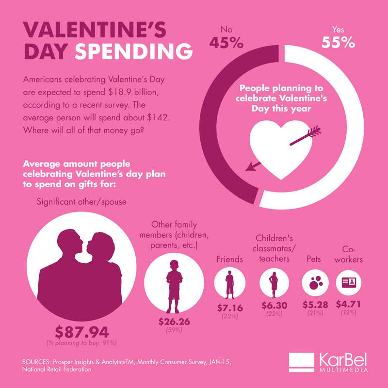
The most loving day of the year was celebrated this week: Valentines Day. The spending on cards, overpriced flowers, chocolates, chilling champagne and the fantastically romantic dinner date is done. Lets just get a sense of  how expensive Valentine’s Day can get. Below visualization depicts the Valentines Day spending by Americans. 

What I like about this Visualization is

  • Color that matches the theme
  • Precise titles show what we are about to see
  • Nice description which shows us the goal
  • Donut chart works well here as it’s only 2 slices

Possible improvements:

But to reach our goal and take proper action, there is very little context. We cannot figure out if this spending is increasing or decreasing as compared to previous years. Historical spending’s might help in getting a proper picture.

As discussed in class regarding grouping the significant attributes which does not have much difference amongst them, we could make two groups: significant other and everyone else.

Use of bubble charts to compare the sizes of the spending could be replaced by a simple bar graph. It will be easier to read. Though the color matches the theme but this is a lot of pink.

The data seems incomplete since it only shows spending on gifts but not the other expenses of flowers, chocolates, holiday, dinner etc. which are overpriced during Valentine’s Day.

I felt the below link depiction of Valentine’s Day spending to be better and simple:

https://nrf.com/resources/consumer-data/valentines-day

But overall we can say that love is not likely to be a cheap thrill on Valentine’s Day.

Sources:

http://www.karbelmultimedia.com/2015/02/valentines-day-spending-infographic/

https://nrf.com/media/press-releases/cupid-shower-americans-jewelry-candy-this-valentines-day


World’s Biggest Data Breaches

Data breaches are highly damaging for both the company and its consumers. This interactive bubble chart depicts the biggest data breaches that occurred. The bubbles represent the different companies which faced data breaches. This visualization has a time scale as the y-axis where the breaches are categorized according to the year it occurred. The visualization also provides more elements to filter and categorize the data. For example, the bubble color and the bubble size which have 2 mutually exclusive indicators called ‘year’, ‘method of leak’ and ‘no of records stolen’, ‘data sensitivity’ respectively.

Things I liked:

  • Firstly, by the time scale, we can easily identify that the number of data breaches has drastically increased over the years which raised a lot of concerns.
  • Secondly, the visualization portrays a complete picture of the data breaches and covers every aspect ranging from the method of the leak to the sensitivity level of data.
  • Thirdly, hovering over each bubble provides details of the breach and on clicking first time it provides a summary of the event, but on clicking the second time it redirects to the actual news article.
  • We can select any combination of the four categorizing indicators mentioned above.
  • A legend provides filtering options based on the type of industry and the type of data leak.

Things that can be improved:

  • The color range used for depicting ‘year’ is very subtle and distinguishing is difficult.
  • Attention diverts to the ones in orange which is predefined as an interesting story.

Reference: http://www.informationisbeautiful.net/visualizations/worlds-biggest-data-breaches-hacks/


Why do I recommend Gapminder Tools Offline


Hans Rosling’s videos were amazing. He used Trendalyzer to told us how to present interactive visualization in a different level. Today I’d like to write why do I recommend Gapminder Tools Offline- upgraded version of Trendalyzer.

  1. Be able to easily bookmark. With Gapminder Tools Offline users not only can create statistic animation but it also allows users to book mark the specific time that they want to book mark. I like this function because it can make my presentation more straightforward and I can show important factors like KPI without digging different story pages.
  1. Interactive bubble presentation with color. With this software, users can easily generate interactive moving bubble charts with vivid colors. It looks like bubbles flying over the sky and it gives audience a friendly scene during the presentation. It can save both presenters and audience time because the moving bubble itself conveys a historical trend itself.
  1. Offline tool. The software note only offers online tools but also offline tools. It allows users to prepare the presentation without Internet restriction. Because your boss might ask you to present a story while you traveling where does not have Internet.

Reference:

  1. The best stats you’ve ever seen
  2.  http://www.makeuseof.com/tag/awesome-free-tools-infographics/

Is a Waffle better than a Pie?

Through our class and blogs, we have discussed as to why pie charts are best left alone. One of the reasons for avoiding pie charts is the difficulty in judging the area of each slice, since it is dependent on the angle at the center. So the question now is, if we were to remove the angle element from a pie chart, would the resulting chart be more useful?

To start answering this question, let’s first identify a name for this resulting chart and look at some of its characteristics. The resulting chart is called a Square Pie Chart or more commonly known as a Waffle Chart. The waffle chart is represented as a square/rectangular block consisting of small tiles. Each tile in the block contributes to the entire sum/percentage of the block and is weighted equally. Therefore, the waffle chart manages to provide a balance between the visual aspect and the ability to synthesize the data. The biggest advantage of using a waffle chart, over a pie chart, is the ability to synthesize data down to 1%. This is possible by comparing the various parts (area) of the waffle (which in most cases is a square, thereby making calculations easy – number of cells in row multiplied by number of cells in column).  Even when compared to a bar chart, a waffle chart looks more interesting and can answer questions such as “x is y times greater/smaller than z”.

However, just like in the case of a pie chart, we need to be cautious when deciding which visualization to use. The critical factors to keep in mind will be the number of categories being described and the value difference between each measures. In addition to these two factors, we also need to tailor the visualization according to the audience, the context/setting, and the message being delivered.

References:

http://tableaulove.tumblr.com/post/56368410545/yummy-yummy-tableau-waffle-charts-from-jesse

http://bl.ocks.org/XavierGimenez/8070956

https://community.tableau.com/thread/125926

http://junkcharts.typepad.com/junk_charts/2008/06/the-right-scale.html

Connected Cars (3D Really?)

We all know that IoT aka Internet of Things is one of the most talked about topics today. You’ll be amazed to know that approximately 23 million vehicles around the world have internet access and big data such as engine controls, driving behavior and automatic crash notifications are going and getting uploaded on the cloud. It is predicted that by 2020; 152 million vehicles will be connected via internet.

Let’s look at this visualization and see if it has succeeded in what it is trying to convey.

Visualization link: Connected Cars

While 3D visualizations can provide rich information, many people have trouble comprehending them. This visualization presents an amalgamation of graphs which are beautifully represented in vibrant colors and each one utilizes different forms. However, the fundamental issue with this visualization is that this uses unjustified 3D graphs. In this, 3D is offering no increase in viewer comprehension. The first four dashboards are still easy to decipher, however, the major problem lies with the last two.

For instance, the fifth graph represents two features merged into one i.e the most innovative car maker for communication and the most innovative car maker for drivers assistance based on an index score. Firstly, the graph shows no mathematical correlation between these two indexes.Secondly, the graph is presented in overlapping 3D triangles with the values labeled with long lines placed close to each other making it difficult for the audience to compare two companies on this index (eye beats memory!!). This representation actually confuses the audience in terms of judging the depth, size and position of objects and could be presented in relatively simple bar graph comparative.

Finally a pie chart is used to represent driver’s willingness to share the connected car data with OEMs, that too in 3D (double mistake). The colors used also overlap and interfere with the interpretation. If observed closely, the 34% drivers who anonymously want to share the data and 31% who wish to share data in lieu of an incentive has only a percentage point difference of 3; however, on the graph it seems that the difference is more because of the unnecessary 3D effects poured in the pie chart.

This visualization can be improved by rotating the axes to make its cross section perpendicular to the planes of presentation. Any suggestions from the readers are also welcomed on how to improve this visualization.

References:

https://www.tableau.com/sites/default/files/whitepapers/dashboards-for-financial-services.pdf

http://onlinelibrary.wiley.com/doi/10.1002/meet.2011.14504801345/pdf

Building Interactive Dashboards With Tableau Actions — Embed A Youtube Video

Last time, I introduced how you can use Tableau Action Filters. This time, you will learn how to embed a video from an external source into your dashboard to highlight something interesting.

First of all, you need to get the youtube video URL you like. To do this, go to a youtube video and click “share > embed”. Copy the source link in src=”…”, like the highlight in the picture:

Next, you should save your Youtube URL in your source data file as an column just like other regular attributes.

Go to the “Dashboard > Actions> Add Actions > URL” in the top navigation from any dashboard view. Click the arrow that appears next to the empty URL box. You should be shown a list of options including the URL field in your underlying data. Click the URL field so that the video associated with a particular record will start when the action is run.

WX20170214-175952@2x

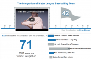
This is a example dashboard embed youtube videos for “MLB Integration by team”. If Clicking on any hall of fame player, represented by a blue Gantt bar, it will load a short biography of that player on the scoreboard.

TO BE CONTINUED…

Reference: http://www.evolytics.com/blog/tableau-201-3-creative-ways-to-use-dashboard-actions/

Three dimensional effect

For this week, I’d like to introduce you the latest technology of making a three-dimensional effect in visualization. The first figure shows the what American paid for gadget lust in the 90s, 00s, and the recent decades, respectably. As we can see, the vertical axis which shows the different times is a downward sloping trend line instead of a commonly seen horizontal line and the horizontal values which show the money spent shows in a three-dimensional effect. That makes audiences feel closer to the data.

st_infoporn_f

Another similar design: The map of foreclosures (New York Times, 2008) displays multiple variables in a striking 3D graphic.

20080406_METRICS_SUB_GRAPHI

I think this pattern of design is worth being studying from.

Reference:

1.The Cost of Living on the Bleeding Edge of Gadgetryfigure https://www.smashingmagazine.com/2008/01/monday-inspiration-data-visualization-and-infographics/

2.In the shadow of foreclosures by the New York Times, April 5th 2008http://mapdesign.icaci.org/map-examples/

Difference between Tableau and D3.js

Tableau is a data visualization software that connects easily to the majority of databases be it corporate Data Warehouse, Microsoft Excel or web-based data and allows for instantaneous insights by transforming data into visually appealing, interactive visualizations called dashboards. It is a Business Intelligence tool with drag and drop interface which makes it fast and easy to use.

D3.js is a Javascript library for creating data visualizations in the browser and is built on top of common web standards like HTML, CSS, and SVG. D3.js helps you attach your data to DOM (Document Object Model) elements. Then you can use CSS3, HTML, and/or SVG showcase this data. Finally, you can make the data interactive through the use of D3.js data-driven transformations and transitions.

Differences between Tableau and D3.js:

  • Tableau: It is a proprietary tool and can be expensive if not using the basic Desktop Application.
  • D3.js: It is a free and open-source tool.
  • Tableau:Development time of dashboard is in minutes due to it drag and drop interface. Learning it becomes hassle-free.
  • D3.js: Development time can be from hours to days as hard coding is required and can be difficult to learn without prior knowledge of web development tools and languages.
  • Tableau: By applying user filter or row level security feature, restricted data access can be provided to different users.
  • D3.js: Concealing data from User can be accomplished but restricted access among different users in difficult to achieve.
  • Tableau: Variety of built-in charts and maps are available to utilize but out of box visualizations are not possible.
  • D3.js: Any imaginable visualization which is codeable is possible, but every chart has to be built from scratch.
  • Tableau: It is able to identify dimensions and measures and can handle gigabytes of data.
  • D3.js: It is struggle to handle large datasets of gigabytes in size.

Use Cases & Key factors:

  • Tableau: Internal Analytics Platform, Public Data Viz work, Need Answer fast, Speed to delivery, for internal use and great visualizations.
  • D3.js: Public Data Viz Work, Embedding into a product, real-time interactive web, control over display, for external use and great visualizations.

We can conclude that for quick and easy visualizations involving commonly used charts and maps, Tableau is suited and D3.js can be utilised when there are extraordinary charting requirements or high interactivity requisites.

Source: http://www.je-lks.org/ojs/index.php/Je-LKS_EN/article/view/1128/1030