To be Interactive or not?

When looking for information on an upcoming assignment, a question came to mind. This question is, “When should interactive visualization be used and when should it not?”. We all know that for a visualization to be good, it needs to tell a story and use the data shown in the visualization to support this story. However, with interactive visualizations that story becomes more fluid instead of static and the results may not be what you expect or want it to be. So why do we use interactive visualizations if this is what can happen? I went looking for information on this and surprisingly I did not find a lot of information on this. What I found however does bring up some good points. Interactive visualizations should only be used in certain cases. First and foremost, the best use of interactive visualization is that it should only be used for yourself when exploring the data. This allows you to freely see what the data is and allows you to explore the stories that lie within the data. Interactive visualizations should never be used as a prop for presentations since the data that in presentations need to be static and should convey your charts story to the viewers. If you give the option of changing the data points and other variables to the viewers, then the presentation will never finish.


Reference: http://stats.stackexchange.com/questions/7048/when-is-interactive-data-visualization-useful-to-use/7098

Defining and using KPIs in a successful business intelligence system

Key performance indicators (KPIs) can aid in measuring BI and analytics performance. The key challenges for creating a KPI is to meet business objectives, and use knowledge to generate value form a successful business intelligence system. Dashboard is to present this KPI in a form for management review. Dashboard will provide real-time presentation of KPIs and allows for drill-down.

In my option, the KPI shall not be limited to presenting the business process and results. It shall also make recommendations for actions to improve business process. After some actions are implemented, the dashboard can reflection the changes of KPI based on those actions. Dashboard shall adopt more machine learning and deep learning algorithms. In this way, dashboard can be more intelligent to make recommendations for senior executives.

http://searchbusinessanalytics.techtarget.com/feature/Defining-and-using-KPIs-in-a-successful-business-intelligence-system

Oscar Dashboard

Here is the dashboard representing number of Oscars presented since 1929 (when it was started) till 2014. There is no such strong claim to make from this visualization but instead of just staring at list of Oscar winners, you can play with it for different categories and ratings for each year.

Dashboard: http://www.antivia.com/decisionpoint-excel/samples/oscars.htm

Good things about the visualization:

  • Less is more. The dashboard is simple and clean with two bar graphs and a block calculating percentage distribution.
  • Right choice of idiom. If we want to find what category of films has highest Oscars then bar graph is best suitable. And it is sorted by the number of winners which grabs users attention to the top category of film.
  • Effective use of filters. When it comes to movie, we have different categories, genres, artists, ratings, release year. All of these characteristics are included in this dashboard using filters.
  • Information follows the inverted pyramid. The most important and substantial information is at the first view followed by significant details by applying filters and then general background information.
  • The percentage calculation for each category gives performance of each category with respect to all categories.

Improvements:

  • They could have represented trends in each category over those years. For example, how is the demand for documentaries or animated films for each year.
  • It has many filters however it would be tedious for user to select all those filters and find the required information.

To conclude with, this provides valuable insights into trends in industry throughout the years which is much better that scrolling through the tables with multiple columns and millions of rows!

Source: http://insidebigdata.com/2015/02/21/visualization-week-ultimate-oscars-dashboard/


What do I like about ‘Inflation Dashboard’

While dong redesign project I had chance to explore Eurostat-a Directorate-General of the European Commission. Among the various visualization tools, I specifically like inflation dashboard tool that they are using for EU inflation rate.

Here are the four features that I like about this tool.

  1. Be able to simultaneously choose two line charts, a bar chart and a map

The four charts show the overall and specific EU member states’ inflation information. The four tables are interactively changing based on what information users want to read.

  1. Choose three simple light colors

The main three colors they choose are very light and simple. The colors are eye friendly and also distinguishable enough for readers to get specific information at the first glance.

  1. Be able to read the individual stories by time range

Readers can choose the time range they want focus and the duration of display so that the website will play the inflation trend automatically.

The tool also allows readers to view data as map, chart or table.

It is a good visualization for governments or companies and individuals to think about when it comes to present a time based interactive inflation visualization.

Reference:

  1. http://ec.europa.eu/eurostat/inflation-dashboard/
  2. https://www.frbatlanta.org/research/inflationproject/dashboard.aspx
  3. http://ec.europa.eu/eurostat/help/first-visit/tools

KPI Visualization Analysis

Since this week we are introduced what is a KPI and how KPI consists of. I choose to analyze a mediocre KPI design.

http://www.dashboardinsight.com/dashboards/tactical/perpetuum-money-maker.aspx

This dashboard is supposed to help traders report all their activities to their customers: when the traders sell or buy, customer daily profit, market KPI’s for exact date and time, risk level. So, customers get a clear idea of what was a situation and why the trader performed in this or that manner. Here are some key changes that this dashboard needs to change:

— Remove all the 3D segment in the graph. We have talked about 3D data visualization in the previous class. Most of the time, it does nothing other than confusing the audience.

— The top right table contains too many raw data and detail. Actually, the data is not even visualized in the dashboard. The author should follow the rule: KPI = metric + goal + action + time frame. A gauge with a leveler graph will work.

— Unidentified figure in the left bottom corner.

— Un identified figure in the Day Result table. what does the figure “81” and “245” mean? Properly label widgets should be added to this dashboard, ensuring the viewer quickly knows the meaning of them.

Reference:

Perpetuum Software’s Personal Moneymaker Dashboard

http://www.dashboardinsight.com/dashboards/tactical/perpetuum-money-maker.aspx

Data Cleaning tips and tricks for our visualization projects

As many of us have started working on cleaning our data for our project work, I thought of sharing a few tips and tricks that I came across for cleaning your data sets while using Tableau.

  1. Get involved with your data

After you have identified the final argument and the different claims that support your argument, the next step would be to understand your data. It may not be sufficient to just look at the column headers, it’s a good idea to think through what the data represents. Check for the data types, values that each column can take if they are within the expected range (an e.g. price range of fruits per kg in a grocery store from $0 to $40.) Be vary of empty or null values. (E.g. in our first assignment the null values for x Coordinate, y coordinate, latitude and longitude did result in a key insight). You can also try to spot initial patterns in the data set.

  1. Never trust your data at the first sight

It may so happen that the first set of 50 -100 rows of your data may be well formatted however there may be errors in the rest of the rows making it difficult to visualize your data. Also, it’s always better to double check your understanding of the data so that you don’t make wrong assumptions. This will save a lot of initial data prep time.

  1. Avoid cleaning your data manually

It’s always better to use the in-built Tableau Data Interpreter for cleaning messy data sets. It’s an easy way to strip out title, footnotes, empty cells and multi-row column headers and create a usable table. The data interpreter is also very useful in extracting sub tables from excel files. i.e. when multiple table are place on the same sheet and separated by a empty spacing in between.

  1. Standardize your data

Use the same naming convention for column headers across all your data sets. For example, if the same column appears in multiple data sets if you standardize it’s easier to remember the column name. This may apply to the data values as well. For e.g. CA and California are the same but may not be recognized in Tableau. It’s a good practice to group these values. Try to use the same unit for measures that you want to aggregate by applying a calculated field. (for e.g. total number of items sold per category and profit per category in a retail store should both be an integer type)

These data sets cannot be linked without using standards
                                   These data sets cannot be linked without using standards


  1. Iterate your data cleaning process

Try to focus on the main issue blockers in the first iteration and start your first data visualization. Based on the insights you get, you can apply better data quality techniques to refine your dashboard to sell your story.

Reference: https://public.tableau.com/en-us/s/blog/2016/05/5-tips-cure-your-data-cleaning-headaches


When KPIs fail!

KPIs designed without structure and clearly defined outcomes can lead to a mindless chasing of numbers, resulting in reduced performance. Here are few bad KPI practices:

1)Using KPI as a target:

A well-designed set of KPIs serves as a navigation tool that gives everyone an understanding of current levels of performance. If we use KPIs as indicators used and owned by everyone to identify areas of improvement, then they become powerful enablers of improvement. But if we use KPIs as targets, then we get what we measure, and nothing else. The article uses the analogy of comparing KPIs to torch. When used as a target, KPI will give a spotlight and leave other parts of the room in the dark.

2)Measure everything everyone else is measuring:

Sometimes businesses end up measuring KPIs prompted by external sources or the most recent leadership book. Bad KPIs are detached from business context and as a result are pointless. In contrast, authors of winning KPIs start with an analysis of the business context, thus making their KPIs successful as a
business tool.

3)Not separating Strategic KPIs from other data:

The key message of important strategic KPI is lost when it is lumped together in one long KPI report or a huge dashboard. Business leaders are time-poor and one needs to ensure that the critical KPIs are not lost in a sea of irrelevant information.

4)Hard-wiring KPI to incentives:

When KPIs are linked to incentives, they stop being a navigation tool and become a target an individual should hit to secure a pay rise or bonus. When this happens, individuals involved can become very creative in how they can manipulate the information to ensure they receive the incentive.

Reference:

www.simplekpi.com/Articles/5-Examples-of-KPI-bad-practise
www.linkedin.com/pulse/20140324073422-64875646-caution-when-kpis-turn-to-poison
www.bscdesigner.com/sound-approach-for-kpis.htm
Key Performance Indicators For Dummies By Bernard Marr

Heatmap of Temperatures

In this blog I would like to analyze a heatmap of “Daily Temperatures & Precipitation” of Sacramento from 1900 to 2015. The visualization consists of 3 separate charts in different tabs for high temperatures, low temperature and precipitation.

The first thing I really liked about this chart is tabs for different charts, labeling of axis is neat and not cramped & placement of legend.

I believe this chart is a perfect example of a heatmap.Even though every daily high/low temperature and precipitation is recorded in this chart, because the author choose a heatmap it does not look cramped. We can clearly see the changes of range of temperature not only along the season but also along the different years, we can clearly observe from the High temperatures chart that the High temperatures have been consistently increasing from 1900 to 2015. The high temperatures were highest only in the months of July – August in early 1900s to June – October in early 2000s.

The one thing  I would change in the Daily High Temperatures chart as “Increasing temperature in Sacramento” . I believe that as per Tuesday’s class having a title which conveys a message/claim is better than having a description of the chart as the title.

In conclusion, I think this the heatmap is an excellent in its visualization of  a 100 years of temperature.

Source – http://digitalsplashmedia.com/sacramento-weather-data-visualization/


TABLEAU DASHBOARD: Best Practices and Design Principles

While doing my assignment, I was doing some research on how to design a tableau dashboard and what are the key principles for creating an informative dashboard. I found a video explain the Dashboard Best Practices and thought of writing my blog on same.

Building Dashboards involves creativity, science and art and there are 5 key design principles for designing a Tableau dashboard.

  1. Have relevant metrics: You need to have relevant metrics for your dashboard which align to the overall strategic goal. A good practice is to involve stakeholders at an early stage to identify the required metrics. Also, it is good to remember, if it doesn’t get measured, it doesn’t get improved; hence make sure that the selected metrics are the ones which can be improved or on which corrective action can be taken.
  2. Make it visually pleasing, do not overboard
    The idea of the dashboard is to make it easy for the users to compare and remember data. Take advantage of this but do not go overboard with the charts and try to limit between three to five charts in one frame. Too much information can be confusing and detrimental to the viewer.
  3.  Make it interactive:
    Take advantage of the Tableau’s features to create a high level summary of the data but always allow users to explore through the data and get engaged. Give them opportunity to dig to the level of detail to meet their needs.
  4. Make it easy to use and access:
    chart 1
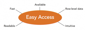
    At this point, it is good to consider things like color choices, fonts, layout and also about access, right. Try to answer following questions: Will people be able to click on it, and immediately access it? Will it be fast? Will it run well?
    Focus should be to make a positive experience for the audience and that they can access and use it easily
  5. Be open to improvement:
    Be open to improvements and try to collect feedbacks. Creating dashboards should be a continuous process. Metrics and goals might change and a good dashboard should be up to date with those challenges and changes so that it stays relevant.

Keeping in mind the above principles can help us in designing a better dashboard.

Reference: https://www.lynda.com/Tableau-tutorials/Creating-visuals/417094/442256-4.html?autoplay=true

Key Performance Questions

This week we discussed KPIs and business metrics in class. Why are they important and how do they help?

For companies to gain competitive edge and knowledge from data they need to completely understand and define business objectives. These business objectives become the underlining principles on which business metrics and KPIs are defined and dashboards can be designed. These help the companies to achieve their goals by providing them a direction and guidance.

But how do we make sure that we have the right KPIs?

Many a times people pick KPIs randomly and later on realize that they are not quite right for them. Otherwise they pick too many KPIs just so that “all angles are covered,” which leads to confusion as to what exactly are the performance drivers. Hence, it is very important to decide on the right KPIs that matches strategic objectives.

I landed on this article by Bernard Marr who has developed an approach to bridge the gap between strategic objectives and KPIs which is called Key Performance Questions (KPQ). This basically is a simple approach which requires you to identify performance related questions that you need to answer before defining a KPI. Once these questions are decided, the management can then ask themselves what data and information we need to answer these questions?

We can also use the same for our projects and assignments. Before designing a dashboard, ask yourself questions. We can start with high-level and generic questions which can later evolve into more specific and detailed ideas. Having these questions will give more clarity to what we plan to achieve.

Some examples can be –  What is the key focus? What value am I trying to bring from this visualization? What is the goal and action? What will be the impact? What data will best represent the case? I believe that the concept of 5-WHYs can also be of help here. It will help provide us the right direction and create better visualizations!

Source – https://www.linkedin.com/pulse/20140814161947-64875646-what-the-heck-is-a-key-performance-question?trk=mp-author-card&trk=mp-author-card