Executive Dashboards

What is executive dashboard? It is a visual representation that gives executives a quick and easy way to view their company’s performance in real-time.

Executive dashboard nowadays uses API (application programming interfaces) to connect with its existing system sources such as accounting software, CRM system, and email system. It can directly pull out those data and transform that information into visualization that can be viewed and manipulated in different ways based on the users’ need.

There are several benefits of executive dashboards:

  1. Visibility: a snap-shot for the audiences lets them get a clear picture of what’s going on.
  2. Ongoing Improvements: measure the performance and let the audience know what to improve it.
  3. Judge Performance Against Business Plan: show what’s company performs compared to business plan and the goals from the business plan versus actual real-time results.

There are two examples of executive dashboard:

Marketing Executive Dashboard

Salesforce
  • Let the directors and VPs know whether they are creating efficient campaigns and generating and converting leads.
  • Relevant information about leads and campaigns such as Campaigns by ROI and Top Marketing Channels by Campaign.
  • Set time smartly. There are quarter and month data. It can get the big picture and details.
  • There are tables supporting charts on the dashboard.

Sales Executive Dashboard

Salesforce
  • Let the audiences to know their organization going this month.
  • Set conditional highlighting to show the audience what perform above average or below average.
  • It uses headers and footers smartly. They efficiently support what charts and tables want to say.


Reference:

https://www.forbes.com/sites/davelavinsky/2013/09/06/executive-dashboards-what-they-are-why-every-business-needs-one/#7c83efd837d1

https://resources.docs.salesforce.com/206/latest/en-us/sfdc/pdf/salesforce_dashboard_samples.pdf


UBER ENGINEERING’S DECK.GL FRAMEWORK

Uber’s engineering team open sourced deck.gl, a WebGL-powered framework specifically designed for exploring and visualizing data sets at scale. Uber can explore GPS traces for a given trip to get full context if there’s an accident on the road. Uber also can communicate plans to city authorities by visualizing pain points if there are pain points around pickup locations in a city.  The engineering team developed deck.gl to meet the needs that the data should be web-based, real-time, and shareable.

deck.gl’s set of features adapts to a wide range of use cases, including mapping. It enhanced map-related visualizations in many different mapping environments. Here’s an example of mapping use case. deck.gl  dealt with large data sets: 2M points and 36K taxi trips in NYC with live GPU interpolation.If you are interested. you can check demo here. It’s amazing.

Reference: https://eng.uber.com/deck-gl-framework/

Tableau ‘Show Me’ tab – to use or not to use?

We all struggle to present the data in the most impressive visualization in Tableau. Most of the times, the ‘Show Me’ menu comes to our rescue. One of the most common mistakes in designing graphs is choosing the wrong graph type from this menu. Below are its possible issues:

  • Upon selecting the parameters when you click on ‘Show Me’, it stops you from thinking out of the box and limits your creativity.
  • Few very useful chart types are never displayed. Chances are that once you select the measures and dimensions; the tab gives you a bunch of options and neither fits the claim.
  • Sometimes, it portrays chart types that should never be used. For instance, for creating the visualization of the market share, it shows the options of pie chart, which might display a complete misleading claim that the you want to tell.

This can be substantiated by looking at the following visualization:

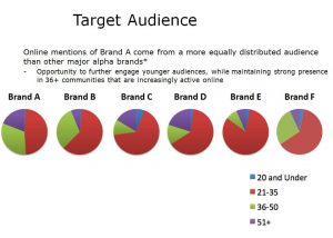
audience-pies

Issues with this visualization:

  • It has perceptual problems as no labeling of the shares is done
  • Very difficult to make comparisons for the same age across multiple brands
  • Results are conveyed but cluttered with long text
  • It uses multiple pie charts

How this graph is improved:

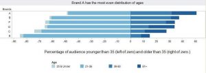
brands1

  • It facilitates age comparisons much better than the multiple pie charts and enables the audience to see the age distribution of each brand
  • The color scheme is subtle yet powerful. The color intensity increases with increasing age, so one need not refer to the legend at every brand
  • The legend and labeling is clearly shown with age groups
  • The intended message to be sent across to the audience is displayed clearly

One needs to think of the best way to put across the claim of the visualization without limiting to the existing charts. 

Reference:https://www.forbes.com/sites/naomirobbins/2011/11/29/thinking-outside-the-chart-menu/#1b4d7b59171a

The power of visualization for golf

Visualization is helping golfers to improve their movement. The visualization can help to compare a real and imagined action and the golfer can stimulate the same muscle that would use to perform the read action. To visualize a shot, a golfer need to get a clear picture of the path the ball will travel on to reach the target. The other way is to visualize is to actually see himself or herself hitting the shot. The visualization can also help a golfer to make swing change to create new neural pathway and make the change part of “muscle memory”.

In my option, visualization shall not be limited to the use in business but also extend its use into sports training. I personally have been took a visualization class and it helped me to show how different I swing each time with statistical charts. I also try to memory my position and strength of the best swing as the visualization pointed out. In all, I believe the visualization is a great way to enhance performance of the sports training.

http://www.businessmirror.com.ph/the-power-of-visualization-for-golf/

Data Visualization in Political and Social Science

Abstract: In this post I will briefly discuss data visualization in political science and how use of visualization in social science can be risky.

Data visualization in political science takes advantage of recent developments in computer science and computer graphics, statistical methods, methods of information visualization, visual design and psychology.

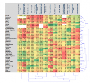
There are two main types of numerical tables that can be a subject of data visualization. The first one is called “object-feature” table, where every row represents an observation or an object and every column correspond to a numerical feature or indicator commonly measured for the whole set of objects. An example of such an “object-feature” table is a factbook for a set of countries, where the objects are countries and the features are numerical indicators such as GDP per capita.

Screen Shot 2017-02-20 at 12.38.18 PM

Source: https://arxiv.org/pdf/1008.1188.pdf

The second type of numerical tables is called connection or distance tables where both rows and columns correspond to objects and at the intersection of a row and a column a numerical value is found characterizing a link between two objects. A typical example of a connection table is the table representing the migration rates or the mutual volumes of export and import of goods for a set of countries.

Data visualization problems and risks: 

There are different sets of problems regarding data visualization in political and social science. First, the problems can be induced by the designer (intentionally or unintentionally) or by the user of the diagram. Second, these problems can be classified into cognitive, emotional and social ones. Cognitive problems can be connected to inappropriate use of graphical elements, lack of clarity, over- simplification or over-complexification of the graphical display, or induced by heterogeneity of target user groups. Emotional problems can be connected to a repellent content of graphical design. Social problems can be connected to cross-cultural differences of users. Another source of problems in data visualization comes from the use of categorical or qualitative measurements for which no standardized and well-established graphical displays exist.

Conclusion: Similar to other fields political and social science has been used data visualization to clarify their message. But using data visualization in these areas is more challenging since we are dealing with a lot of qualitative data and factors that can not be visualized easily. To improve our visualization in social science we need more insight on data beside technical capacities. 

References:

1. Bresciani, S., Eppler, M.J. (2008). The risks of visualization: a classification of disadvantages associated with graphic representation of information. ICA working paper #1/2008.

2. https://arxiv.org/pdf/1008.1188.pdf

3. LeGates, R. (2005). Think Globally, Act Regionally: GIS and Data Visualization for Social Science and Public Policy Research. Esri Press.


How to Choose the Right Data Visualization Types

At a glance, data visualization is about drawing a picture with your data rather than providing numbers and facts. Going by this definition, anything put forth to represent the data counts. But not every way of representation is apt for every situation. Different situations(depending on the data and audience) call for specific ways of representing data. With that in mind, I am listing out five different ways of data representation and their optimal usage. 

1) Bar Graphs 

Bar graphs could be horizontal, vertical or stacked. While horizontal graphs are used mainly for comparative ranking, vertical graphs(column) are used for showing chronological data. Stacked charts are a bit more complicated in that they usually show the part to whole relationship. The problem for bar graphs, in general, is that it gets cluttered if there is a huge amount of data to be represented. Moreover, labeling would be difficult with a cluttered graph.

2) Maps

Maps form one of the most complete ways of representing data when various geographical areas have to be compared/contrasted. Maps can do more than just displaying data. They can direct action as well. Despite all this, maps have their disadvantages as well. Simply put, if the data that needs to be visualized does not involve a geographical area, it doesn’t need a map. Moreover, as with bar graphs, too much data can clutter the map and filling the map with data points doesn’t make for a pleasant viewing, not to mention inundating the viewer.

3)  Line charts  

Trends. Dynamism. Volatility. Line charts portray these aspects with an unerring efficiency. They display relationships in how data changes over a period of time. A cursory glance at the line chart given below lets the viewer know that the amount of sales by means of credit cards were the highest(this is just a minute part of what the whole chart says).

As with most other ways of representations, line charts become confusing if the number of variables to be represented shoot up. Besides, a legend is imperative to decipher the meaning of the chart and the viewer may be forced to constantly refer to the same for interpretation.

4) Area charts

Like its close relative, area charts too are most effective when used to represent time series relationships and for facilitating trend analyses. Area charts are of two types, unstacked(which is basically a line chart with enclosed colored areas) and stacked area charts. Stacked area charts and more informative and consequently, is used more. They portray a part to the whole relationship.

As long as one sticks to stacked charts for representing a part to the whole relationship of not more than 6-7 values, an area chart seems to be a perfect choice. Unstacked charts clutter quickly and can be used only for 3 or fewer values.  

5)  Scatter plots

If correlation in a large data set is what one needs out of a representation, scatter plots are the way to go. The data set needs to be in pairs with a dependent and an independent variable. Upon distribution of data, the result would show a positive/negative/neutral correlation. The addition of a trend line would make it more informative by highlighting the correlation and shows how statistically significant it is.

Contrary to most other forms of data representation, scatter plots need a large amount of data to appear meaningful. A scatter plot with only a few variables would appear empty, with little to no information provided for the viewer.


Source : http://www.datapine.com/blog/how-to-choose-the-right-data-visualization-types/

Is interactive visualisation always a good option?

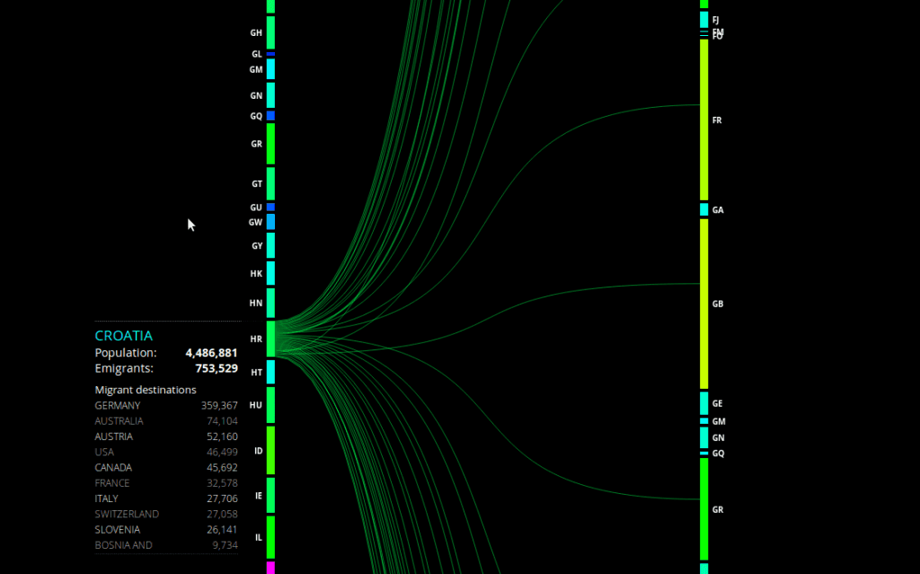
Peoplemovin is an experimental data visualization project which shows the immigration status of people from around the world. Created by Carlo Zapponi, this interactive visualisation shows flow of 215,738,321 migrants as of 2010. The data has been collected from the World Bank and plotted as flow charts representing the flow from emigrant country to the destination country. The blocks on the left represent emigrant country and the blocks on the right are the destination countries. Carlo has used attractive colour schemes with a different colour from blue to red to compare a particular country with the rest of the world. For example, the immigration details of India show that the largest number of Indians have migrated to the United States. The thickness of lines is used to represent the volume of immigrants. But it is difficult to get the exact figures by just looking at these lines. For this reason, the detailed figures for each country’s immigrants can be seen in a table on the left, based on the country selected by the user. Though, the visualisation is very attractive and informative, listing all the countries on the same page makes the columns on both sides very long, making it a little difficult to see the connecting flow lines. In my opinion, the visualization could have been simpler and more information.

Reference: https://datavisualization.ch/showcases/peoplemovin-visualizes-migration-flows/

Designing a effective KPI Dashboards

A good dashboard makes us think directly about metrics rather than aesthetics itself. Therefore, it should be designed to facilitate ease of use. Since the best dashboard designs work on the subconscious level, it can be hard to pinpoint exactly what makes them so effective. But if we look beyond specific techniques for creating a dashboard, we’ll see three common themes.

  1. IT’S FUNCTIONAL.

A well-designed dashboard must first and foremost be functional. A dashboard is “a visual display of the most important information needed to achieve one or more objectives, consolidated and arranged on a single screen so the information can be monitored at a glance.”

Since the primary purpose of the dashboards is to clearly communicate our most important metric, it’s only logical for the design to enhance this functionality. Any design elements that hinder the objective should be discarded.

  1. IT’S INTUITIVE.

As mentioned earlier, dashboards should be glanceable. In order for a dashboard to be understandable at a glance, it must be intuitive. This involves two aspects: 1) removing cognitive barriers (such as misleading pie charts, 3-D visualizations and unnecessary information) and 2) properly visualizing and labeling the metrics.

  1. IT’S LIVE.

An effective, well-designed dashboard is always-on and refreshes automatically (i.e. the data doesn’t have to be manually updated). It’s easy to take this one for granted, but without live updates on the dashboard, your metrics might as well be buried in an email attachment or spreadsheet.

These common themes of KPI’s are a measurement of the result that is a consequence of a goal. As we discussed in the class call for action can also be influenced by the goal. Having this in mind and designing a dashboard with themed framework discussed above will make for a effective dashboards.


Source: https://www.geckoboard.com/blog/dashboard-design-what-makes-an-effective-kpi-dashboard/#.WKqIghIrLdc

Process of making Dashboards – Design Thinking

Picture – https://i2.wp.com/www.tableaufit.com/wp-content/uploads/2016/05/Design-Thinking.png?resize=700%2C332

There are 4 phases of designing a dashboard: What is? What if? What wows? What works?

What is? – This is the part that no one likes. It involves understanding the data, involves a ton of sticky notes and sadly, a 101 crash course on doing the work. People tend to skip this part.

What if? – This is the part which most people want to do first, without understanding the data. We simply throw ideas out here, just like spaghetti at a wall. If it doesn’t stick, it will, at a later stage. Many ideas come and we have to filter out some of the outlandish ones.

What wows? – This is the moment when you feel you have conquered the world and you’re at cloud 9. We begin to realize what Tableau can do. The goal here is prototyping.

What works? – This is the final product. Usually, by this point, we have clarity and have a rock solid dashboard.

Reference : http://www.tableaufit.com/humans-dashboards-tableau-design-meets-ideo-aka-design-thinking/

WHO SKILLED THE INFOGRAPHIC

For today’s blog, I want to share an interesting blog I read from last week: WHO SKILLED THE INFOGRAPHIC

“Infographic posting generally rose steadily from 2007 to 2012, where it peaked, and has begun to decline since then,” Sarah Rapp, the principle visualization designer of Adobe wrote in an e-mail.

Publications are under constant pressure of catching eyeballs since public attention is the most scarce resources in this world. Those most talented visualization designers are working on producing simpler and easy-reading content rather those which were popular once with rich and complex interactive that have a smaller readership.

So what worth we rethink is that what kind of infographic do we really need?

The answer is focused on Insight.

The very medium of data-rich infographics might not be the right thing to the general consumers. For example, sometimes, what a general consumer concern is not how the weather radar looks like today, what you need to do is tell him/her whether he should bring um umbrella or not. So, a simple text-based push sometimes is enough for a mobile-first world.

That gets us thinking when we are doing our project or real task work, we don’t need to pursue a fancy or eyeball catching effect, instead, we should spend more time deciding what key message we want to deliver.


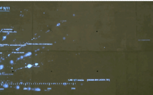
屏幕快照 2017-02-19 21.58.02

( the Lens of 9/11 by Local Projects breathtaking figures but not useful all the time)

reference: https://www.fastcodesign.com/3045291/what-killed-the-infographic