What is a Data Visualization’s Goal?

The ultimate goal of data visualization is to make it easier for management teams and the business people to make informed decisions. Data visualization makes it easier to analyze a set of information. With background information, business objectives and business goals, visualizations provide an additional context.  With a good visualization you can point out areas of improvement, areas with potential, weak spots etc. They provide a way of communication that can be easily understood by the audience, saves time and leads to informed decision making.

Hence, it is very important to be critical and ask yourself – What do you want to represent with this visualization? Is it making sense? Is it easily understandable? Does it convey the right meaning? For example, lets consider this visualization below –

https://www.theguardian.com/news/datablog/gallery/2013/aug/01/16-useless-infographics#img-4

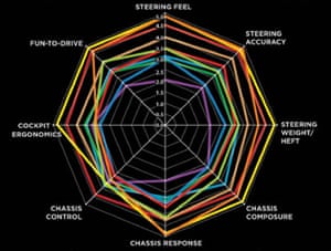
This a radar chart that is designed to assess cars by comparing different car features against each other. This is a classic example of eye beats memory. It is confusing and difficult to understand.

  • What do the different colored lines symbolize?
  • The colored lines used to connect the different features are highly confusing and difficult to make sense of.
  • While comparing one feature to another, you constantly need to remember the value of that feature to another.
  • Don’t even try comparing multiple features, it will require you to really squint your eyes and maybe create a table just to understand what’s going on!
  • I don’t know what how to judge whether each feature is good, average or bad? How do I define that?

The creator of this visualization did not think whether this visualization will help or hinder information analysis. There was no thought put into how it will prove to be an effective tool for decision making. In my opinion, it is a pointless visualization. What do you think?

Source –

https://www.theguardian.com/news/datablog/gallery/2013/aug/01/16-useless-infographics

Week 7 Views.

The map below shows the most common jobs per state, held by people who are from a non-US origin. Though the data is not quite clear on if the people are legal or illegal immigrants in this scenario, we can see that, 59 percent of the workers have lower than a high school education, compared to 31 percent of the rest of the labor force. (Mekouar, 2015)


This visualization contains a lot of data and could be represented in multiple better ways.

The main issues I would improve are:

Firstly, the representation of color and labels make the map look cluttered.

  • Having a legend would improve the above flaw to a certain extent.

Secondly, grouping the states and indicating the common jobs by % would present the data to create a better understanding.

The last thing according to me that would make more sense is to classify jobs by skill level and create an understanding on the education levels and the wage details.

As the weeks have passed, I have learned to appreciate and criticize details of each visualization. To create better and more influential visualization/ dashboards we should first ask the question “Why is it required?”. This has given me an understanding of how to better justify the data to your audience than just making an attractive visualization.


http://blogs.voanews.com/all-about-america/2015/08/24/most-common-jobs-held-by-immigrants-in-each-us-state/

Rules to Make Dashboard Simple

Dashboard should only display information relevant to your objective. In order to make dashboard simple, it is necessary to avoid four factors as following:

Overuse of color – Using every color of the rainbow isn’t necessary. Too many colors can be distracting and confusing. Also, don’t use colors that are to similar. If using different shades of the same color, make sure the shades are different enough to distinguish at a glance.

Logos –  Unless sharing the dashboard with outside partners, users should know their company. Including in the company logo only takes up space that can be used for something more important.

Navigation- If you have to split up the information into multiple windows or use scroll bars to view a full graph or chart, you run the risk of users missing key information. Did you choose the most important metrics? Are you creating a data puke?

3-D Element – The colors, shadows and axis inclination can easily skew the interpretation of the data. It’s better to keep it simple and stay 2-D.

Guide Lines & Borders – These should be used sparingly, when the context is absolutely needed.

How to Create Effective Dashboards: 3 Best Practices

Interactivity in Tableau

Tableau is good at creating visualizations for us using a few-clicks. However, when it comes to interactivity among visualizations, we have to do it all by ourselves by using the features provided in Tableau – this can be a daunting task (as evidenced during assignment #3 🙂 ). To make our lives a little easier, let’s take a quick look at some of these features and see how we can use them for our speed violations data set.

Filters are one of the most basic interactive feature that can be used in Tableau. They are primarily used to engage the user’s attention to a subset of the data. Let’s take a look at how we can add filters to our visualization:

  • Using Keep Only/Exclude option: Using this option, the user can select the data points which he/she is interested in and then keep those only in the visualization for deeper analysis. This can be achieved by selecting the data points in the visualization through several clicks or dragging and then choosing whether to retain (Keep Only option) the selected data points or exclude (Exclude option) them from the view using the Tableau prompt. As an example, say we have the map for Chicago with the addresses marked as per violations reported. The user can focus on different parts (for e.g. north, south, east, and west) of the city by selecting addresses in the region and then using Keep Only option for further analysis.
  • Using filter shelf: The user can drag different dimensions and measures into the filter shelf to apply a filter. This option gives the user a wide variety of options, such as range, condition, wildcard, etc., to apply the filter depending on the parameter which is being used. Let’s take the same example which we used above, the user can do a wildcard filter for addresses having the string “N WESTERN” in it (there are seven unique addresses with this string in our exercise data set!).
  • Interactive filter as a card: The user can be given the ability to filter in/out of the dataset by having an interactive filter card along with the visualization. This can be achieved by clicking on the drop-down menu for the field in either the row or column and then select “Show Filter”. This will open up a filter card for the selected field, next to the visualization. Using the same example, we will have a filter card with options to select “All” the addresses or individual ones. This filter can be modified to be presented in various ways such as “Single Value”, “Multiple Value”, or “Wildcard Match”.

We will take a look at sets, groups, and actions in the upcoming blogs!

References:

Dashboard doesn’t always need to be fancy

Finally creating dashboard visualization comes to the topic in the class lecture. Good visualization speaks louder than words.

There are many good examples of how to make good visualization for corporation business performances. However, here I’d like to share what I learned from a dashboard that representing Indianapolis Museum of art performance(link).

  1. Dashboard doesn’t need to be filled with all different charts. All charts are in the same size, same format in this dashboard but they emphasize each chart with information-oriented icons and clear measure words. Smaller fonts for Word explanations also help readers to have better understanding about their performance.
  2. Numbers and icons could replace fancy charts. There are no single fancy charts in this dashboard. Highlighted numbers and relevant icons replace the charts. It provides brief information about the entire business picture.
  1. Transparent data is worth to present. For some company they don’t need to show the analytical data but only summarized final data. Each single data is very transparent and self-explanatory by itself.
  1. Clear highlight help readers to focus on the topic. Here they highlighted number with red color and words with black color. Same color for the highlight clearly comes to reader’s eyes. It unifies that chart to one theme in a sense.

Reference:

  1. http://www.dashboardzone.com/museum-dashboard-a-dashboard-with-no-fancy-charts
  2. https://www.kaushik.net/avinash/digital-dashboards-strategic-tactical-best-practices-tips-examples/

Is U.S. about to hit recession?

“Next year, we will hit recession”, calls Chad Shoop, Editor, Pure Income.

In his recent article, Chad states that the trend in durable goods for the year 2016-17 is an indicative of the country on the verge of recession. According to Chad, durable goods orders can be considered as a measure of company’s confidence in its growth. Rising orders shows confidence that the economy will continue growing, while falling orders shows shrinking economy and curtailed spending.

The durable goods trend has shown a fall only twice over the past two decades. Once before the 2000-2001 recession and second time during the midst of global financial crisis of 2008. For the remaining years, i.e. from 1992-2000, from 2001-2008 and from 2009-2016, this graph has rose at a choppy but steady path. There is a pattern here. Each time this graph has turn lower, it has been a signal for imminent recession-today is no different.

The U.S. Census Bureau News generate these graphs every year. It is a simple line graph with trends lines indicating the rising trends in it order patterns over the last two decades. The figures to the right show the amount invested by companies in the durable order goods over the years. The graph makes its claim very clear in a very simple way, warning us about our future.

Hence, we need to prepare ourselves for a recession like investment- environment. We need to find a strategy to make profit from declining stocks before it is too late. Because, as Chad states, “Crash is coming. It’s just a matter of when, not if.”

Reference: http://thesovereigninvestor.com/us-economy/new-signs-economic-recession/

Knowing your audience is the key

Last week we were struggling to create interactive visualization for the audience of our choice. Many of us experienced the difficulty of choosing the audience. But once our user was fixed,  we forgot about the audience while creating the visualization and were more focused towards creating some interactivity in our Dashboards.

Audience plays most important role in any visualization. The best visualizations don’t make your audience work too hard to understand them. Showing your readers the actual data and explaining what it exactly means will increase their comprehension and will encourage them to spend more time with your data, amplifying its effect. Following points will help us to enhance our analytics skills and ability to approach any data.

It is important to match your visualization to your viewer’s information needs. You should always be asking yourself: “What are they looking for?”

1. Understand your audience before designing your visualization

What type of decisions do your viewers make? What information do they already have available? What additional information can your charts provide? Do they have time (and interest) to explore an interactive website, or should you design a one-page handout that can be understood at a glance?

2. Your audience determines the type of visualization you prepare

Spend some time thinking about your dissemination format before you sit down at the computer to design your visualization. Give a glance at what viewers what, it can be visual reports, executive summaries, live presentations, handouts, online reporting and more.

3. Remember that the key is to keep your audience engaged

Ensure that your audience is looking where you want, when you want. Keep it simple but at the same time it should be informative enough to engage your audience in visualization without any confusions.


Sources:

Why Your Audience Matters in Data Visualization

https://www.maptive.com/use-data-visualizations-win-audience/


Fantasy Football Dashboard Advantages and Disadvantages

http://overflow.solutions/special-projects/2016-fantasy-football-dashboard/

This Dashboard shows the creator’s Fantasy Football Draft. There are four graphs in the dashboard: Player listing sorted by project score, points by rank, box plot of projected FF points for each player by position, and points by position and team. All the four graphs are interactive, and i believe the interactiveness creates better understanding of the data visualization as well as confusing the audience.

Audience: Anyone interested about the fantasy football, and want to be successful in it.

Purpose: Help the audience to choose a good pick.

Advantage: They are many information in this dashboard. The interactive part makes it easy for audience to filter the data. The use of color help the audience understand the role of players.

Disadvantage:

  1. In the points by rank graph, it is hard to distinguish the cross, circle, square, and etc. in the small interface. Also, in the dashboard we do not know the difference between the symbols.
  2. The audience may get confused by so many filters. Maybe do not group them together and put them closer to the graph.
  3. Do not like the player search option, there are not so many player in the database. Barely use it.

To sum up, is you are new to the fantasy football, this graph will confuse you. If you are a addict player, this data visualization may help you a lot.

Reference:

2016 Fantasy Football Dashboard

http://overflow.solutions/special-projects/2016-fantasy-football-dashboard/

It is pretty! But is it required?

My this week blog is about how “visual noise” deviates the user from interesting data. Even a credential source like The Economist Magazine falls into trap of beautifying their charts to a level that they lose their purpose.

In their edition “The world in 2012” they published the following chart
The above chart basically matches price of gold to yield of bonds. To somebody who reads The Economist, the above correlation holds substantial value but the visual noise created by distracting image (coin), extremely enlarged chart and microscopic font deviates the attention of the reader.

Following is another such example:
In this chart too, it is difficult to concentrate on the plotted columns while ignoring the cranes and workers that litter the chart. These irrelevant decorations just compel the reader to work harder than they otherwise should to discover the meaning hidden in the data.

A designer should understand that making a chart beautiful to the level that the data looses its integrity actually works against the designer. It makes the chart non effective and fail to provide give quick insights that aid decision making.

The most common chart junk items include:
1. Cartoons or irrelevant decorations: These meaningless decoration do not excite reader about the data rather just add work on user’s side.
2. Dark grid-lines: They often tend to deviate user’s attention. The best practice is to use soft grey grid-lines or eliminate whenever possible.
3. Bright and bold colors: Bright colors are too tiring to look at and also one should be careful about color blind audience.
4. Uppercase: Uppercase should be used only when an element requires special attention.
5. 3-D effects: Three dimensional effect just adds to confusion in readers mind than adding relevant context.

In conclusion, I would state that a good practice after creating a chart is to step back, identify unnecessary items and remove them. Also, one should repeat this process until nothing else can be removed and the visualization has a purpose and supports the objective.

Reference:
http://www.exceluser.com/blog/1133/good-examples-of-bad-charts-chart-junk-from-a-surprising-source.html
https://www.blue-granite.com/blog/data-visualization-remove-chart-clutter-and-focus-on-the-insights


Programming Platforms for Interactive Visualization in Web Browser Based Applications

Introduction:

Browser based application are very popular wherever interactivity with users is a requirement. However, most of application use classical user interfaces (UIs). In Information Visualization (InfoVis), there are several powerful and versatile applications that are well known among experts, but designed to run natively in operating systems (OSs) only. In this post we compare 3 most popular programming platforms for developing browser-based InfoVis applications.

Java Applets

Strength:

Java requires the application to do the rendering on its own, targeting the client area in pixels. However, among the free libraries available for Java, several renderers exist which free the developer of this work. Some renderer libraries for Java provide features supporting animation. When providing user frame selection, it is possible to fire a manual drawing event. Java on its own has reached a very stable state.

Weaknesses:

The installed version of the VM differs among clients. Incompatible versions can prevent the Java applet from running. There are also problems embedding applets in some operating system or browser configurations. The use of Java applets has declined during the last years with the increasing flexibility of Flash.

Flash

Strength:

While the Flash drawing functions are similar to those of Java, they do not actually perform the drawing directly. In fact, they cache the graphics primitives and the drawing is performed in a renderer thread independent of the user code. Flash not only supports timer events but also has timeline support already built in the platform. Flash is very stable inside the browser.

Weaknesses:

For Flash debugging is more complicated because the compilation does only run in the plugin and a special debugging plugin is needed. ActionScript is a language based on the ECMAScript, which causes several compatibility weaknesses, like poor type safety.

Silverlight

Strength:

In Silverlight graphics primitives are defined in a description language. They can also be modified or complemented with additional graphics primitives using code. In Silverlight, there are no timer events but timeline support. Drawing separate frames is possible as in Java and Flash, but you can also modify existing objects instead of drawing new ones. 

Weaknesses:

Like in Flash, caching the renderer output is not possible, so user frame selection requires firing a manual draw event. For each site that requires Silverlight, there are thousands of sites requiring Flash. This is due to the fact that it is very difficult to introduce a new technology into an established medium, especially, if something has to be installed that normally is not part of the environment.

Conclusion:

No technology is superior to all others in all situa- tions. Developers need to consider the environment and user group they address as well as their requirements. These prerequisites define the priorities. Therefore, even the platform-independence of web applications is limited.

References:

E. Burnette. Is Flash better than Java?, April 2007. URL http://blogs.zdnet.com/Burnette/?p=286.

http://www.oddhammer.com/ actionscriptperformance/set4.

https://publik.tuwien.ac.at/files/PubDat_217968.pdf