Mental Model for Home Health Care providers

Before we create dashboard, we must endeavor to learn the process by which our internal and external customers use data to make decisions about the work they do. This done by asking questions on what is needed. Using below questions as discharge manager’s mental model as a guide three interactive dashboards to display, highlight, and clarify data are created. (Refer example)

  • are patients who might be at increased risk for readmission within 30 days – receiving referrals?
  • which providers are geographically closest to a patient’s home?
  • how well do different agencies perform by quality-of-care measures?
  • how do patients rate different agencies on satisfaction surveys?

First dashboard filters for a hospital and desired date. The top section displays summary metrics that drill down by hospital service line. The map pinpoints the ZIP code locations of home health agencies with referrals, while a bar graph quantifies referrals per agency.

Second dashboard shows concerning patients who may be at risk for readmission and for whom home health care may help reduce that risk.

Third dashboard shows how HHA’s perform on publicly reported quality metrics.
Often, we blame ourselves when we can’t make any sense of the information given in a dashboard Most of the time, the data analyst has failed to understand the mental model.

Reference: http://www.healthdataviz.com/gallery-transition-of-care/

Netflix Infographics Data Visualizations

This infographic shows the importance of infographics and the idea behind using them. Infographics are used to portray a specific message to the viewers that are difficult to comprehend from complex data, for example, survey data. One of the key purposes of an infographic is to raise awareness about a cause, its severity and what can be done to support it.

The purpose of this infographic is to convey features and performance indicators of a product or its service’s operations, show its uniqueness and the competitors in its field.

Netflix

The advantages of an infographic are clearly observed by looking at this image.

  • It makes the information more appealing: By using the color coding of Netflix, it is easily relatable to it and makes it more appealing to the viewers.
  • It’s easier to understand: As the infographic is segmented and clearly labeled, it is easy to understand what it wants to convey.
  • They are more engaging and more persuasive: The viewer is more open to accepting the message infographic wants to portray. The use of pictures corresponding to the popular brands adds to the value of product or service.
  • They are accessible: They transform complex data into visuals that can be easily understood by a layman which makes them more accessible and why they are utilized in marketing and social media.
  • They are easy to recall: Using visuals pertaining to Netflix and its services, the information is absorbed effortlessly by the viewer which makes it easier to recall.

The disadvantage of this infographic is it does not mention the data sources with relevant links. The links allow the user to dig deeper into the information and makes it verifiable, as a reader can draw wrong conclusions without relevant data.

So, Infographics can be effectively used to deliver complex information in its entirety and appeal to the public by using proper visualizations.

Image source: https://www.behance.net/gallery/20892755/Netflix-Infographics-Data-Viz

Source: http://www.business2community.com/infographics/why-how-and-where-to-use-infographics-01407374#zFD1OV411xcHk6Bh.97

Building Interactive Dashboards With Tableau Actions — Google Image Search

Doing a google search or google image search from a dashboard is another action that we should try. So, what is the benefit of it? In the visualization, users can explore news stories or related images by following links provided within the Tableau dashboard for thousands of different data points.

Here is a good example provided by the following link:

https://public.tableau.com/shared/BCTCC8K6H?:toolbar=no&:display_count=yes

Clicking on any location will open a new browser with a Google Image Search for that location. Then how to do it:

  • Google search the images of the locations and copy the URL that appears in the browser. (e.g: the link of Kansas City is https://www.google.com/search?q=kansas+city&source=lnms&tbm=isch&sa=X&ved )
  • Go to any of the dashboard ‘Dashboard>Actions> URL’. Paste the URL you just copied. Replace the actually useful portion of the URL for the query, which is the text immediately following the “?q=”, with a field from your data.
  • Add the field from your data source (e.g: I want to change the city location) , for which the information you want to change interactively by clicking the arrow that appears next to the empty URL box.

  • Finished! If you click on any location point on the map, a Google Image search is executed with the name of that city (from my underlying data) as the search query.

Reference: http://www.evolytics.com/blog/tableau-201-3-creative-ways-to-use-dashboard-actions/

Visualization Chart Decision Tree

One of the main issues that I have seen when trying to make a visualization is selecting the proper chart for the visualization. Most of the time when we create a visualization, we tend to use chart types that we are familiar and comfortable with instead of using the chart type that is appropriate for what we want to show. In order to properly determine the type of chart to use, we need to first determine how we want to present the information. In order to do this, we need to choose one of the basic presentation types. There are four basic presentation types that we can use to present information.

– Comparison
– Composition
– Distribution
– Relationship

After determining which presentation type to use, the decision tree in Figure 1 can be used to choose which chart is the best one to use based off of other criteria.

Figure 1 – Chart Selection Decision Tree

Reference: https://eazybi.com/blog/data_visualization_and_chart_types/

14 Billion Years in 1 Data Visualization

The Histography project is an interactive visualization which records all events in our history into a singe page. It was created by an interactive designer named Matan Stauber.

The visualization use dot as mark. Each dot corresponds to a historical event. There only channel of the mark is its size. Some important events have larger size. All the data come from Wikipedia entries. When you click on a dot, the detail information of this event will show up.

There are many different ways you can browse the Histography. Either you can use the bottom slider to explore the events in a range of time or you can then filter down by category: for example, by music, religions, inventions. However, the data could be further categorized and adopting different levels of filters. It could help user target the events they interest in more easily. Also, the whole page could be zoom in and zoom out and applying more channels to encode the data. For example, it could reference another history Viz called ChronoZoom, which has the zoom in/out feature and a classified timeline.

Reference: 

http://www.citylab.com/design/2015/10/14-billion-years-in-1-animated-data-viz/410323/

http://histography.io/

http://techcrunch.com/2012/03/16/explore-13-7-billion-years-of-cosmic-history-in-your-browser-with-chronozoom/

http://www.chronozoom.com/#/t00000000-0000-0000-0000-000000000000@x=0


Choropleths or Cartograms?

A choropleth map is a map in which the areas are shaded or themed according to the measure of the variable being displayed on the map.

We have been using such maps often, for representing population density, electoral votes, GDP income and more.

Advantages

  • It provides an easy way to visulize how the values of a measure are changing across the area
  • They are useful to visualize two variable decisions like the electoral maps. It can clearly indicate the colour differences and hence reading the map becomes easy

Disadvantages

  • When using maps for multiple ranges, it becomes difficult to distinguish each value. For eg: Using choropleth maps for Population density, differentiating the shades for similar values of population density becomes difficult.
  • The intervals need to be chosen carefully to depict a color change

Cartograms

Cartograms are maps in which the size of a geographical area is drawn proportionately to the value of data it contains. For eg : For mapping the popultaion density of different states, since New York has the highest population density, the size of New York will be considerably bigger than it actually is geographically.

Advantages

  • Cartograms are good at showing the relationship between spatial units
  • They give a clear idea about the size and the value of the measure

Disadvantages

  • Sometimes they become difficult to read as the shape gets distorted
  • Not sure about what to do with 0 or negative values
  • More data is needed to plot the states/regions as polygons

I have been doing a project which deals with Population density. I tried my hands on generating a Cartogram in tableau, and it required far more efforts than plotting a choropleth map. Cartograms definitely size the data accordingly, but recognizing becomes difficult as labelling in cartogram is tough.

Personally, I would stick to Choropleth maps for a basic map and then use bubble chart to visualize the regions according to the size, where each bubble would represent the value.


References-http://www.clearlyandsimply.com/clearly_and_simply/2015/04/cartograms-in-tableau.html


The Real difference between Google and Apple

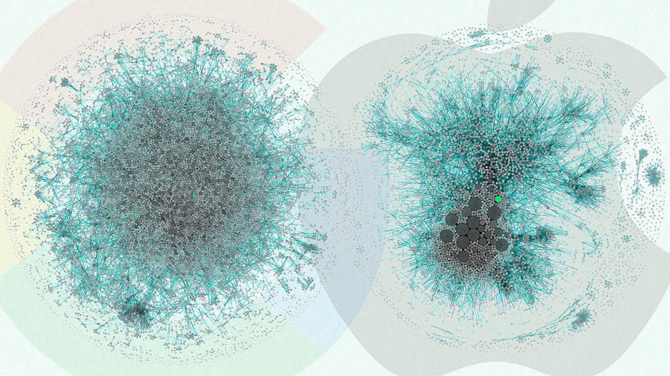
Both Apple and Google are powerful and successful companies driving today’s cutting edge innovation and technology. The below visualization talks about the patents obtained in both these companies and how it translates into their organization structure.

Right: Apple Left: Google

Argument: Apple has a more centralized organization structure, originating from it’s well known design studio. Google, however has a stream of distributed open source approach to their new products.

In order to prove this difference in organization structures, a data visualization company, Periscopic charted the last 10 years of patents filed at Apple and Google as a complex network of connections.

Understanding the visualization – Each blob is a patent inventor. As many patents can have multiple inventors , each line is a link between the inventor and the co-inventor. While Apple’s viz looks like multiple blobs scattered across, Googles’ viz looks more like a monotonous single blob which is evenly distributed.

According to the patent data, in the last 10 years:

  • Apple has produced 10,975 patents with a team of 5,232 inventors.
  • Google has produced 12,386 patents with a team of 8,888 inventors.

The proportion of patents seems to be similar, however, there is a group of highly connected experienced set of inventors at the core of Apple, however for Google its more evenly dispersed. This translates to a more top down, centrally controlled system in Apple. Google on the other hand has a more flat organization structure with many teams having experienced inventors.

KPI – Average number of inventors listed per patent.

  • Apple – 4.2
  • Google – 2.8

Because of even distribution of patents at Google one is bound to think that the average number of inventors listed on a patent should be more in Google than at Apple (from the above visualization). However, the underlying data denies this. On an average an inventor in Apple produced twice the patents than an inventor in Google.

Audience for the visualization – Periscopic helped develop a product called PatentsView which is a visualizer for American Institute for Research and US Patents Trademark Office.

About PatentsView – It transforms the patent database which is made public for over a century, into a viewable network of connections. The patents, can be viewed by company or can be sorted according to the creator or topic.

Main Intention – According to the CEO of Periscopic, they wanted to utilize the publicly available patent data to find interesting patterns and also inspire others to explore this data.

Reference: https://www.fastcodesign.com/3068474/the-real-difference-between-google-and-apple


Working Mothers

Working Mothers

The Visualization “Working Mothers” is a good example of interactivity with usage of different tableau features but  it is too general and lacks claim, argument, predictions etc.

The visualization shows the percentage of working mothers from 1860 to 2010 in US, there are 3 different charts, two for comparing 2 years and another showing change in the ranking for the years selected. We can select the years using a slider. All three charts are dynamically connected. 

What I like 

  1. Slider bar to select different years for comparison
  2. Interactivity between all three charts
  3. Showing of ranking and its increase and decrease at the same time, using lines

What is missing 

  1. If Region level data is included, the audience can see the variation of working women over the course of time across regions like south, south-east etc. 
  2. The visualization compares just two years and there is no way to see the variations across time and comparing the same to two different regions/states can add an argument/claim to the visualization
  3. Audience – The audience to this visualization is not clear 
  4. Claim – There is no claim, for ex –  there has been an increase of working mothers after 1950
  5. Argument – the Visualization is not making any argument like “x” state has more working mother 
  6. Action and Prediction elements are missing, it would be a nice add on to predict number of working mothers over the next 50 years

For the above even though the visualization makes use of cool tableau features it lacks in the essential elements like Argument and prediction.

Source -https://public.tableau.com/profile/adam.davis5609#!/vizhome/WorkingMothers/WorkingMothersStateRates

Should I use Donut chart?

Donut chart shows relationship of parts to a whole but it is important to think if it makes any sense. Just because it looks cool, most of the times it doesn’t tell you much. It depends upon what you want to convey. For example, if it is related to gender ratio or performance of one entity overall, then donut chart will be the best fit. But if you have many entities to display then it may become chaotic.

Image-Source: http://payload.cargocollective.com/1/2/73104/1481815/Pie-Labeled.jpg

The above donut chart displays food consumed in 2010. It is eye-catching, labeled properly with different colors. I would like to comment over some of the issues with this donut chart.

  • When you look at each food product you can get its percentage contribution. But it is hard to compare them with each other. You cannot identify minute differences. The contribution of Veggies and Pasta looks similar but there is difference of ~3%. This can mislead the results. While comparing, user has to remember the values for each item causing inconvenience.
  • Use of different colors is confusing the user especially for color-blinds. It is hard to distinguish Soup, Salad, Fries and Sushi. They all look same.
  • Lower values are not visible at all (Salad, Sushi).

It is possible to transform this messy donut chart into meaningful graph. Simple bar chart will be the better alternative in this case. User can easily identify items and compare the values. No need of color palettes in this case. Bars are easily distinguishable. For the lower values, you can combine them together in one item as ‘other’. If you want to use color palettes, then you can even make categories as ‘Fast-food’, ‘Veggies’, ‘Meat’.

While creating a visualization, we should find to make something that looks cool but does not sacrifice a bit of analytical clarity!

Source:

http://payload.cargocollective.com/1/2/73104/1481815/Pie-Labeled.jpg

http://www.datarevelations.com/with-great-power-comes-great-responsibility-or-think-before-you-use-a-donut-chart.html


Interactive Visualization- 5 Key Properties

Interactive visualizations are often used to show insights from the data sets. It gives the user to select filters and view the data to see patterns or trends. But creating interactive visualization can get tricky. The following key points should be followed while creating a dashboard-

  1. Ease of understanding for Novice User: A new user who does not have a full understanding of the data set must be able to do analysis without wasting much time on the visualization. They should be able to understand the trends, correlations and anomalies using the tool and make faster decisions based on the visualization.
  2. Driving Processes: The visualization should highlight the KPI’s and important metrics which drive the business processes. They must be visually enhanced by using right kind of colors or patterns which makes it easier for the user to identify them. The representation should be simple but granular as well so that no vital information is left out, but it is also easier for the user to make sense out of it.
  3. Data must tell a story: The data should be analyzed in such a way that it unfolds a story. The user by applying appropriate filters should be able to see different perspectives leading to a decisive conclusion. The interactive dashboard should be such that is gives a high level overview and takes the user to granular details of the data.
  4. Data correlation: On viewing the visualization the user should immediately be able to identify the hot spots which need immediate actions. They should be able to find trends in the data set by viewing the relationship between different data streams and different data sets at times.
  5. What next?: Every data visualization should comment on what could happen could happen next? By using predictive analysis, some predictions should be made about the trends in the future. By using calculations and algorithms the data analyst can give some recommendations about the future of the data trend.

Source: https://www.forbes.com/sites/benkerschberg/2014/04/30/five-key-properties-of-interactive-data-visualization/#1f83815e589e