Top 100 Lyrics – But why?


The Visualization

The visualization  shows the lyrics of top 100 songs in a tree map. Each word has its own cell, with size proportional to the number of times the word appears. The cell is  further divided by the song.

What I don’t Like

I believe the visualization is just another pretty tree map without any claim. Also the words like ‘the’, ‘you’, ‘I’, ‘a’ etc are included and these words don’t teach/tell us anything  as against the words like ‘love’ or ‘crying’ which might give the context of what kind of emotions are felt in the song.  

What I like

Division of the words in cells and subdivision by song and highlighting of the entire song when a  word from the song is selected.

Improvements

I believe the author should have first removed all the common words by the usage of any natural language toolkit and then did the same analysis. By following this he might have had better analysis about the emotions of the top most heard songs.

I believe by taking into account each and every word there is no claim to the visualization, This is a classic example of a fancy visualization without any message.

Source – https://public.tableau.com/en-us/s/gallery/top-100-songs-all-time-lyrics
 

GitHut: A visualization about GitHub statistics.

GitHub is the most widely used source code management and version control tool available on the web. With its increasing user base and code repositories, GitHub repository can help in identify trending programming languages. This trend has been captured by a project called GitHut by combining repository statistics and Git specific trends on programming language.

What I liked –

  • The active repositories chart gives a quick overview of the growth in the number of active repositories over time. The intent of the visualization is not to analyze the growth in repositories, but to give the user a detailed picture of which programming languages are contributing towards this growth. This chart, even though, placed right at the top does not sway the user’s attention too much because it’s sized-down, when compared to the repository language chart.
  • The repository language chart displays a wide range of information in a very easy to analyze manner. The wide range of parameters being analyzed, such as active repositories, number of pushes and forks, year first publishes, and open issues, can be easily tracked for each programming language by mouse-hover functionality over the language. This tracking works by mouse-hover over any of the data points, making it easy to track based on the parameter most useful for analysis. We can also compare multiple languages by selecting them with mouse-click. This functionality will highlight all the data points for the selected languages to be compared.
  • The top active languages chart section consists of 50 charts. This section can be analyzed based on percentages or total value, which is a good way of allowing users to compare statistics. Also, the scales for the 49 charts are dynamic i.e. when the user brings the mouse over the chart, the scales are shown. This helps in keeping the entire visualization clean.

What could have been done differently –

  • The top active languages section displays a separate chart for each programming language. Since the time scale under consideration (Q2/12 to Q4/14) and the repositories scale (1K to 100K) are same, I think a single chart with a filter would have sufficed. The following are the advantages by doing this:
    1. The author could have saved space.
    2. Eliminated the need for the user to scroll up/down.
    3. Given the ability to compare two, or more, languages based on active repositories.

References:

http://githut.info/

Domestic violence in Spain

This interactive dashboard provides a comprehensive information about murders of the woman due to domestic violence in Spain. It contains 5 simple separate visualizations to convey the story.

  • First one provides a line graph representing the deaths of woman per year due to domestic violence. Although the rate was quite high in 2008 and 2010, currently it is going down.
  • The second one depicts the count of murders per month. It has a color range of different shades of violet depicting an indication of the count.
  • Third one indicates the same information but on the map of Spain.
  • The fourth one is a bar graph denoting the number of murders by either partners or ex-partners.
  • Fifth is also a bar graph depicting the age range of the dead women in Spain.

Each chart is very simple on its own, but together with the others, they portray a holistic picture of the murders in Spain. The use of the same color range helps to connect faster with this visualization. We can easily identify that Andalucía and Cataluña are the most violent regions. Users can also perceive that woman are mostly murdered by their live-in partners and are usually in the age range of 31-40.

Reference: https://public.tableau.com/en-us/s/gallery/domestic-violence-spain

50 Years of Crime

This interactive visualization created using Tableau presents information about decades of crime data across the United States. This interactive dashboard provides options to either view Property crimes or Violent crimes. In addition, this dashboard provides flexibility to the users in interacting the data. This dashboard consists of 3 charts:

  • A heat map with different shades of violet indicating the severity of the crime rate in each state.
  • A line chart indicating the different crime rates across time starting in the 1960s to 2012 for each state.
  • A scatterplot of crime rates versus state population.

Things I liked:

  • All 3 charts are interconnected and when one particular state or line graph is selected all the chart shows information about that state.
  • The crime rate versus population chart gives the users a deeper understanding where users can identify states which have low population but high crime rates.
  • In the line graph, users can select one state and hover over the others to give an indication of difference.

Things that can be improved:

  • Holistically the first graph provides a lot of insights into the data without having to filter different states. But the line graph is on a whole quite clumsy and doesn’t convey information without filtering.

Reference: https://public.tableau.com/en-us/s/gallery/50-years-crime-us

Why Should I use D3.js?

In the past two weeks, we have discussed concepts of D3.js and also worked on a couple of visualizations. There was one thought that was continuously present in my mind – we can create these visualizations using Tableau in seconds. This is too much work.

SO WHY ARE WE EVEN USING D3.js? That is when I decided to do some research. D3.js is time consuming but provides some really cool features.

  • Easy Integration with web – Data visualizations created with D3.js work on web. We can interact with any part of the DOM giving it the flexibility to accordingly change. (Eg – https://bost.ocks.org/mike/uberdata/)
  • User Interface Features – D3.js can be used with applications to create advanced user interfaces with charts, analytics etc. directly built into them. It not only gives flexibility to the developers but also provides them with a huge list of libraries that can be reused to create visualizations.
  • Customization – What to do when you need to create visualizations that are not available with prepacked solutions? D3.js allows you to be as creative as you want to be and create visualizations that you want to use and that represents your data best.
  • I don’t want to share my data – Use D3.js. It is best to create visualizations for clients that are external to the company and want to interact with specific information, using D3.js. You can control what they can see and how much they can interact with a visualization.
  • Interactive Visualization Online – With D3.js, you can create visualizations that deal with smooth data transitions without having to refresh views, clicking multiple buttons etc. With D3.js we can transition from one data view to another and with so much ease – D3 Show Reel Demonstration . The data is parsed easily making it interactive and meaningful.
  • Community  Support – D3.js  boasts of a very strong open source community support to help people when they are stuck as well as learning resources.

Source – https://www.linkedin.com/pulse/why-you-may-want-consider-powerful-open-source-d3js-data-guerino

– http://www.scribblelive.com/blog/2013/01/29/why-d3-js-is-so-great-for-data-visualization/

Interactive data visualization

The following data visualization has four buttons for audiences to select different years:

https://flowingdata.com/2016/06/28/distributions-of-annual-income/

Last lecture we talk about the if we need to use interactive data visualization to make our point. In my opinion it depends on the case, and i do not think too much interactive things are helpful. Take the above visualization for example, the author only give four choices: 1960, 1980, 2000, 2014. Also, the data visualization has animations when user switch years. The animation plays an important role in this visualization because we can see and compare the amount changes between different majors. I find it super fun to play with this data visualization even though it has four choices.

So, my conclusion is, as long as the interactive data visualization can give use an idea about the difference between selections, it is a good visualization.

Also, I found an article about how to make interactive data visualization successful. Maybe I will table about it int the next blog post.

http://www.forbes.com/sites/benkerschberg/2014/04/30/five-key-properties-of-interactive-data-visualization/#eb593ab44eb0

Rules of constructing a good argument

Rules to keep in mind to devise a strong argument:

Claim is the point an arguer is trying to make and wants another to accept. When a claim is made, the question to be asked is “What is your point?”

ExampleThe Ravens will win the Super Bowl this year.

Visualization refers to the proof or evidence an arguer offers.   Grounds answers the questions, “What is your proof?”. It can consist of statistics or reports via physical evidence of reasoning.

Example: They have the best defense in the league.

Warrant is the inferential leap that performs a “linking” function by establishing a mental connection between the grounds and the claim

Example: The team with the best defense usually wins.

Backing consists of evidence to support the type of reasoning employed by the warrant.

Example: The team with the best defense has won each of the last five years.

Qualifier states how sure the arguer is about his/her claim

Example: The probability that the Jets will win the Super Bowl is 80 percent.

Rebuttal admits to those circumstances or situations where the argument would not hold.

Example: Anything could happen. The Ravens defense might have a lot of injuries.

Reference: http://commfaculty.fullerton.edu/rgass/toulmin2.htm

Tell A Meaningful Story With Data

Data will be remembered only if presented in the right way. Often, executives and managers are being bombarded with charts, graphs, dashboards with complex data analytics. The reason why they struggle with the data-driven decision making is that they don’t understand the story behind the data. In this way, a powerful story with data means a lot.

Stories are meaningful when they are memorable, impactful and personal.  When data and stories are used together, they resonate with audiences on both an intellectual and emotional level. To tell a meaningful story, you’d better:

Identify the audience. What does the audience know about the topic? There are usually five types of audience in common: novice, generalist, management, expert and executive. The novice is new to the subject, but doesn’t want to oversimplification. The generalist is aware of the topic, but looking for an overview understanding and major themes. The management want in-depth, actionable understanding of intricacies and interrelationships with access to detail. The expert want more exploration and discovery and less storytelling with great detail. The executive only has time to glean the significance and conclusions of weighted probabilities.

Use data visualization to complement the narrative. There are mainly two visual narrative genres: one is author-driven narrative, which doesn’t allow readers to interact with charts; the other one is reader-driven narrative, which provides ways for reader to play with the data. Those two should be balance intended by author with story discovery on the part of reader. A good data visualization should stands on its own. If you take it out of the context, the reader should be able to understand what the chart is saying as well. A good data visualization also should be easy to understand. while too much interaction can be distractive, the visualization should incorporate some layered data so the curious can explore.

Reference: https://www.thinkwithgoogle.com/articles/tell-meaningful-stories-with-data.html

All bubbles in the air!

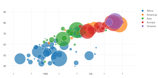
Bubble charts give you the ability to visualize up to 4-dimensions of data and are an absolute fan favorite! They communicate the count or proportion of a variable where the size of the bubble reflects the quantity in two dimensions. We could add the third dimension by plotting the different sized bubbles with x and y axis like a scatter plot. The fourth dimension is added usually by use of different colors (shades of a color) to sort data into categories.

The bubble chart shows a lot of data all at once, making it tricky and hard to understand the answer on the first go. The difficulty is in interpretation of bubble graphs. While they can give a quick comparison of values by looking at them, they are not as well suited for accurate determination of analysis of your data.

Best practices for Bubble Charts:

  1. Use when the audience is aware of the data and educated.
  2. Size bubbles appropriately.
  3. Do not use when data results in overlapping bubbles.

As we can see in the chart, there is total chaos and it creates a piece of modern art, with multiple perceptions at the user end. With no prior information on what data is being represented there is no clear understanding of the details and requires additional effort to decipher and generate an analysis. Hence at times bubble charts are as useless as pie charts.


http://www.quickbase.com/quickbase-blog/when-to-use-bubble-charts-to-display-your-data

https://visage.co/data-visualization-101-bubble-charts/

http://www.msktc.org/lib/docs/KT_Toolkit/Charts_and_Graphs/Charts_Tool_Bubble_508c.pdf


How to make visualization deceptive

Manipulation of the facts or deception of the reader can be both intentional and unintentional. The data would be distorted which lead to misleading to audience. There are several ways to present misleading visualizations.

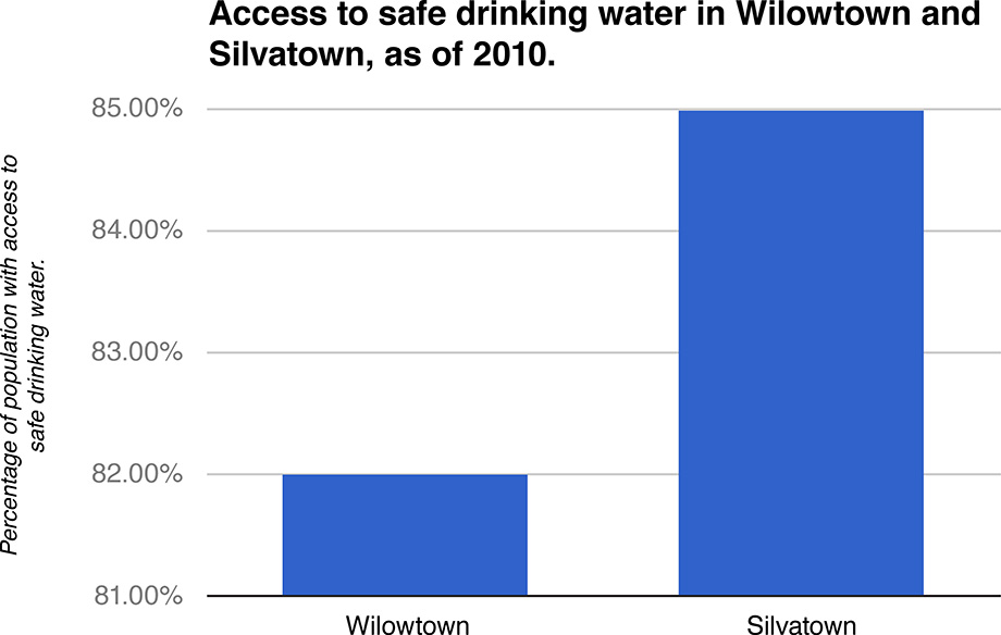
1.Truncated Axis.

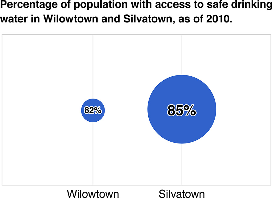
2. Area as quantity.

The two graphs above allures the audience to feel that the difference in percentage is huge.

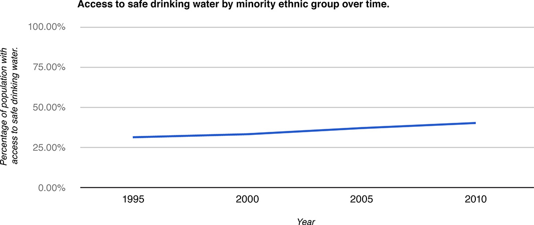
3. Aspect Ratio.

The aspect ratio of the chart has been distorted by stretching the X-axis, which mislead the audience to feel the change was not significant by the flattened line.

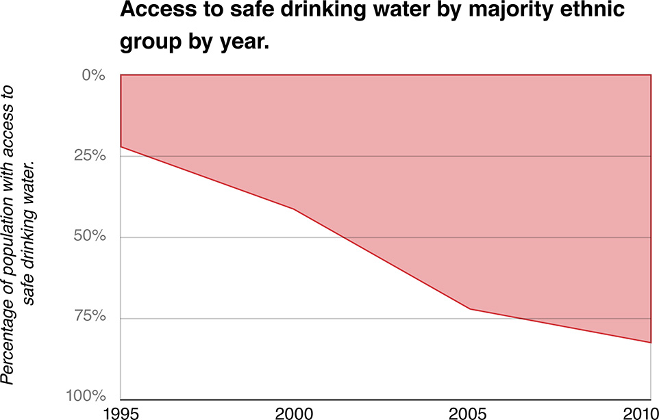
4. Inverted Axis

The Y-axis has been inverted, hence, creating an illusion that the access to safe drinking water has declined.