What does a day in the life of an average American look like?

This stunning dynamic visualization depicts the average life of an American based on the data collected in 2014 from The American Time Survey that has been created using CSS and D3.js.
Each dot represents a person, different colors represents different activities like sleeping, leisure etc. There is a time tab at the upper left corner and speeds of transitions like slow fast and medium. Every time a person changes a task or activity the corresponding dot will move from one activity to another.
The day starts off start slow as we see more people are sleeping or just beginning their daily chores. It then moves quickly to peak rush hours where people are travelling to work. The day in this dynamic visualization starts at 4:00am and runs for 24 hours. It is an excellent example of how dynamic visualizations can simplify a task where we must keep a track of thousands of people and their daily activities which is a strenuous task using conventional visualization methods like bar graphs or pie charts.

Also, this is a good example for understanding how each individual from a data set affects the whole pattern. For example, if 200k out of 1000k people start travelling at 9 am instead of 8 am, there is a monumental change in the trend. The example also contains mapping between activities using lines to better understand the transitions from one activity to another and understanding the most common ones like ‘household care’ to ‘personal care’ to ‘eating and drinking’.

Reference: http://flowingdata.com/2015/12/15/a-day-in-the-life-of-americans/
Introducing My Dashboard

Hey guys, how is your weekend? For me, I have finished my very first dashboard.

This is a static single web page written in HTML, SCSS and ReactJS,  it’s built with webpack and hosted on Heroku. The source code can be seen from here. Also, the images used in the web page are stored in AWS S3 buckets. You can clone my git repository to your local server, and start the code the see how it looks. The instruction is in the “README.md” file on the git repo.

The idea to use ReactJS instead of plain JavaScriptis that, we can build modules separately, and reuse different modules, which will facilitate web development in large scale. ReactJS also has many other advantages, like virtual DOM, great documentation, relatively stable and so on. Also by using SCSS, we gain benefits from OOCSS, the philosophy to develop responsive websites.

After launching the webpage, you can see that I use the percent circle mentioned last week. The elements below those percent circles are still images, next thing I will do is to change them into D3 DOM elements. This would take some efforts and I’ll offer the detailed instruction of the process. Please stay tuned for new improvements and feel free to reach out to me for suggestions, ideas and anything! Thank you! 😀


Top 5 Tips for Getting the Most Out of Your Tableau Dashboard

Tableau is widely used to create visualizations and dashboards to analyze various kinds of data and derive useful results. There are a few simple tricks to make the tableau dashboard more efficient:

  1. Do not join different types of sources: While creating visualizations we tend to join different data sets. It is important to consider the file types while performing joins. Joining a database to an Excel file and then to some other tableau extract. This can be hazardous for tableau performance. It takes a lot of time to fetch results from different file types and perform calculations based on it. It is crucial to not join too many different file types for better performance.
  2. Calculations should not be too complex: If the data needs to be processed by performing way too many complex calculations, it should be done in the source file and not tableau. Tableau calculations should be kept short and simple. It helps to perform calculations faster and retrieve results in a short time.
  3. Reduce number of report in the dashboard: Too many reports in a dashboard takes a lot of loading time. The number of reports in a dashboard should be precise and too the point. There is no use in creating a new report to visualize every small detail. The reports should be made efficient by displaying right amount of information. This helps improve tableau performance.
  4. Do not bring unwanted data: Before loading the data into tableau, it is important to performs checks whether all the data is necessary for visualization. If some columns or rows are not needed for the visualization, they can be filtered out before bringing them into tableau. Too much of data results in increase in parsing time which reduces tableau efficiency.
  5. Use Parameters instead of  Quick Filters: Using parameters helps reduce load time of the dashboard. The user can insert the values in parameters to see results related to the input. Quick filters displays all the possible results a user can see but it leads to increase in loading time of the report.

By following these simple rules, efficiency of tableau dashboard can be increased.

Reference: https://www.excella.com/insights/top-5-tips-for-getting-the-most-out-of-your-tableau-dashboard

Playing with data to get different interpretations

Last month we created the visualization to depict the daily volume of speed violations that have occurred in Children’s Safety Zones for each camera in Chicago. I tried to see number of violations in each area in Chicago from 2014 to 2016.

There were few areas where the speed violations were massive as compared to other areas. Those speed violations kept on increasing in higher numbers for next year. Also there are areas like “4843 W Fullerton” where number speed violations increased from 2014 to 2015 by 82211 but in 2016 it decreased by 15843 which shows us the efforts of the traffic police department to decrease the speed violations.

Below is the link which shows the changes in amount of violations in Chicago from 2014 to 2015 and from 2015 to 2016.

https://drive.google.com/open?id=0B8ffu231haBVeHdkYVo0d1YzdDA

In order to get the picture of increase and decrease in number of speed violations in every area following steps were carried out on Tableau:

  1. Get the number of speed violations separately for each year based on Violation Date field. To get only the number of speed violations for particular year, I took three calculated fields each consisting the violations of year 2014, 2015 and 2016.
  2. To achieve this from violation date I extracted only year using YEAR function. For example to get the number of speed violations for year 2014, Violations_2014 calculated field was created with code:  If YEAR([Violation Date]) == 2014 THEN [Violations] END.
  3. Once we have the amount of speed violations for each year separately then we can take the difference between any 2 years to get the depiction of increase or decrease in the number of speed violations.
  4. To see the amount of increase and decrease in year 2015, we can create calculated field as Difference_2015 with code: SUM([Violations_2015]) – SUM([Violations_2014])
  5. Step 4 is to be repeated to get the change in speed violations for year 2016 with code: SUM([Violations_2016]) – SUM([Violations_2015])
  6. Once we have the amount of change in speed violations for each year we can plot the graph with the Address field on Y-axis and change in speed violations on X-axis.

This can be done in different ways in Tableau. I followed this approach to get the detailed step by step understanding of the data. Your comments are welcome for any alternate or better approaches to get the same visualization.

Why does your audience matter in data visualization?

Typically a resume is only a single page as recruiters have only seven seconds to skim through and decide if you could be a good fit for the company. On a similar note, if your audience is the executive board they have very limited time to glance through your viz, which means you need to present accordingly. Secondly, consider the amount of information your audience already have and how effectively you can discover new insights, answer their questions and objectify the argument. A chart designed for your manager may not be applicable for your customers. Hence, it’s always better to understand your audience before designing your visualization.

One interesting technique which can help in our story telling project would be to break up our charts into several slides while presenting and finally show a combined dashboard collating all the sheets which can portray our story better. This storyboarding technique ensures that your audience looks at the right chart when you want them to. Another good technique for a smaller audience is to draw attention to key charts by giving curated handouts which can be saved for future reference. This is a great way to keep your group engaged through your presentation.

Reference:  https://www.techchange.org/2015/05/21/audience-matters-in-data-visualization/


Game of Thrones, Visualized, Simplified!

https://flowingdata.com/2016/06/03/game-of-thrones-discussions-for-every-episode-visualized/

When I tell someone today that I don’t follow or enjoy Game of Thrones, GOT as popularly known, because it confuses me, they treat me like an outcast. GOT is one of the most popular shows right now. With so many things happening in each episode it is pretty easy to get lost somewhere.

This is an interesting network graph, which represents the connection of all characters mentioned in an episode. a network graph shows the connection between two things. There are nodes and if they are related, they are joined by a path. Here, each character is a node and the connections are the lines joining them. The color represents the affiliation of each character. The size of the node represents  how frequently each character was mentioned. More so,it is combined with the twitter analysis and it also shows the smiley used most frequently with each character.

For example, in this episode, Robb and Walder were mentioned together and it symbolizes a heartbreak over Rob. We see the big red node; indicating that Daenerys was mentioned for the maximum number of times.

What I did not understand is the size of the lines joining the characters.  Some are joined with thick gray lines, some with red, some with light purple and that is something I was not able to interpret why.

References – https://flowingdata.com/2016/06/03/game-of-thrones-discussions-for-every-episode-visualized/


If you insist on using Pie Charts

We have learned that you should never use a pie chart to visualize your data. Unfortunately, there are some people that just want to use a pie chart to visualize their data. Whether it is because they love pie’s or just because they have always used it, there are some guidelines that should be followed when using pie charts.

  1. Don’t Use Pie Charts (But if you want to, follow steps 2- 6)
  2. Limit the data represented to no more than six
  3. Present the data from largest to smallest in a clockwise direction
  4. Only use pie charts when visualizing data about money or percentages
  5. Label Carefully
  6. Keep the pie chart simple

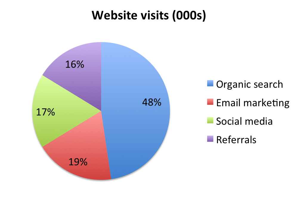
The chart above is a good example of a pie chart that is not the pyramid pie chart. The data represented is less than six which allows a user to easily get an impression of what the pie chart is trying to convey. The size of the data goes from largest to smallest in a clockwise direction. This can be used to help the user identify the differences in size between each segment if it was not labeled correctly. The data represented is using percentages and is labeled carefully in order to not misrepresent the data. Finally, the pie chart is simple without that many excess flare that it would not be an eye sore to see. While this pie chart is not as great as the pyramid pie chart, it does follow some basic guidelines that helps reduce the clutter and complexity that so many people seem to add to pie charts.

References

http://www.sandhills.edu/academic-departments/english/wordguide/chartadvice.html

TradeGecko – A good Inventory Management Software Program

Before dashboards were introduced, all major organizations maintained their data in spreadsheets. A lot of time would be spent on these spreadsheets which eventually would affect the working of the organization. Frustrated with spending entire day in spreadsheets for mundane business administration, Carl Thomson, a former fashion designer shut down his clothing company in 2011. It was out of this frustration that TradeGecko was born in 2012. TradeGecko was one of the newest entrants in the Inventory Management System’s market which was filled with poorly designed archaic IMS software. Following the principle “Good Design is Good Business”, TradeGecko stepped up in the UI department, making some tedious inventory management processes less painful and much easier to eyes.

Thomson launched TradeGecko with a goal to offer clean and intuitive IMS to small business owners. Its flat and sparse design, as opposed to traditional IMS, allows easy visualization of inventory levels, sales statistics, and others. The dashboard uses on screen cluttering, presenting only essential information. Also, its cloud-based platform ensures that information stays updated in real time.

In the market where many software designers ignored the essentials of a good design IMSs for retailers, Thomson brought a positive change. His software today is considered as one of the few well-designed program for IMS.

Reference:http://www.softwareadvice.com/inventory-management/spotlight/user-interfaces-2014/

Comparing cooking oil

The infographic in the below link compares around 40 different cooking oil based on criteria : % Saturated, %Polysaturated, Ratio, %Monosaturated and % Transfat.

http://www.informationisbeautiful.net/visualizations/oil-well-every-cooking-oil-compared/

Any visualization that requires the user to scroll down more than once to get a glimpse of data, has failed. By the time I scroll down to Safflower oil, I don’t recollect what were the first 5 oils that I read about. This info-graphic could have been represented in a simple spreadsheet since the visualization does not anyway present the insights in a readable manner. The oil data is not ordered based on %Transfat or any other criteria. For every criteria, the info-graphic represents what is good and what is not, for eg. For % SATURATED : high = bad, but why is OMEGA-3 vs 6 represented without numbers. It is tedious to count the number of boxes to know what is the ratio of OMEGA-3 vs 6 for Corn oil. When I look closely, I realize I don’t have to count the boxes since it just represents the ratio between the prior values. How do you identify whether the oil flavor is strong, gentle or neutral? Based on the different shades of black color font used for the oil name. How complicated!!

15 JavaScript frameworks and libraries (part 1 first 4 libraries)

JavaScript is one of the best open source stance and the top programming language with number of repositories on GitHub. There are several useful libraries to share.


  1. Augular.js

It is a JavaScript framework used by developers to create complex web applications. It supports MVC architecture. It uses data binding as one of the main concept and users can interact with the interface. When a new interaction is performed by the user, the view is then updated with the new values and turn the interaction with the model to be synchronized. The DOM is updated after the underlying logic.


  1. Backbone.js


It is normally used to build simpler web application frameworks. And is ia a great fit for new beginners to lean web app development. It also supports MVC and it suppoets RESTful APT, proper state management and so on .


  1. D3.js

It is a great to create complex and rich web applications with data manipulation features. It applies SVG, HTML, and CSS to build dynamic webpages. It can also bind data to DOM and enable data-driven events. It can create high-quality data –drirven web pages.


  1. React.js

It is ideal to build highly scalable front-end user interfaces. It is build on a virtual DOM which acts as mediator between client-side and server-side and use it to improve performance. The changes on virtual DOM match with the server DOM, and make process faster than a traditional UI update.


https://opensource.com/article/16/11/15-javascript-frameworks-libraries