Healthcare Data Visualization

Today’s healthcare reporting tools have incredible powers to tell stories about patient health—whether individual patients or entire populations. But simply showing the visualizations won’t be enough. The present reality is that not many physicians use these tools to such an extent. There are several factors that can affect their ease of use, starting with acquiring the actual data.

Collecting and directing the flow of information: It would be nice if physicians, researchers and other clinicians could just shepherd the needed data into a simple dashboard and quickly go about their business of curing the world of what ails it.

Turning different data formats into one for all: Once the data has been acquired it must be made usable. And here’s where the time-tested computing principle of “garbage in, garbage out” applies. Data must be scrubbed, normalized and aggregated into a standard format all can view and manipulate.

Presentation: Data visualizations must be easy for business users to access.

  1. Make the reports/visualizations relevant based on the user’s role, identity and concerns. Each set of users—clinical, financial, executive, IT, marketing, etc.—requires different metrics.
  2. Begin with the end in mind. This may seem an obvious piece of advice, but be sure to communicate with business users what they need to see or want to accomplish in advance of structuring the report. And as a general rule, aim for no more than three to five key performance indicators.
  3. Make visualizations easily accessible by users. Circling back to our observations about today’s mobile healthcare landscape, this is especially important for physicians and nurses who are constantly on the move.
  4. Make sure you are HIPAA-compliant. It will be far easier to obtain data from outside data sources if you can demonstrate that it will be well-protected within your organization—in storage, in transit and in the way it is presented.
  5. Create reports that can lead to action. The more information that can be acted on, the better.

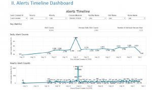
An impressive example of visualization in healthcare would be Santa Clara capstone project in the Kaiser Permanente in which students have been developing a Clinical Alert Notification system (CANS) manages alerts from all physiological devices and nurse calls. This application holds large amount of data, which can be used not only for making business decisions but also for reducing alert fatigue. A screenshot attached to this blog shows how an interactive visualization in Kaiser project is designed how it can help stakeholders.


Alerts Timeline Dashboard


References:

https://www.healthcatalyst.com/healthcare-visualization-benefitshttps://www.healthcatalyst.com/healthcare-visualization-benefits

TV Dashboards/ Wallboards

A TV Dashboard (or a wallboard) is a tool used to display key business metrics in real-time. TV Dashboards have evolved over the years from office whiteboards to office monitors that continuously display a business’ data.

They give businesses a clear view into their KPIs and allow all employees to have a better understanding of performance. Dashboards can dramatically improve a business.

The benefits of TV Dashboards include:

Transparency: It helps to maintain transparency at all levels in the company. Each and every employee, no matter what his/her position is in the company, is able to see the same metrics and this helps to reach the goals clearly.

Real time business decisions: The changes in the metrics are real time and this helps to take business decisions immediately whenever any improvements/changes have to be made.

Metrics driven: Decisions are made according to the changes in metrics and not any gut feeling. This improves the results of the decisions.

Here is the link to an image of a sample wallboard of a company:
https://www.klipfolio.com/images/content/dashboard-examples/dashboard-example-marketing-performance.png

Reference: https://www.klipfolio.com/resources/articles/what-is-a-tv-dashboard

An Ambiguous Representation

Due to the increasing amount of data and the increased use of data representations, it is natural that mistakes and ambiguity creeps into many of the representations. This most likely arises from the fact that in order to look distinct and striking, the designers tend to use shapes, figures and representations which look ornate and fanciful, but fails to do what it is designed to do – To give the viewers a good understanding of the data it is based on. Given below is an example of how trying to look distinct may tarnish the purpose of the representation.

The representation is designed to show the number of EU scholarships grants made available for students. The footnotes mention that a total of 270000 students were given the scholarships this year(2012-13) – highest since its inception. Which brings us to the first problem faced by the representation. The representation does not show/mention the total number anywhere. Even if we tend to look past this particular data omission, we are faced with another question. What parameter is used to illustrate the figures? Line length or the angle?

A careful analysis of the representation points towards line length as the parameter used to represent this data. But, the human brain is wired in such a way that it notices patterns and colors before raw data and numbers. As such, a cursory glance might confound the viewer into assuming that the parameter in use is the angle. Perhaps more important is the almost unavoidable error which may arise while trying to make sense of this representation. Take the case of Germany and Turkey, for instance. From the statistics provided to embellish the representation, it is clear that the number of scholarships for students from Turkey is less than 1/5th of the number of scholarships for German students. But it is nigh impossible to come to the same conclusion by looking at the representation.

The only word I can use to describe the representation for Spain is – strange. It looks like it has gone around the circle by 280 degrees, but in reality, a bit has been broken after ninety and have stuck it at the left.

In conclusion, even though the ‘bar chart’ looks distinct and different to the viewer, the information it has been designed to portray comes out as confusing, misleading and frankly, wrong. Upon further reading, I found that this type of representation is aptly named the ‘racetrack’ representation where the inner tracks are shorter than that outer ones, which results in the designer having to stagger the starting positions. I can safely say that it would be quite some time before I use this to represent data.

Source: http://junkcharts.typepad.com/junk_charts/2017/01/race-to-the-top-erasmus-edition.html

http://www.ibercampus.eu/-270-000-students-benefitted-from-eu-grants-to-study-or-2076.htm

World Values Survey

World Values Survey is a research project that focusses on changing values and beliefs and how social and political developments impact them over time. This survey involves people from over 60 countries and shows understanding of the importance of the select group of values with respect to each other: Family, Work, Friends, Leisure Time, Religion and Politics.

This plot graph will help the sociologists, economists, and political scientists to understand how the factors like GDP, diversity in population and culture influence the beliefs of people.

This visualization uses dot plot to show the relative importance of the values from the most important being on the circumference and tapering down in importance towards the center. The colors used are distinct which help to distinguish between the values represented in the plot. As the size of the dot decreases sequentially, it is easy to interpret the importance of values for the countries involved in the project.

The center dot plot shows how the world ranks the values comprehensively from most important to least important on average. We can certainly observe that about 75% of the countries rank family higher than other values while politics is universally the least important value. It also shows which countries are affected by the religion they follow.

The visualization makes it effortless and straightforward for a layman to perceive the graph and precisely shows the result of the survey. But as the graph represents data relatively, the size of the dots should not by directly connected to the percentages associated with the values and that is a disadvantage of this graph.

Source: https://knoema.com/infographics/hxpxvpg/world-values-family-work-friends-leisure-religion-and-politics

The Wizards’ shooting stars

In any game of basketball, shooting points ultimately boils down to taking and making shots. The Wizards have been known for their offense. Their average offensive rating is 103.0 points per 100 possessions which have put them in a three-way tie for 16th position in the 30-team NBA. The Wizards have had efficient shooters around the basket and from behind the three-point arc in the last season. The Wizard’s Shooting Stars dashboard has been designed to represent the performance of the team’s shooters. The dashboard has the list of all the Wizard’s players for last season with their best shots, their shooting range, performances in different shooting zones, shot distribution etc. The dashboard creator has used an appealing way to represent the shot trajectories for the shooters categorized as missed and made shots. Also, he has used a unique way of representing their shooting percentages based on varying distances and linked it to the actual figures of missed and made shots. The dashboard has a UI which is easy to understand for the users with an attractive view. Overall, this dashboard can be considered as a good example of well-designed visualization.


Reference – http://www.washingtonpost.com/wp-srv/special/sports/wizards-shooting-stars/

The Wizards' shooting stars
The Wizards’ shooting stars

Insights in the quality of the data is what matters

Data visualization attracts lot of attention because they are a finished product, and look nice as well. However, for many companies engaged in data visualization, those final deliverables aren’t the most important benefit of data visualization. Instead, it’s the insights into the quality of their collected data that truly leads to success.

Data visualization provides 3 key insights into data:

Insight into Data #1: Is the data complete?

The most straightforward insight that visualization can give you about your data is its completeness. With a few quick charts, areas where data is missing show up as gaps or blanks on the report (called the “Swiss Cheese” effect).

In addition to learning which specific data elements are missing, visualizations can show trends of missing data. Those trends can tell a story about the data collection process and provide insight into changes necessary in the way data is gathered.

Insight into Data #2: Is the data valid?

Visualization plays a pivotal role in understanding data’s validity. By executing a quick, preliminary visualization on collected data, trends that indicate problems in the complete data can be found.

Insight into Data #3: Is the data well-organized?

Poorly organized data can be the bane of the final step of a data collection or business intelligence process. Using data organization tools from the start can help streamline later steps of the process.

During collection, the data is often organized in a way that optimizes the gathering process. However, that same organizational scheme can be a problem when the time comes to act. The data visualization process serves to highlight the organizational challenges of your data and provides insights into how it might be done better.

Source: http://www.boostlabs.com/benefit-of-data-visualization-3-crucial-insights-into-your-data/

Budget Puzzle: Empowering the people with Data

In the democracy, though the masses are bestowed with the power to choose, the empowerment becomes futile with the lack of information provided about the choices given. People have little or no idea about the policy making processes, the budgeting process, etc.

In line with the global trend of democratizing access to information and empowering people, this data visualization does an excellent job of demystifying the process of balancing the national budget. By placing budget balancing in the hands of everyday users, this visualization taps into the power of collective thinking to solve big problems.

In this interactive visualization, readers are asked to come up with a set of cuts that would sufficiently reduce the deficit for both 2015 and 2030. Some policies save more money in the near term than others, and some policies, have much more long-term savings.

The country’s ultimate deficit solution will have to include a mix of medium- and long-term savings.The spending options are broken into four categories: domestic programs and foreign aid; the military; health care; and Social Security. To achieve these savings, readers are asked to choose a mix of tax increases and spending cuts.

Visit this Link – BUDGET PUZZLE 

Bike Share in Philadelphia

This visualization is about the data of bike share station usage of Indego, which is a public bicycle sharing system that serves parts of Philadelphia at over 100 stations.

The purpose of this visualization is to help people to plan their commutes and avoid the busy hours in local bike stations.

As is shows, the x-axis represents different time within a day. The Y-axis is more complex, which represents the percentage of time the station is full or empty during that moment.

The graph itself only using a mark and two channels, with the mark of area and the channels of Color and Color saturation. However, the using of channel might no appropriate here. it might confuse people as it using deeper red to represents there are more bikes available. Because in our daily life, the color red always represents the signal of congestion or insufficience. Also, it lacks information density. For example, it could not present the difference in bike usage in each day within a week.

In fact, the author creates this graph because he thought his inital visualization is imperfect. But I don’t think so after digging out it. Here is his previous visualization.

Reference:

http://www.randalolson.com/2015/09/05/visualizing-indego-bike-share-usage-patterns-in-philadelphia-part-2/

http://www.randalolson.com/2015/07/18/visualizing-indego-bike-share-usage-patterns-in-philadelphia/

Spurious Correlations

In statistics, spurious correlations is a mathematical relationship in which two or more events or variables are not casually related to each other, but it may be wrongly inferred they are, due to either coincidence or the absence of third reason.

It’s well known that correlation doesn’t imply causation. However, when lines, bars, and points have similar trend, we start to believe that one may be the cause and one may be the result.

There are several ways would cause spurious correlations:

  1. Axis scales: either x or y axis scale that measures different values can’t be paired in a single graph especially those showing similar curves.
  2. Change scales: although x and y axis measure same value, the scale of either event change and the proportion and range is different. The graphs below obvious show that in different range those two events highly relate to each other. However, in same range, those two events are irrelevant with each other.
  3. Ifs and thens implying cause and effect: comparing two unrelated data sets together may lead to a misunderstand of causation. We can use to different present skills to examine the causation:

If Pandora loses less money, then more music is copyrighted.

However, this graphs doesn’t show that correlation:

Reference: https://hbr.org/2015/06/beware-spurious-correlations

Potential Data Resource from Uber Movement

Uber lately introduced Uber Movement, a website that uses Uber’s data to help urban planners make informed decisions about city. With this website, also we could call it a data analytic platform, local leaders, urban planners, and civic communities are easier to work on cracking their city’s commute and figure out how best to invest in new infrastructure.

This website would help us reliably estimate how long it takes to get from one area to another. Also, we can compare travel conditions across different time of day, days of the week, or month of the year-and how travel times are impacted by big events, road closures or other things happening in a city.

Uber claim the data is anonymized and aggregated into the same types of geographic zones that transportation planner use to evaluate which parts of cities need expanded infrastructure without release any personal privacy information.

https://movement.uber.com/cities

https://www.wired.com/2017/01/uber-movement-traffic-data-tool/