Dangers of Bling Data Visualisation

Data Visualisation is making its way into mainstream recently. However, this gaining popularity is leading to increasing misconceptions about making attractive visualisations. The purpose of visualisation is to provide information which otherwise would be very difficult to infer from the voluminous data available. Hence, more emphasis need to be given on conveying the correct information rather than incorporating too much “bling” into these representations.

Info-graphics can be catchy, aesthetically pleasing, thought-provoking. But these features would not hold any value if the info-graphics cannot fulfil their purpose of telling informative stories. Let us consider the example of stream graph of movie box office receipts over time.

Steam Graph of movie box office receipts from New York Times


The graph definitely looks attractive. But can it explain its obvious intent? Probably not. It would take us some time to understand that the peaks of the curve represent the weekly sales of each movie and the area under the curve represents the total receipts. It is unclear why certain movies are below the zero line. Also, comparing different movies seems difficult by just looking at the graph. In short, no matter how appealing the graph looks, it fails to be a good-decision making tool.

Hence, while creating any data visualisation, we should not its true purpose. We need to keep in mind that visualisations are meant to define the data behind the data. And so, we should try to focus on making an informative data visualisation rather than a bling data visualisation.

Reference: http://www.information-management.com/news/news/the-dangers-of-bling-data-visualizations-10025306-1.html?zkPrintable=1&nopagination=1

Visualization As Research Tool In Psychology

This visualization is created to help academics in the field of psychology. More specifically, it presents some important contextual and historical Influences in Psychology and also the related perspectives and psychologist.


The whole dashboard looks simple but elegant. It uses one type of mark and two types of channels to encode the data. The node presents each element, such as a psychologist or social method. The color is to differentiating types of information.  The size of node will be enlarged when user select a related node. The more relevant these two node is, the larger the node is. The hidden X-axis is time-based, from 19th centenary at left to 21th at right.

Using this visualization tool, I believe student will master the study of psychology in more easy way. And it also encourages student to self-explore. However, it will be better if it could provide us with the information about why the linked topic are relevant.

Reference: 

http://www2.open.ac.uk/openlearn/CHIPs/index.html


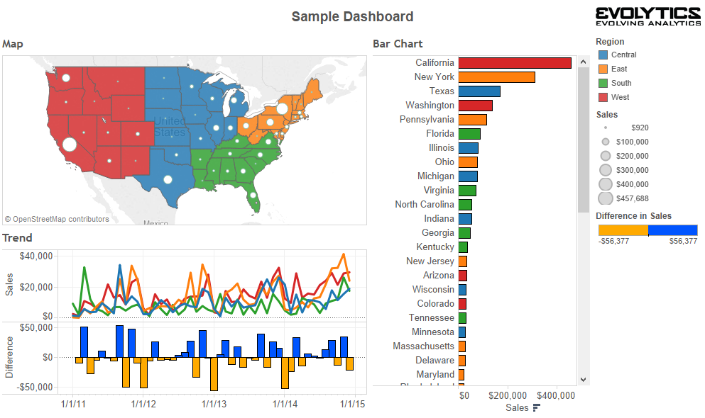
Building Interactive Dashboards with Tableau Dashboard Actions–Filters

To interact with your users, you want to transfer the control to them to discover more and make insights they find easier to retain. Here, I will share three different ways to leverage dashboard actions to improve your user experience.

Dashboard actions in Tableau allow you to add logic to dashboard components that create actions somewhere else. For example, you can add logic that says, “If a user clicks on Dashboard Sheet 1, I want something to happen on Dashboard Sheet 2.” To set up a dashboard action, navigate to “Dashboard > Actions> Add Action” in the top navigation from any dashboard view. Three types of action will be presented: Filters, Highlight, and URL. This week, I will introduce the filters first.

  • Filter – If you click on sheet one, sheet two will be filtered to whatever you clicked on sheet one. Example:  Here is an overview of the dashboard.

We could make every individual dashboard sheet as a filter for the entire dashboard by hovering over the sheet, clicking the down arrow that appears in the upper right, and selecting “Use as Filter” (on all three sheets).

Then when clicking on any sheet, the other sheets are filtered to whatever I clicked on. For example, if we click on Washington in my map view, the trend line and bar chart sheets will be filtered to just that state:

If not all of the sheets have enough data to show the details of each state, you should set the filters separately for each chart, for example only the bar chart instead of the map.

TO BE CONTINUED…

Reference: http://www.evolytics.com/blog/tableau-201-3-creative-ways-to-use-dashboard-actions/

Understanding a Box plot

I personally have never used a box plot because I didn’t know how to use it and when to use it. But when Professor explained in last lecture about average violations per day using box plot, I found it more appealing. Box plots are great way to quickly examine one or more datasets graphically. Of course, you need to know the meaning of all fields on a box plot to understand it. Here is an easy and simple example of how to interpret a box plot.

  • Box plot (aka Box and Whisker Plot) plots all data points and splits it into quartiles (Q1, Q2, Q3) and it is represented as a box which goes from first quartile to third quartile.
  • The vertical line drawn at the Q2 is median of data set.
  • Two horizontal lines extend from front and back of the box are called whiskers. Whiskers often (but not always) stretch over a wider range of scores than the middle quartile groups.
  • The extreme points preceding first quartile and  following third quartile are known as outliers.

We can display three common measures of the distribution in data set.

  1. Range: It is the distance between two extreme points on a plot. If we consider outliers, then it is between (5) to (95)-> 90. If we exclude outliers, then it is (95-15) 80.
  2. Interquartile range: The middle half of a data set falls within the interquartile range. In a boxplot, the interquartile range is represented by the width of the box (Q3 minus Q1). In the chart above, the interquartile range is (80-38) 42.
  3. Skewness: We can identify different skewness patterns based on shape of dataset. If the data points are concentrated at the lower end, the distribution is skewed right and vice-versa. If it is evenly split at the median then it is Symmetric.

In Speed Violations example, we can easily identify danger zones which are nothing but those outliers in box plot. Also, our grades distribution on Camino is also a box plot which gives you where your grades stand in overall class grades, what is the average score and how many are above/below average.

I am trying to create a box plot in Tableau, if anybody has already done please share!

Source: http://www.datavizcatalogue.com/methods/images/anatomy/box_plot.png

http://stattrek.com/statistics/charts/boxplot.aspx


15 JavaScript frameworks and libraries ( part 2 to be continued)

6. jQuery

jQuery is another  JavaScript library to work on event handling, animation.  jQuery has easy to use API and it has When working on a web project, it takes less time to complete simple tasks and it is compatible with most web browsers. jQuerty can control DOM and Ajax application. jQuery separates HTML and JavaScript code which makes the code cleaner.

7. Ember.js

Ember.js is a mix of Angular.js and React.js. It is similar to Angular.js when syncing data. The two-way data exchange makes web application faster and more scalable. Developers can create front-end elements. It is similar to server-side Virtual DOM to provider better performance and scalability. Its community also provides sample code and libraries.

8. Polymer.js

Polyer.js is userful to create HTML5 and its main focus in to extend functionality and able to create own tags. For example, a developer can create an element with its own fuctionality similar to that element in HTML5.

9. Three.js

Three.js is another JavaScript library and it is popular for 3D development. Three.js uses WebGL and can be used to render 3D objects. It is better to use write web-based games such as HexGL.

https://opensource.com/article/16/11/15-javascript-frameworks-libraries

The Story of English Premier Football League

The d3.js visualization built by Anna Powell-Smith displayed story of the English Premier Football League since 1993. The interactive visualization enables users to select the season years and rank basis (position and points). So it’s easily to review the results of the game for each season.

When you move the mouse pointer to different lines and dots, it will give you an clear view of the team’s performance in that your. For example, when I move my pointer to the line representing Leicester, it will be automatically highlighted. The rank of Leicester dropped down since game five and got back to the top tier in game 15. In addition, when  I move my pointer to dots on the line, it will pop up the information about that specific game. So it’s a really cool interactive visualization using d3.js tool.

The link to this visualization: http://thestoryoftheseason.com/

Hans Rosling: What I learnt from his visualization!

After professor posted the video link of visualizations created by Hans Rosling, I saw the video. It indeed was a very different way to show visualizations and present data. To me, it seemed more like a movie with changing visualizations that made sense, were easy to understand and portrayed what they were supposed to show clearly.

I went ahead and searched for some of his interactive visualizations – Gapminder.com . I just concentrated on the visualization for Life expectancy over years (although there is so much more data that can be added and information that can be viewed).  Here are some of the things that I really liked –

  • Use of bubble charts – In this week, we had discussions about using the right idioms to represent data. While a bar chart seems right to me about almost everything, I liked how bubble chart was used in this visualization and conveyed the meaning of the data.
  • No Trend lines – The first thing that comes to my mind when I have to represent data over time, are trend lines.  Using bubbles to change sizes and show trends (move up or down to show increase or decrease) across years to represent data was very innovative and interesting for me.
  • Interactive Visualization – This visualization can be customized and interacted with in so many different ways. It gives you a chart to show data over the years.  You can filter it and view data, compare data across countries, regions etc. It adapts quickly when a selection is made and transitions quickly.
  • Just Enough – You can interact with individual piece of data and even though there is so much information in this visualization, it is not overwhelming. They have displayed and organized it appropriately.
  • The video feature is super cool! Definitely check this out!

Best Practices for Designing and Building Great Dashboards

Dashboard is used to provide relevant and timely information to its audience. It is not used to display designer’s artistic and technical capability. Therefore, keeping it simple and focus on the core message is the primary goal for the designer.

Avoid some visualization components that are not directly contributing to the message:

  1. Logos
  2. Navigation
  3. Non-essential Text: to minimum labeling and instructions.
  4. Too much color
  5. 3-Dimensional objects
  6. Horizontal or vertical guide line: when overuse, may detract attention from the data.
  7. Too much detail

Keep these practices in mind:

  1. Who are you trying to impress: the most effective dashboards target a specific group of audiences and present data specific to that use case.
  2. Select the right type of dashboard: what kind of information that audience want to take way from the dashboard.
  3. Group data logically: use space wisely. Because of western language, our eyes usually start from the top left-hand corner and move to the right. Hence, letting audiences discover something new at the top-left-hand corner.
  4. Make the data relevant to the audience

  1. Present the most important metric only: be clear, simple, and effective.
  2. Present up to date data

Keep dashboard simple and focus on the core message are primary goals. The dashboard below showing effectiveness and simplicity.

  • Simple color: users are not overwhelmed but understand at one glance.
  • Number and change: it summarizes important number to sales department and lets users know the details of the change.
  • Story: the graph on this dashboard deliver a clear story of US monthly sales. All the important KPI are included. This helps decision maker to develop strategy. Moreover, graphs are grouped logically. From left to right, it moves from big picture to details and each supports previous one. Although there is no description, it delivers a clear story.
  • Filter: although it is the details information less important putting on the right-hand side, it clearly shows the background of the story.


Reference:

https://www.geckoboard.com/blog/designing-and-building-dashboards-data-visualisations/#.WJ5VcBIrImo

https://www.geckoboard.com/blog/building-great-dashboards-6-golden-rules-to-successful-dashboard-design/#.WJ5UkhIrImo

https://public.tableau.com/en-us/s/blog/2013/10/dashboard-layout-and-design


Dive into Tableau Calculated Fields

Last week, we discussed in the class of how to simplify complex visualizations in Tableau by creating new data from existing data through calculated fields.

Though it is best to prepare our data as much as possible before it gets to Tableau, there are many reasons to leverage the calculated fields functionality in Tableau. Few of them are:

  • To segment your data in new ways on the fly
  • To prove a concept such as a new dimension or measure before making it a permanent field in the underlying data
  • To filter out unwanted results for better analyses
  • To take advantage of the power of parameters, putting choice in the hands of your end users
  • To calculate ratios across many different variables in Tableau, saving valuable database processing and storage resources

As we know it is important to understand the data before making any visualizations. Understanding the data also includes knowing the nature of the data based on which we can decide in which family of calculation our data belong. There are three major families of calculated fields in Tableau:

Non-aggregate calculations 

These are the simplest type of calculation. Non-aggregate calculations are performed for each row in the underlying data, rather than being performed on aggregated data (such as you would find in a pivot table or Tableau view).

It is a calculated field which does not use any functions from the ‘Aggregation’ function group. For example: [Sales] – [Cost] would be a non-aggregated calculation.

Aggregate calculations

Aggregate calculations are those that use aggregate functions.  Examples of aggregate functions are SUM, AVG, MAX & MIN (there are a few others). Therefore an example of an aggregate calculation would be: Profit Ratio = SUM(Profit) / SUM(Sales).

When we drag and drop a measure in Tableau, it is automatically aggregated. The default is sum. The primary difference between aggregate and non-aggregate calculations is that aggregate calculations often can’t be sensibly calculated for each row in the underlying data set – it normally only makes sense to calculate them when the data is aggregated.

Table calculations:

Table calculations allows us to compare two or more separate measures in our data set, it allows us to compare a singular measure to itself (the only way to compare a measure against itself).  These are the calculations which are applied to the values in the entire table. For example, for calculating a running total or running average we need to apply a single method of calculation to an entire column. Such calculations cannot be performed on some selected rows.

When writing any calculation, make sure to know exactly what you want to do. There are many functions and table calculations within the powerhouse of Tableau which can be utilized to create the calculated fields for presentation of data in a pictorial or graphical format. Keep exploring. Keep learning.

Sources:

http://www.clearlyandsimply.com/clearly_and_simply/2010/10/calculated-fields-in-tableau.html

https://www.tableau.com/about/blog/2017/2/top-10-tableau-table-calculations-65417

Tableau Fundamentals: An Introduction to Calculated Fields


Do not apply Eenie, Meenie, Minie, Moe technique to graph selection

We have already discussed in class, that we should not randomly select your idioms. Also, while doing my last assignment I spent lot of time in “design dilemma”. While figuring out which graph to use, I happened to read an article by Stephen Few in which he mentions about best means to encode quantitative data in graphs. He states that, there is a procedure to follow while creating your visualization.

Step 1: Understand the relationship/message you are trying to present
Step 2: Select the best suitable graph
Step 3: Format your chart

He mentions that almost all typical business information can be addressed by either one or combination of the below mentioned 7 quantitative message types (off course there are exceptions to this) and he has suggested suitable encoding methods which can be a quick cheat guide during our design dilemmas.

Disclaimer: There can be other choices as well, this is just one of the few.
1. Nominal Comparison: When you have to compare between one or more measures in any order.
Suitable Graph: The best encoding method is using either a horizontal or a vertical bar chart, but for large data sets it is better to use simple data points.

2. Ranking: When you have to communicate the order i.e. either highest to lowest or vice versa
Suitable Graph: Again, bar charts are most suitable for this.
Extra tip: For highlighting highest values sort in descending order and for lowest values, sort in ascending.

3. Time Series: When you want to convey how things have changed over time.
Suitable Graph: Line Chart: When you want to stress on the trend and shape of data
Bar Chart: When you want to stress on comparison between individual values
Points + Line chart: To show individual values and simultaneously highlighting shape of the data.

4. Part-to-whole: When you want to represent some values as ratios or part of the whole
Suitable Graph: Bar charts are suitable to represent this relation.
Caution: Do not use pie chart for this, it is difficult to compare size of slices of a pie.
Use stacked bar chart when you want to display both the parts and the whole.

5. Correlation: When you want to compare 2 values and see if there is any relationship between them.
Suitable Graph: Trend line and points (scatter plot) are suitable for this type of relationship.

6. Deviation: To show difference between 2 sets of value
Suitable Graph: Only when displaying time series and deviation together
Line Chart – To stress on shape of data
Points + Line chart – To stress on both on individual values and simultaneously highlighting shape of data

7. Distribution – If you want to measure counts of values per interval along a quantitative scale
Suitable Graph: Histograms are a good fit to emphasize individual values
Use lines to emphasize on shape of data

Reference: https://www.perceptualedge.com/articles/Whitepapers/Communicating_Numbers.pdf