The map below shows the most common jobs per state, held by people who are from a non-US origin. Though the data is not quite clear on if the people are legal or illegal immigrants in this scenario, we can see that, 59 percent of the workers have lower than a high school education, compared to 31 percent of the rest of the labor force. (Mekouar, 2015)
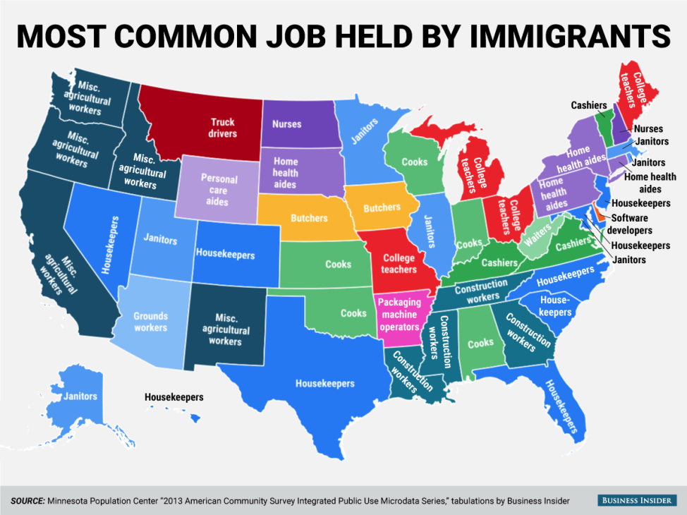
This visualization contains a lot of data and could be represented in multiple better ways.
The main issues I would improve are:
Firstly, the representation of color and labels make the map look cluttered.
- Having a legend would improve the above flaw to a certain extent.
Secondly, grouping the states and indicating the common jobs by % would present the data to create a better understanding.
The last thing according to me that would make more sense is to classify jobs by skill level and create an understanding on the education levels and the wage details.
As the weeks have passed, I have learned to appreciate and criticize details of each visualization. To create better and more influential visualization/ dashboards we should first ask the question “Why is it required?”. This has given me an understanding of how to better justify the data to your audience than just making an attractive visualization.
Interesting and highly relevant post. The visualization could have implemented the points you have mentioned above easily using Tableau.
Thank You Sangamitra.
It has been an experience to get to the point of criticizing and understanding ways to correct specific visualizations.