Donut chart shows relationship of parts to a whole but it is important to think if it makes any sense. Just because it looks cool, most of the times it doesn’t tell you much. It depends upon what you want to convey. For example, if it is related to gender ratio or performance of one entity overall, then donut chart will be the best fit. But if you have many entities to display then it may become chaotic.
Image-Source: http://payload.cargocollective.com/1/2/73104/1481815/Pie-Labeled.jpg
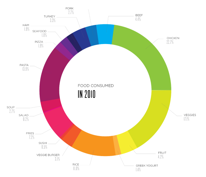
The above donut chart displays food consumed in 2010. It is eye-catching, labeled properly with different colors. I would like to comment over some of the issues with this donut chart.
- When you look at each food product you can get its percentage contribution. But it is hard to compare them with each other. You cannot identify minute differences. The contribution of Veggies and Pasta looks similar but there is difference of ~3%. This can mislead the results. While comparing, user has to remember the values for each item causing inconvenience.
- Use of different colors is confusing the user especially for color-blinds. It is hard to distinguish Soup, Salad, Fries and Sushi. They all look same.
- Lower values are not visible at all (Salad, Sushi).
It is possible to transform this messy donut chart into meaningful graph. Simple bar chart will be the better alternative in this case. User can easily identify items and compare the values. No need of color palettes in this case. Bars are easily distinguishable. For the lower values, you can combine them together in one item as ‘other’. If you want to use color palettes, then you can even make categories as ‘Fast-food’, ‘Veggies’, ‘Meat’.
While creating a visualization, we should find to make something that looks cool but does not sacrifice a bit of analytical clarity!
Source:
http://payload.cargocollective.com/1/2/73104/1481815/Pie-Labeled.jpg
I agree! Most of the visualizations I find are just pleasing to the eyes and lack the most important factor as to why the visualization is needed in the first place.
I agree. Some visualizations fail to convey key message and are just to impress the audience.
It seems like you can apply the rules of making a pie chart to donut charts too, though it will probably be better to change it to a bar chart.
Yes. As I said, if there are few entities to compare then either pie chart or donut chart can be used to make it pleasing.