As we all know, this has been one of the wettest years in California in a long time. People have had evacuation notices due to high chances of flood and reservoirs overflowing. This has been the strongest storms hit since 1995. When I was going through daily news, I found this visualization and it looked very interesting. Though it looks like modern art with so many colors splashed, it makes a lot of sense when closely looked at.
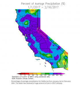
The visualization presents the precipitation (rain or hail) in % over the last month and half. I particularly liked this one as it shows all the exact points and helps understanding the most affected areas. The color scale being diverse does not collude and merge with each other and shows discretely the areas of regions. Even though this might be breaking one of the rules of thumb, of presenting in black and white. I understand that it is very helpful in this situation.
For our upcoming assignment of interactive dashboards, I feel this has created an impact on me to use what matters. When you want to understand the big picture to its core details in a couple of clicks, it helps to know what exactly is the message you want to convey to the audience.
So find the message you want to put across and enjoy the assignment!
https://www.washingtonpost.com/news/capital-weather-gang/wp/2017/02/18/historic-storm-pounds-southern-california-with-high-winds-and-record-rain/?utm_term=.13262146b08f