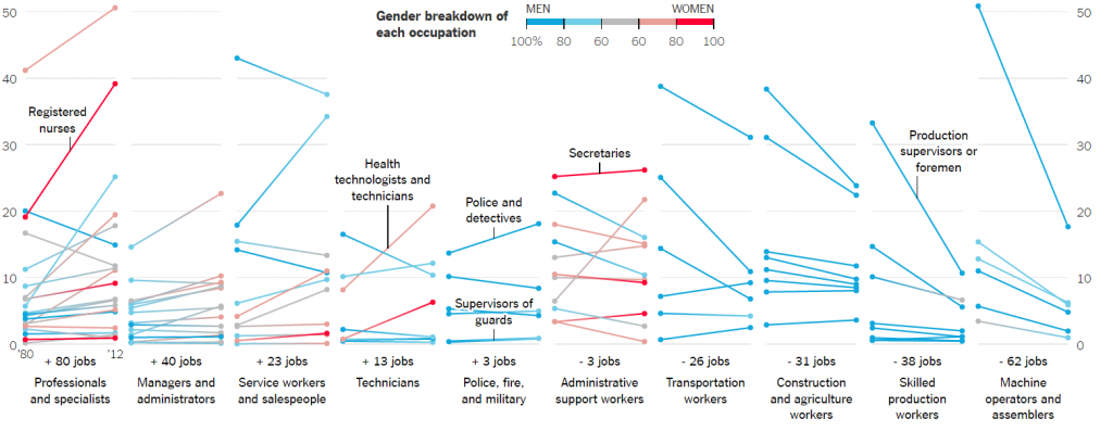
The visualization is that about the changing nature of the types of jobs, the jobs that pay the salary between $40,000 – $80,000. The types of jobs that pay wages as stated above in 2014 dollars — have shifted since 1980 is the claim of this visualization. The visualization depicts that few job positions are male dominated production occupations while some of the job positions out in the market are female dominated. The x-axis of the visualization shows the number of increase or decrease in the jobs in various domains. The y- axis shows the percentage share of each occupation and the line plot shows different occupations which contributed to the increase or decrease in that domain.
- One of the best parts of the visualization is that it clearly shows the gender breakdown of each occupation. The legend for the plot shows that the plot uses stepped colors to show the percentage of male or female dominance in a particular occupation. For example, the first section of the visualization shows that in professionals and specialists domain people can be dietitians and nutritionists; Librarians, archivists, and curators etc. and the color of the plot shows that whether that job is male or female dominated.
- Another feature of this visualization is that it also depicts which occupations are the biggest gainers and losers by showing the occupations which have gained and lost share; the increase in jobs per 1,000 middle – class jobs; and also, the percentage change in their share.
- The best feature of this visualization is that it shows which industries have the majority share in the jobs per 1,000 middle – class jobs and which sex dominates it.
Reference https://www.nytimes.com/interactive/2015/02/23/business/economy/the-changing-nature-of-middle-class-jobs.html