Abstract: In this post I will briefly discuss data visualization in political science and how use of visualization in social science can be risky.
Data visualization in political science takes advantage of recent developments in computer science and computer graphics, statistical methods, methods of information visualization, visual design and psychology.
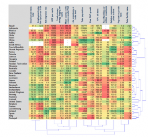
There are two main types of numerical tables that can be a subject of data visualization. The first one is called “object-feature” table, where every row represents an observation or an object and every column correspond to a numerical feature or indicator commonly measured for the whole set of objects. An example of such an “object-feature” table is a factbook for a set of countries, where the objects are countries and the features are numerical indicators such as GDP per capita.
Source: https://arxiv.org/pdf/1008.1188.pdf
The second type of numerical tables is called connection or distance tables where both rows and columns correspond to objects and at the intersection of a row and a column a numerical value is found characterizing a link between two objects. A typical example of a connection table is the table representing the migration rates or the mutual volumes of export and import of goods for a set of countries.
Data visualization problems and risks:
There are different sets of problems regarding data visualization in political and social science. First, the problems can be induced by the designer (intentionally or unintentionally) or by the user of the diagram. Second, these problems can be classified into cognitive, emotional and social ones. Cognitive problems can be connected to inappropriate use of graphical elements, lack of clarity, over- simplification or over-complexification of the graphical display, or induced by heterogeneity of target user groups. Emotional problems can be connected to a repellent content of graphical design. Social problems can be connected to cross-cultural differences of users. Another source of problems in data visualization comes from the use of categorical or qualitative measurements for which no standardized and well-established graphical displays exist.
Conclusion: Similar to other fields political and social science has been used data visualization to clarify their message. But using data visualization in these areas is more challenging since we are dealing with a lot of qualitative data and factors that can not be visualized easily. To improve our visualization in social science we need more insight on data beside technical capacities.
References:
1. Bresciani, S., Eppler, M.J. (2008). The risks of visualization: a classification of disadvantages associated with graphic representation of information. ICA working paper #1/2008.
2. https://arxiv.org/pdf/1008.1188.pdf
3. LeGates, R. (2005). Think Globally, Act Regionally: GIS and Data Visualization for Social Science and Public Policy Research. Esri Press.