The most loving day of the year was celebrated this week: Valentines Day. The spending on cards, overpriced flowers, chocolates, chilling champagne and the fantastically romantic dinner date is done. Lets just get a sense of how expensive Valentine’s Day can get. Below visualization depicts the Valentines Day spending by Americans. 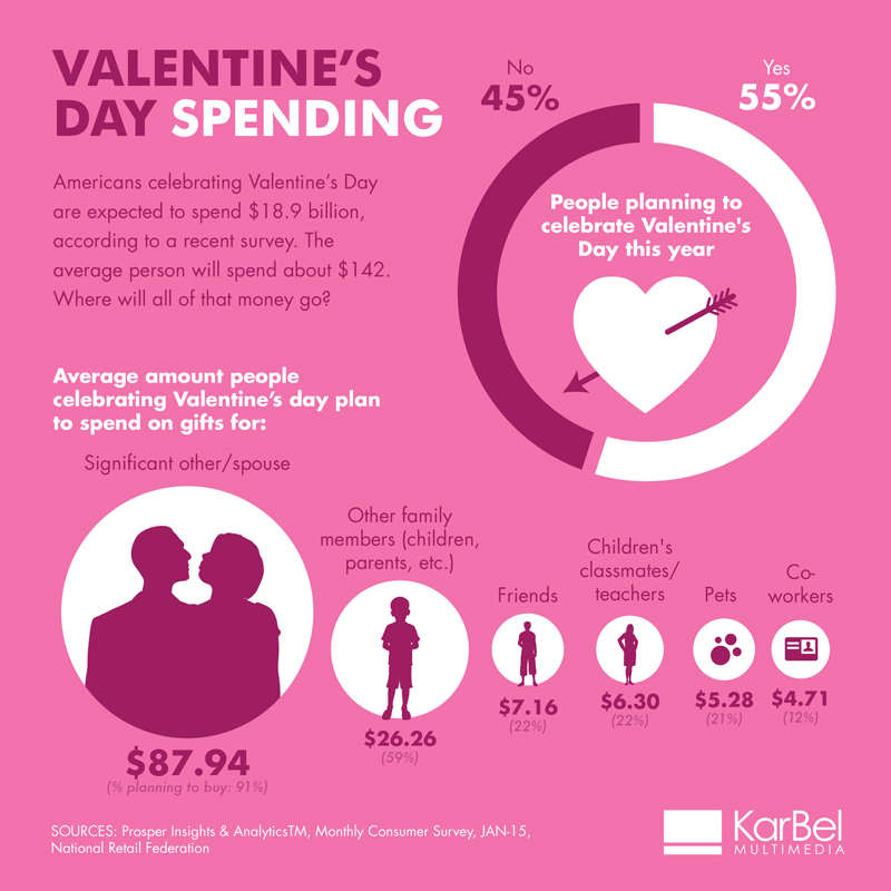
What I like about this Visualization is
- Color that matches the theme
- Precise titles show what we are about to see
- Nice description which shows us the goal
- Donut chart works well here as it’s only 2 slices
Possible improvements:
But to reach our goal and take proper action, there is very little context. We cannot figure out if this spending is increasing or decreasing as compared to previous years. Historical spending’s might help in getting a proper picture.
As discussed in class regarding grouping the significant attributes which does not have much difference amongst them, we could make two groups: significant other and everyone else.
Use of bubble charts to compare the sizes of the spending could be replaced by a simple bar graph. It will be easier to read. Though the color matches the theme but this is a lot of pink.
The data seems incomplete since it only shows spending on gifts but not the other expenses of flowers, chocolates, holiday, dinner etc. which are overpriced during Valentine’s Day.
I felt the below link depiction of Valentine’s Day spending to be better and simple:
https://nrf.com/resources/consumer-data/valentines-day
But overall we can say that love is not likely to be a cheap thrill on Valentine’s Day.
Sources:
http://www.karbelmultimedia.com/2015/02/valentines-day-spending-infographic/
https://nrf.com/media/press-releases/cupid-shower-americans-jewelry-candy-this-valentines-day