We have learned that you should never use a pie chart to visualize your data. Unfortunately, there are some people that just want to use a pie chart to visualize their data. Whether it is because they love pie’s or just because they have always used it, there are some guidelines that should be followed when using pie charts.
- Don’t Use Pie Charts (But if you want to, follow steps 2- 6)
- Limit the data represented to no more than six
- Present the data from largest to smallest in a clockwise direction
- Only use pie charts when visualizing data about money or percentages
- Label Carefully
- Keep the pie chart simple
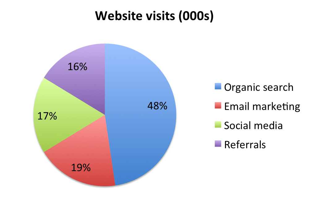
The chart above is a good example of a pie chart that is not the pyramid pie chart. The data represented is less than six which allows a user to easily get an impression of what the pie chart is trying to convey. The size of the data goes from largest to smallest in a clockwise direction. This can be used to help the user identify the differences in size between each segment if it was not labeled correctly. The data represented is using percentages and is labeled carefully in order to not misrepresent the data. Finally, the pie chart is simple without that many excess flare that it would not be an eye sore to see. While this pie chart is not as great as the pyramid pie chart, it does follow some basic guidelines that helps reduce the clutter and complexity that so many people seem to add to pie charts.
References
http://www.sandhills.edu/academic-departments/english/wordguide/chartadvice.html
This is a clear pie chart, but since there are only 5 things which we want to convey, do we need a chart for that? Right now, we need to see blue is the largest, then remember and map it again that it refers to organic search.
I have been using Pie charts all my life till I took this course and now I feel that just mentioning data simply would be better.