Manipulation of the facts or deception of the reader can be both intentional and unintentional. The data would be distorted which lead to misleading to audience. There are several ways to present misleading visualizations.
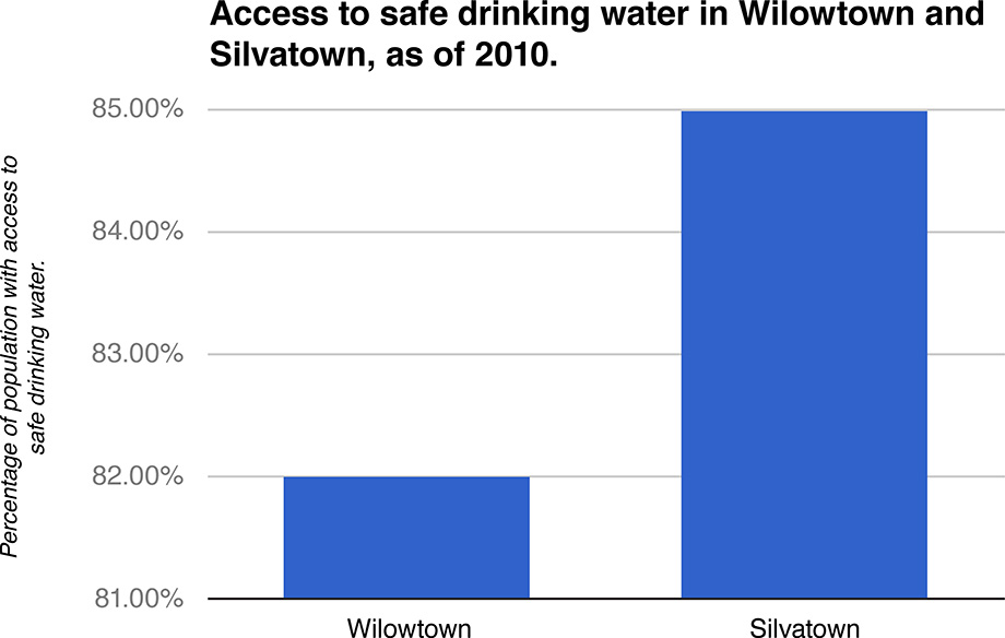
1.Truncated Axis.
2. Area as quantity.
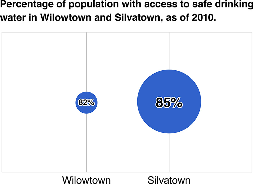
The two graphs above allures the audience to feel that the difference in percentage is huge.
3. Aspect Ratio.
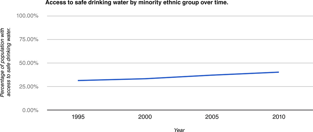
The aspect ratio of the chart has been distorted by stretching the X-axis, which mislead the audience to feel the change was not significant by the flattened line.
4. Inverted Axis
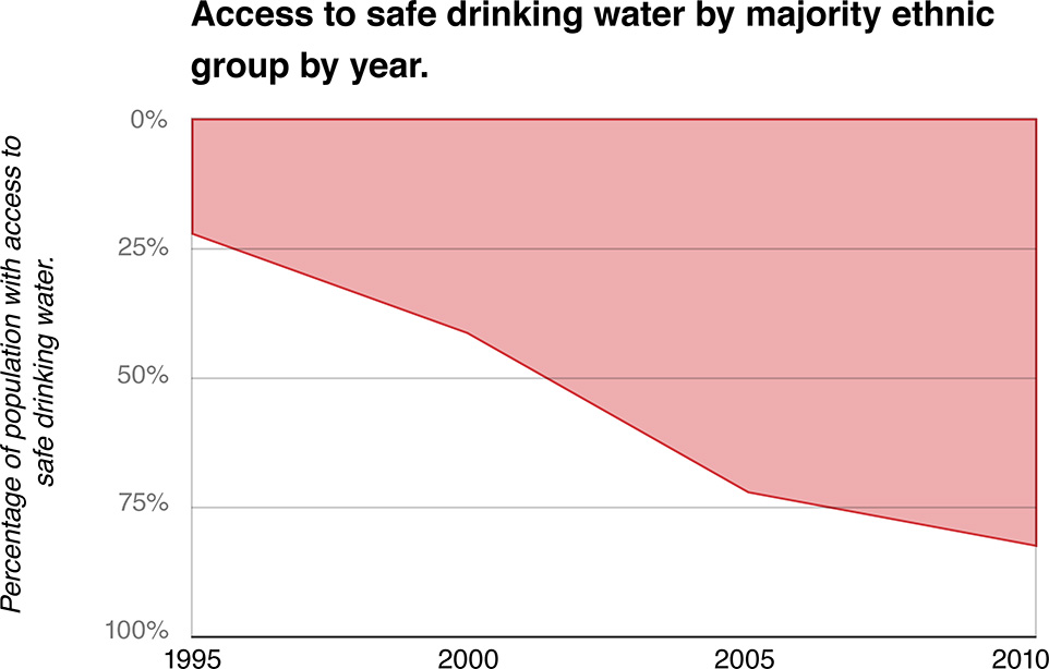
The Y-axis has been inverted, hence, creating an illusion that the access to safe drinking water has declined.