Bubble charts give you the ability to visualize up to 4-dimensions of data and are an absolute fan favorite! They communicate the count or proportion of a variable where the size of the bubble reflects the quantity in two dimensions. We could add the third dimension by plotting the different sized bubbles with x and y axis like a scatter plot. The fourth dimension is added usually by use of different colors (shades of a color) to sort data into categories.
The bubble chart shows a lot of data all at once, making it tricky and hard to understand the answer on the first go. The difficulty is in interpretation of bubble graphs. While they can give a quick comparison of values by looking at them, they are not as well suited for accurate determination of analysis of your data.
Best practices for Bubble Charts:
- Use when the audience is aware of the data and educated.
- Size bubbles appropriately.
- Do not use when data results in overlapping bubbles.
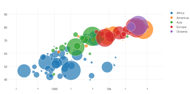
As we can see in the chart, there is total chaos and it creates a piece of modern art, with multiple perceptions at the user end. With no prior information on what data is being represented there is no clear understanding of the details and requires additional effort to decipher and generate an analysis. Hence at times bubble charts are as useless as pie charts.
http://www.quickbase.com/quickbase-blog/when-to-use-bubble-charts-to-display-your-data
https://visage.co/data-visualization-101-bubble-charts/
http://www.msktc.org/lib/docs/KT_Toolkit/Charts_and_Graphs/Charts_Tool_Bubble_508c.pdf