The following graph is from Bloomberg (2013); which for many is a trusted source. Unfortunately, even this trusted source has misused power of statistics to deceive people.
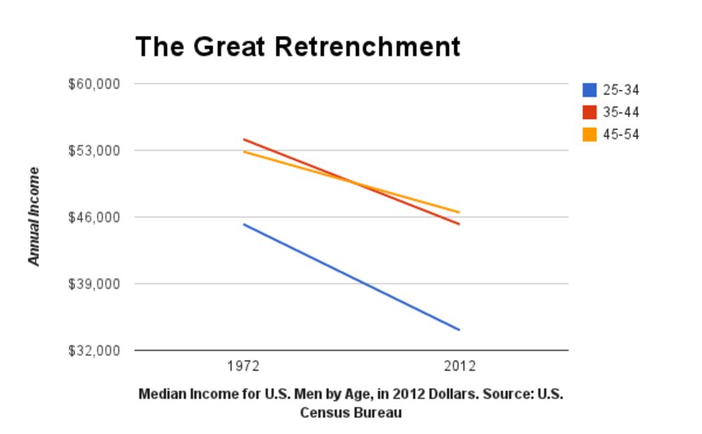
Looking at this graph, a common man would be highly concerned with the slope depicting sharp decline in median income for U.S. men but in true sense there are more flaws with the graph than with the fact depicted.
The first flaw is regarding incomplete information. The designer has only shown 2 data points and no information is depicted about what happened in middle years. On investigating more from U.S Census data one can see that median income was actually stable between 1972 and 1999 which is contrary to what designer has depicted. Also, for age 45-54 there was actually an increase in median income till 2000 and only after that there was a decline in the income.
The second flaw is with the y-axis. The designer has deliberated truncated the y-axis so as to magnify the gap. If the same graph is seen making y-axis start from zero, the decline doesn’t feel much and our perspective about the problem changes.
Lastly on investigating on the data more, we find that from 1947 to 1972 there was steady increase in median income and since 1972 (end of Gold standard) there has been a slow decline in the number. The designer has deliberately chosen 1972 and 2012 to catch attention of its readers. The same news can be changed to “Income for men has risen” by giving 1947 and 2012 as new data points.
References:
Image & Article Source: https://www.bloomberg.com/news/articles/2013-12-31/for-u-s-men-40-years-of-falling-income
Other Source: https://medium.com/i-data/misleading-with-statistics-c63780efa928#.qaw475rwg