Big Data and Data Visualization

Why Visualization is the most significant “V” for Big Data?

Big Data Analytics is the analysis of huge data sets with large volume, variety, and velocity. But as the term says, the information extracted from it will be large in size which is not beneficial in decision making. Big data Analytics should be focussed on understanding the relationships between people and processes and then defining patterns that will lead to outcomes that are user specific and determined. Data Visualization helps in identifying the data that is important to produce graphs and charts that are relevant to get insights from Big Data.

Challenges with Big Data Visualization are Visual Noise, Information Loss, High rate of Image change or Data Change and Performance Requirements- Scalability.

Some probable solutions are:

  • Veracity: Reliability of the data sets is important as the analysis will not yield good results if the integrity of the data is questioned. Data Visualization helps in checking the quality of data following data governance. It also helps to deal with outliers- to remove them or to highlight them using another chart.
  • High-Performance Requirements: Increased memory and powerful parallel processing can be used for high dimensional data. By performing Interactive Visualization: selection, linking, filtering and rearranging or remapping, Big Data dashboards can be used to display meaningful results.

The most effective Big Data Visualization techniques with their Big Data class are:

  1.  Treemap and Circle Packing: Applicable to hierarchical data.
  2. Sunburst: Volume & Velocity.
  3. Parallel Coordinates: Volume, Velocity & Variety.
  4. Streamgraph & Circular Network Diagram: Volume & Variety.

Data Visualization is the most significant way Big data will be accessible to large and wider audience and will be essential to transforming analysis and reporting to effective decision making.

Source: http://pubs.sciepub.com
Interactive visualization can make five-year drought disappear fast

It is a good year of 2017 for California because most of drought cleared out in the beginning of this year. With interactive visualization we can experience the drought disappearing process in California faster and clear.

  1. Color tells the intensity- Dark Red. Red as universal color meaning stop or severe. In this interactive visualization they choose dark red as most intensive level. With the universal color no further explanation is needed and it makes the visualization clear and meaningful.
  1. Only one focus- California. The focus in this visualization is very clear. It only focuses on one state in the U.S., neither more general nor more detail information is needed. Readers can just focus on how the drought is changing in the state.
  1. Well-defined time period- Five years. The past five years are meaningful because during the years California has been experienced severe drought, more time period or less would not bring the visualization result as effective as this visualization.
  1. Clear time sequence- 2011 to 2017. Readers can see the changing of time sequence and can stop anytime to check the drought intensity. Maybe the single data itself is not meaningful but when the data is in the time-sequenced visualization, there is more meaning in each single data.


Reference:

https://ww2.kqed.org/science/2017/02/24/watch-how-fast-a-five-year-drought-can-disappear/

Google Flights

Ever wondered how many things move in the sky daily? Well, Google Trends came up with an answer to our question with their Google Flights Visualisation. Google Flights is a visualisation designed to show the flights moving over U.S. one day before Thanksgiving, 2015. The visualization begins with the start of the day and shows all the flights that have crossed U.S. in that one day till midnight. While the visualization does not give the flight details, users can easily understand which times of the day are more popular for international and domestic flights and, for flights to and from different hubs around the country. The visualization does use different color codes for various airlines but due to the fast-moving inbuilt timeline, users cannot make the most use of this feature.

In my opinion, though the visualization is very attractive, it is not very informative. No real data can be inferred from just looking at the screen. There is no option to filter out the data based on international or domestic flights, or based on different airlines for any given point in the day. The zoom-in and zoom-out feature also doesn’t seem to be of much help since no new data is visible even after zooming in on a particular point. According to me, this visualization could have been better if the user had tried to represent more data than focusing on animations.

Reference:

http://googletrends.github.io/iframe-scaffolder/#/view?urls=Thanksgiving%202015%7Chttps:%252F%252Fgoogledataorg.cartodb.com%252Fu%252Fgoogledata%252Fviz%252Fbf595f4c-7381-11e5-9ec5-42010a14800c%252Fembed_map&active=0&sharing=1&autoplay=0&loop=1&layout=narrative&theme=red&title=A%20day%20in%20the%20life:%20US%20Thanksgiving%20on%20Google%20Flights&description=The%20day%20before%20Thanksgiving%202015%20shown%20in%20US%20domestic%20and%20international%20air%20travel%20booked%20with%20Google%20Flights

PRINCIPLES OF DESIGNING A DASHBOARD

The advent of dashboard designing software has made dashboard designing quite a simple task. Data collection, refinement, quoting the references and linking the same constitute most of the work to be done before dashboard designing. It should be kept in mind that a dashboard is a tool that makes it easier for the viewer to make sense of the plethora of data and complicated relationships which has been assimilated in it. Hence, a dashboard should be simple, user friendly and eye-catching. Anybody would be able to design a near-perfect dashboard if they imbibe and put into practice the following few principles:

  1. Right Chart Type: This might seem pretty obvious but it has the scope to destroy all the work previously done on the project. Selection of the right type of the chart has to be the foremost consideration before designing any dashboard. Different charts have different strengths and weaknesses and as such, care must be exerted in choosing among them.
  2. Overcrowding the representation: A dashboard loses its purpose and becomes meaningless if the target audience cannot easily grasp the information given in that. That is exactly what happens when too much data is squeezed into a particular chart. The idea of making dashboards must to be to make the data representation lucid and not to put every bit of information together.
  3. Playing with colours: Colours are great at commanding attention to the representation, but care needs to be exerted while choosing them. Intense colours may be used to highlight something of importance, but it might not be a good idea to use multiple dark colours as this may overwhelm the senses of the viewer and deflect the attention from the important things. Moreover, for comparison studies, it would be a better idea to use different gradients of the same colours.
  4. Providing context: A dashboard is just a nugatory collection of figures, shapes and colours if no context is provided. Therefore, providing context is the most important part of any dashboard and should be at the top of the checklist. Some of it may seem obvious to the designer, but it is always a good idea to provide context for everything that the designer wishes the audience to know.
  5. Consider the audience and the venue: Another easy to ignore, but a potentially tricky factor that to be considered is the type of audience, the venue and the media that is used to view the dashboard. Each dashboard should be tailored to suit the particular user group it is designed for.

Source : http://www.datapine.com/blog/dashboard-design-principles-and-best-practices/#

And the Oscar goes to….

This year’s Oscar Ceremony, as always, has attracted the interest of a great audience, including the Hollywood, mass media and movie lovers. When I was back in China like five, six years ago, I would watch the real-time streaming Oscar Ceremony in the afternoon, and can name about what prize goes to whom or which. This year I was just waiting to read the media’s post. Except for the “funny mistake”(not funny at all) of announcing La La Land as best picture but actually the prize belongs to Moonlight, making some fast media quickly post the final wrong full Oscar result, this Oscar’s winning result fits with most of the prediction on fivethirtyeight, as you can see from here and here.

Firstly, let’s go to the prediction article. The author has collected the points of each nominee for different categories from multiple movie guilds. As we can see, all the predictions except the best picture one turns out to be right. This is a simple data visualization, just ranking the Oscar nominees by their total points from each source in a table. Although we did not know how the author get the data from those sources and what he or she did to get the result numbers. Anyway, these predictions are making Oscar less to be expected. Please also refer here to see the model used in these predictions, this is simply math.

The other article calculated the probability predicted by the betting organization. It has also borrowed the result from the first article. The visualization in this article is a set of line charts, that carefully record the implied probability based on Paddy Power betting odds. For the main categories, we will again find that La La Land supporters will lose the bet at best picture to Moonlight.

At last, I should say those visualizations are very concise and easy to understand, no fancy tables or animations. Also in my opinion, Oscar is about art, but art is very difficult to evaluate nowadays, in this sense, I think I trust data more, which is relatively more impartial. As long as we have data, we can visualize it, and make it as a living. 😀 Thanks, data, thanks, Oscar.


Is it the Earth’s Orbit ???

bloomberg-climate-change

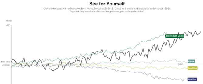
In our course, we have been taught to tell stories through our visualization, rather than simply showing the data. That is exactly what Bloomberg Business has achieved through their visualization. Bloomberg has come up with a story telling visualization to list down the various factors which might be the reasons behind global warming. Each screen of this visualization lists on of the many factors, starting from Earth’s orbit, sun, deforestation, to Greenhouse Gases; and shows the effect of temperature of all these factors over the years since 1880 to 2000. All the information is displayed in a very informative fashion with the help of line graphs and trends lines moving along the time line. Also, there is an explanation for each of the graphs mentioning why the developer has considered a particular factor as a reason for global warming. There are also graphs combining and comparing two or more of the above-mentioned factors with each other.

In my opinion, Bloomberg has done a great job in telling their story. The visualization is both interactive and informative. The developers have been able to establish a perfect balance between the two by creating attractive visualizations and also focusing on the main purpose of visualization, which is giving information.

Reference: https://www.bloomberg.com/graphics/2015-whats-warming-the-world/

How Walmart uses data visualization to convert real-time social conversations into inventory?

Data driven decisions at Walmart is more like a norm than a exception. WalmartLabs analyzes the data from the social network sites through their tweets, pins, shares, comments and so on to get retail related insights.

In an age where sharing of information has been made easy, social media is paying a vital role in creating better understanding of consumer likes through social buzz. Such social buzz typically precedes all important product launches. People are frequently expressing their views about the latest smartphone or the coolest video game to be hitting the shelf. WalmartLabs taps this social buzz and helps buyers plan their inventory and assortment.

Consider the following visualization of Sony’s Android phone Xperia Z showing a spike in social activity that helps its buyers to make smarter decision ahead of time.  Walmart’s buyers also get a sense of what they should stock online and in stores by checking out pins on Pinterest. Top pins feed into a social-media analytics dashboard for buyers. So do the reports from Twitter that engineers have created by visualizing and analyzing Twitter feeds. Buyers can see when the number of tweets on, say, gel nail polish peaked and see which colors were the most popular in which locations.

Such humongous amounts of social data are generated online, and it is crucial for retailers to transform it into meaningful information. These insights is what enables the buyers to understand the customer demands and plan their inventory accordingly.


Source: http://www.fusioncharts.com/whitepapers/downloads/Towards-Effective-Decision-Making-Through-Data-Visualization-Six-World-Class-Enterprises-Show-The-Way.pdf

Meteor Showers: Celestial anomaly mechanics demystified with visualization

Meteor showers on Earth are caused by streams of meteoroids hitting our atmosphere. These meteoroids bits of rock that were once released from their parent comet. Comets can produce debris by water vapor drag. As a comet orbits the Sun it sheds an icy, dusty debris stream along its orbit. If Earth travels through this stream, we will see a meteor shower. Although the meteors can appear anywhere in the sky, if you trace their paths, the meteors in each shower appear to “rain” into the sky from the same region.

We always wonder how the meteor shower work and also where and how do the originate. This visualization tracks their path and origin and also the day of the month it will occur.This new 3D experience offers a great way to understand the journey of the meteoroids and the sources of meteor showers on Earth. All major meteor showers are mentioned in this visualization. The different functionality like viewing the meteoroid shower from the earth or following the earth in its orbit, provided in this visualization helps the user understand the actual dynamics of a meteoroid shower and also tracks the time of occurrence.

This visualization shows these meteoroid streams orbiting the Sun, some stretching to the outer regions of the solar system. It lets you select the meteor shower in the menu to see the corresponding meteoroid stream in space.

Visualization: Click Here

Note: Their meteoroid orbits are based on those measured by NASA’s CAMS video camera surveillance network and were calculated by meteor astronomer Peter Jenniskens of the SETI Institute and NASA Ames Research Center.

Reference: Click Here

Know your Audience

Over the years, dashboards have evolved as a powerful tool that enables business users to make better and faster decisions backed by data. It serves as an important communication tool to transmit complex information about your business performance. When creating a dashboard, the first and foremost question to keep in mind is: Who is the intended audience? If the audience is not defined clearly, the message that is communicated may not be effective.

Audience Spectrum

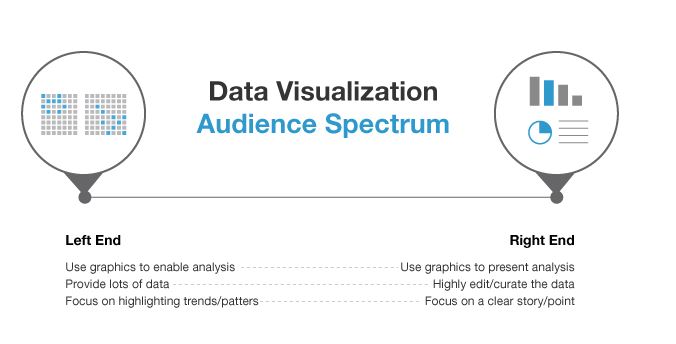
Imagine a spectrum of audience for a dashboard. On the left side, we have data-hungry analysts and scientists who want as much information as possible. To cater to this audience, several dimensions in the data need to be squeezed into a tiny amount of space in the dashboard – so it’s vital to keep the graphic as clean and compact as possible. Rather than portraying a specific story and guiding the audience, we simply present the information in an easily consumable fashion giving the user full control in navigating the information.

On the other end of the spectrum, we have an audience that’s not as data savvy and would like the storyline presented with highlights and conclusions. The audience here is not familiar with the information and neither do they have a lot of patience to pore through it. One needs to advertise the data and explain it as efficiently and as quickly as possible with a primary focus on the conclusions.

These are the two extremes of the audience spectrum and there are varying degrees in between. It’s important to understand where your audience stands on this spectrum, and how much data do they need to see. Follwing is a link to one of the visualizations that I think might be appealing to an audience
across the entire spectrum:

https://www.nytimes.com/interactive/projects/vancouver2010/medals/map.html

References:

www.klipfolio.com/blog/first-rule-dashboard-design-audience
blogs.forrester.com/ryan_morrill/13-11-11-data_visualization_catering_to_your_audience

Interactive data visualizations – why and how they should be used!

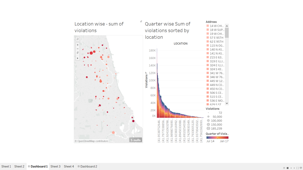
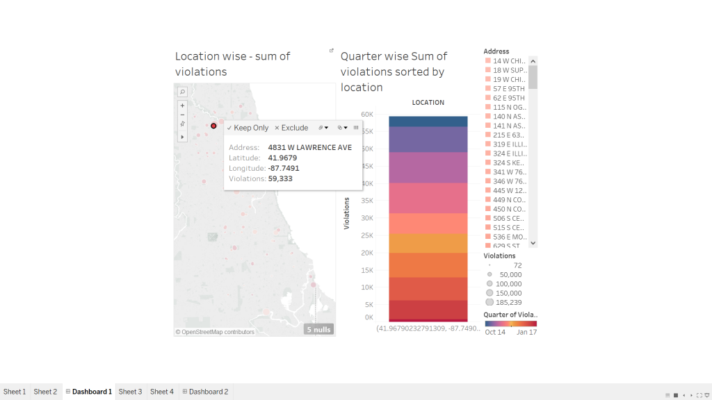
Last week we learnt about interactive data visualizations and its prominent highlights-how effortlessly and conveniently it merges and presents data based on different topics with the help of one common factor that binds them together. Interactive data visualizations are special types of info graphics that let the use play around, explore and essentially “interact” with the data and with what the visualization presents. However, like most other data visualizations, they have their own purpose and strengths when it comes to certain topics. In most cases, I have observed interactive data visualizations to be used in places where there is a lot of information associated with a certain data field (consider example of “state”) and cannot be adequately represented with one pie chart or line graph. This data is further sub-divided into related fields that tell us some more information about the “state field” like income or sex ratio, which would be further divided into income based on region or gender or occupation or sex ratio based on age group etc. While I was working on the project on interactive data visualizations, I realized that the entire essence of a good interactive diagram is the choice of field that would bind the two visualizations together. A field that is selected to be used as a filter, should relate the two charts in such a way that clicking on it would expand and bring forth more information about the concept. At the same time, we must be careful that the “filter / highlight action” on the dashboard is not repetitive of what the first chart does, instead the “action” functionality should bring to light additional information about the same field that could be completely represented using the first diagram.

2017-02-26 (1)

2017-02-26

P.S. I have referred by own assignment for this week- Interactive data visualizations to put forth my opinions for this blog.