Public Healthcare Data Visualization

Nowadays data plays an important role in public healthcare management. To better understand what stories large volumes of data tell, we need accurate and clear data visualizations to uncover the actionable insights.  Below is an example of data visualization created by Ken Patton and Dr. Heather King, which analyzes health outcomes by prevalence across a number of demographic factors including geography, gender, age, and activity levels.
Diabetes

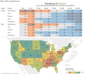
The cells displayed in different colors and percentages immediately convey the messages that African-Americans and people with annual income between 10-15k have higher prevalence of diabetes. The distribution map indicated that diabetes are more prevalent in Pennsylvania and Southern States. The appropriate use of colors enhanced the story telling. It is accepted that colors have meanings. The warm colors (i.e. red, orange) usually describe danger or worse situations while the cool colors (i.e. light blue) usually indicate safe or less worse situations.  So it’s a good design of data visualization as it’s easy to catch the points and very intuitive.

source: http://www.tableau.com/stories/workbook/tackle-government-data-public-health

reference: http://www.healthcareitnews.com/news/best-practices-healthcare-data-visualization

Food Trend

The Rhythm of Food is an interactive data visualization website jointly created by Google News Lab and Truth & Beauty.

The project examines a wide range of  edible items, from sushi to Chinese dumpling, showing their changes in popularity among different seasons from past 12 years (2004-2016). The data sources come from Google Search Trends, a data pool which records what interest people have in.


The two things I am very interest in were its data validation process and its interactivity. To keep the data be valid at first, the project uses Google Knowledge Graph topics to obtain the clean data. For example, the search record of “apple computers” will be distinguished as fruit “apple” and thus omitted by system. The data chart has high interactivity. User could search the trend of a food and apply three levels of filters to obtain a specific kind of result.

However, the data from google search engine might not reflect the real world. The system could present a more accurate data visualization by enrich its data sources in future.

 Reference:

http://rhythm-of-food.net/

https://blogs.scientificamerican.com/sa-visual/visualizing-the-rhythm-of-food/

Fitbit

Fitbit is a company headquartered in San Francisco, California, known for its products which tracks all the daily activities of a person including number of steps walked, climbed, ran; as well as heartbeat, sleep time and other metrics involved in the health of an individual.

Fitbit provides this interactive dashboard which shows all the physical activities of a person and the consumption of food to keep track of the fitness level. The daily stats highlights the progress towards daily activity goals. Each tile on its own behaves in a dynamic way and allows us to see more detail information and history.

Having a better view of the data and the daily progress, one can make more informed health choices and know what exactly he/she is lacking behind.

Reference: https://blog.fitbit.com/heres-what-makes-the-new-fitbit-dashboard-awesome/
Photo source: https://static0.fitbit.com/simple.b-cssdisabled-png.hd53c63eab7cc1316845e4b4084fbc504.pack?items=%2Fcontent%2Fassets%2Fzip%2Fimages%2Fapp-dashboard%2Fscreen%2Fweb_Next_Gen_Dash%402x.png

Billboard Top 100 over the years

The Billboard Top 100 has become a standard in the music publishing industry for songs based on their record sales and their “air time”. A look at the referenced visualization shows the top 5 songs over a period of 58 years.

Blog1

Though the visualization helped me take a trip down memory lane, I had few gripes with the presentation of it. First, the layout used for the entire visualization wastes a lot of real estate on the screen. More precisely, the filters for changing the year are placed at the bottom when they ideally could have been placed on the left side where the most visible filter (find an artist) is placed.

Secondly, the axis for the main visualization element is difficult to read as the horizontal axis (containing the month/year) is constantly moving and the vertical axis (containing the chart position) connects with the song across the timeline using a line graph which is difficult to read and grasp when the visualization is in “play mode”.

Furthermore, the threshold colors used are not intuitive since there are no legends to understand the gradient change i.e. from red to blue to light grey.

Reference: How Music Evolved: Billboard’s Hot 100, 1958 – 2016: http://polygraph.cool/history/

Tips For Effective Data Visualizations

  1. Use Good Data: Data quality is the first principle. Good data should be accurate, concise, and valuable. Use the data that is meaningful and targeted to the reader rather than some common knowledge that everyone knows.
  2. Tell a story: Make your visualizations as a logical story. Although graphs, charts, tables are helpful and attractive, they are not all of your presentation, but proper complement to boost your message and idea.
  3. Choose right visualization and keep it simple: Some graphs could be very creative, colorful, fancy, but make sure you choose the proper and right visualization and keep it as simple as you can. Because the goal of visualization is to display your data accurately and easy to understand.
  4. Label the data: Give as much description and information to your figures, statistics, etc, so that the data is more easy to comprehend.  For instance, a title tells what you are going to interpret; an aix on the graph tells how the data is measured.
  5. Organization is the key: Good organization helps readers digest the information you want to convey. The organization of graphs and charts includes using the solid line or non solid lines, misrepresenting data, obscuring your data, etc.
  6. Be open to unexpected insights: Schedule a little bit more time in your iteration for dealing with unexpected insights. When a new insight is uncovered, try to think about the impact. Sometimes, an insight looks like not directly relative to the topic, but you’ll find it delivers business value in the end.

Reference: 

  1. https://www.thoughtworks.com/insights/blog/five-principles-effective-data-visualizations
  2. http://www.copypress.com/blog/9-tips-for-making-your-data-visualization-more-effective/
  3. https://blog.hubspot.com/marketing/data-visualization-mistakes#sm.0001sa9p6lkrrcpjval18kj8srjdb

The Traps When Creating Data Dashboard

Decision makers love dashboard because it offers them snapshots of operation processes, marketing metrics, and key performance indicators. Moreover, dashboard provides just-in-time information. Executives can make rapid adjustment. However, dashboard may mislead decision makers. There are three possible traps.

  1. The important trap: dashboard doesn’t have sufficient information providing to decision process. This may be caused by software default measurement or the consultant who establishes the analysis and does not understand that business. Therefore, when creating dashboard, designer should know the business well and make sure all the information on the dashboard is useful and critical. Dashboard should show the priority of business. It should align with business goal and business model.
  2. The context trap: it is caused by designer’s subjective judgement. Although all the elements on the dashboard are true, they build up an analysis with bias or without full consideration. Therefore, interpreter and user of the dashboard to ensure that the most relevant and useful metric is conveyed.
  3. The causality trap: it is caused by misattributed causality. Designers may present the grouping or data that doesn’t have causality.

To avoid these traps, in my opinion, knowing the business well, understanding the user, and getting other’s opinions may help to create useful, thoughtful, and effective dashboard.

Reference: https://hbr.org/2017/01/3-ways-data-dashboards-can-mislead-you

Uber vs Lyft: Who Wins?

The days are gone for standing on a street and waiting to get the attention of a cab! Look around any major city and you’ll see that ride-sharing services Uber, Lyft and others are nearly as ubiquitous as taxis. These services have established themselves in New York, Los Angeles and San Francisco, and are rapidly making their way into new parts of the US and the world. There is significant increase in demand for ride-sharing services as hitching a ride is as simple as whipping out your phone, tapping in an app, and waiting for a black town car or pink-mustache-flaunting Prius to arrive.

Both the companies draw customers for notably different reasons. Here is a comparison of Uber vs Lyft in a few basic categories.

uber_vs_lyft

This is easy and simple form of visualization that conveys enough information that helps customer to select proper riding option. The color code easily distinguishes two choices. The data shows people who use Uber are more likely to cite “level of service” and “convenience” as reasons for using the service, while Lyft users are more likely to answer “meeting new people” and “supporting individuals in my community.”

Armed with all this information, you’ll hopefully be able to make a more informed decision on whether Uber or Lyft are right for you, and how to have a successful experience hailing a ride from your phone!

References:

  • https://www.compare.com/auto-insurance/guides/uber-vs-lyft-vs-taxi
  • https://www.cnet.com/how-to/uber-lyft-ride-share-ride-hailing/
  • https://www.survata.com/blog/fist-bumps-or-black-cars-uber-and-lyft-attract-users-for-different-reasons/


Changing the Game

Data visualization in sports is straightforward. For example, the most intuitive way is to show the ball movement in basketball court is to visualize the data on a basketball court like below.

Like the graph shown, the best decision that Kawhi Leonard choose would be passing the ball to Danny Green at this point. It will give the team EPV(expected possession value) 1.08 points. the data visualization using the color from light to dark to show the transitional Value. The visualization is very easy to interpret. Coaches may change their decision bases on this.

For the data prepare and cleaning, the STATS SportsVU cameras are installed in arenas. The camera set tracks every ball movement and the results. So the data is very reliable.

The visualization will not only show the ball movement decision, but the player movement. There are 82 games for one NBA team to play in one season. Then the file size, complexity and success rate are going to increase. So in the future, basketball will not be the only sports using this technology. The way athlete playing the game is going the change.

One more thing I found interesting in basketball data analytics is that not everyone is buying it. For example, Charles Barkley, a former NBA player now a basketball commentator at TNT, constantly raging against the correlation between basketball data analytics and team performance. It is always fun to watch old school analytics arguing with new one.

Reference:

Welcome to Smart Basketball

https://www.theatlantic.com/entertainment/archive/2015/06/nba-data-analytics/396776/

Taking Data Analytics to the Hoop

http://www.ibmbigdatahub.com/blog/taking-data-analytics-hoop

NBA drafts Big Data

https://rc.fas.harvard.edu/news-home/feature-stories/nba-drafts-big-data/

Gay rights in the US, state by state

The visualization of gay rights in the US is definitely an exceptional work. I find that the visualization is simple, intuitive and yet one can effectively understand gay rights in different states.

Screen Shot 2017-01-15 at 3.54.14 PM


The first thing I like about the visualization is the usage of concentric circles. This is an excellent way to represent rights in individual states (along with regions) as this saves a lot of space and each state is depicted in the same chart. The placement of legend in the interior of the chart is also strategic as the traditional legend space is used for highlighting of rights of individual state as selected.

The second thing I like about the visualization is the coverage of various topics and simple representation of the “Maximum”, “Minimum”, “Prohibited”, “No law or unclear”. This visualization makes use of different colors/patterns to represent and hence does not require more than one chart to represent different states.

The chart is also not over crowded and the reader not feel overwhelmed by the information. Hence even though the information is represented in one chart, utilization of concentric circle makes the representation of gay rights across 50 states for  seven different attributes simple yet intuitive.

Source – Gay rights in the US, state by state

Nokia – Microsoft acquisition. Worth it?

In early 2000, Nokia was at the most luminary position in terms of mobile phone market. However, within a decade, Nokia was uprooted from the mainstream market due to numerous reasons. In 2013, Microsoft acquired Nokia for $7.9 Billion, to provide Windows Operating System for the Nokia mobile hardware and it was hoped that Nokia shall revive its market position. Microsoft invested in Nokia with the aim of providing hardware for its Operating System. However, as rightly shown by the visualization shows below, Microsoft spent billions on a sinking ship.

Microsoft-Nokia

The figure depicts the Nokia mobile phone sales from 2010. When Microsoft announced the strategic partnership in 2011, the global sales of the Nokia mobile phones was 105M. When the partnership was materialized in 2013, it fell drastically to 61M. Further, towards the completion of the acquisition in 2014, Nokia’s ship had already sunk with the global sales to a meagre 40M only. This depicts a sales dip of 62% in just 3 years. Leading this, Microsoft announced acquisition impairment charges of $7.6B.

Microsoft is the leader the Desktop OS, but it completely failed to integrate its software to Nokia’s hardware. Hence, Microsoft could not revive Nokia’s sinking ship even after being the market leader in desktop OS.

Source:https://www.statista.com/chart/4848/nokia-and-microsoft-mobile-phone-sales/