Global Warning – A Myth or Reality?

Tweet
Graph 1

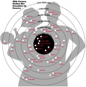
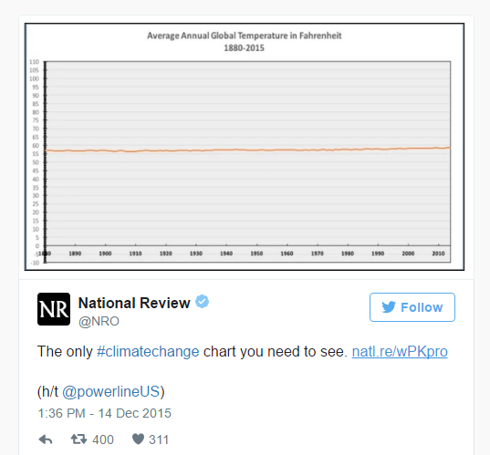
In Dec 2015, National Review published an interesting tweet that showed visibly no major change in the annual global temperature from 1880-2015.

This graph makes global warming look like a myth. The temperature has been shown as almost constant with no significant change over time. Then why is everyone so worried? What are they saying when they talk of rising temperatures and its harm to the planet earth?

Lets take a closer look –

Temperature
Graph 2

This is a classic example of how not using the right scale can distort data and deceive people. What Graph 1 ignores to mention or highlight is that even a change of one degree in average global temperature is important and by starting the y axis from 0, the scale is making the temperature change look irrelevant. Misleading visualizations having skewed axes results in misinterpretation of data.

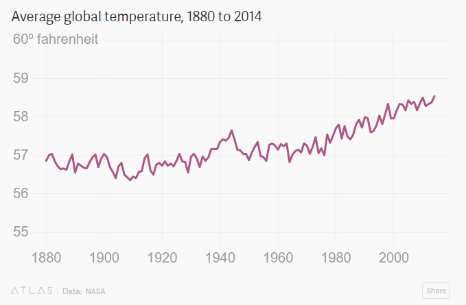
Graph 2 on the other hand, by starting the y axis at a higher number shows the pattern accurately and thereby will help in making informed and correct decisions.

Hence it is very important to choose the right y- axis and it is perfectly acceptable to not start your axis at 0 because at times, like in this case even the minutest fluctuations matter.

Source –  https://qz.com/580859/the-most-misleading-charts-of-2015-fixed/

Is my perception correct?

Picture1

                      Source: © Understandingusa (2007).

The above picture was published in www.understandingusa.com in 2007 and represents Civilian War Casualties in 20th Century by country.
The designer had idea of a “shooting target” as a reference behind the above visualization and as maximum points are earned in the center, the innermost circle represents the countries with maximum casualties.
The flaw with above visualization is related to “how different people perceive same thing”. In this case, the problem is, not all people are aware of shooting sports and a lay man would correlate this with concentric circles and without looking at the description would infer the biggest circle to be countries with maximum number of deaths, which is not true. Only, reading the graph carefully with description would make it clear that such is not the case.
The other issue is regarding choice of image; image of a family is used as a target which might induce emotional harm to some of the viewers. Again the issue is related to perception, this graph might be acceptable for people who regularly use such visualization to gain attention of audiences but might be inappropriate for people less inclined towards such crude representations. Therefore, it is always better to consider various perceptions and alternative methods of raising awareness than using such arousing graphics before designing a graph.


Reference:


The power of maps in visualization

Geo-spatial visualizations can be immensely powerful. Consolidating data from several countries across the world and representing them in a single visualization with tools such as intensity or heat map can tell quite a story. It is not always necessary to fill the map with all available data points. The map can be powerful even with minimum representation. In that aspect, I found the ‘Real time Web monitor’ by Akamai very interesting.

Akamai Real Time Web Monitor


Rather than showing the web traffic % in every country, the map only highlights countries with above normal network traffic. If one needs to dig deeper, the country-wise web traffic can be drilled down by expanding the plus/minus controls on the left. To make it simpler for users to locate a particular country, the countries are grouped by their respective continents. However, it must be noted that the web traffic for every region is calculated as a percentage of global network traffic while the above normal percentage figure is calculated based on region-wise normal network traffic. This does not stand out distinctly until you take a closer look at it.

I took a snapshot of the web monitor at 9.45 PM PST Friday 1/20/2017. The results were not surprising. Overall, the US web traffic was above normal, with California alone constituting about 3.9% of global traffic. In Asia, Japan topped the list followed by India and China. Underdeveloped countries in Africa had web traffic of only 0.1%.  It would be interesting to see how the trend changes during weekdays.

Image source:

https://www.akamai.com/us/en/solutions/intelligent-platform/visualizing-akamai/real-time-web-monitor.jsp

When Connections Matter!

In this day of technology, our professional network has immense value as we need the right connections to get us places. Everyone today relies on their network to keep friends and family updated, to get in touch with people of similar interests, to find people suitable for their organizations or start a new business venture.

Socilab is an online site where we could analyze how wide our LinkedIn network is. Considering my network chart (image below), I found that I have multiple clusters of people either from the same location, from the university I studied in or my prior workplace. Considering it is real time data, the network chart helped me analyze my strong networks and where my network links are weak.

Network Charts are not very easy to read, but in situations like these give us an understanding on how wide and how diverse your network is with respect to location or industry. Use the link  http://socilab.com/ to create your own network map and analyze your connections.


Screen Shot 2017-01-22 at 11.27.03 AM


ENERGY CONSUMPTION BY SOURCE IN THE USA

Being the fifth largest country in the world in terms of land area and the third largest in terms of population, it is not surprising to find the USA in the second position in terms of percentage consumption of energy(19.2% of the total world consumption). This figure can be reconciled with another recently acquired data: a dramatic climb in urbanization(more than 80% as of 2015) resulting in a commensurate rise in ‘megaregions’ – Cities which either have/are projected to have a population of 57-63 million by 2025. Consequently, the energy required is derived from a wide range of ‘primary sources’.

pic1


The pie-chart above provides a bird’s eye view of the distribution of the sources of energy. The chart is pretty straightforward and serves its purpose with aplomb – Even a perfunctory glance enables the viewer to grasp the percentage distribution of energy sources, both renewable and nonrenewable. But things get more interesting(or irksome, depending on the way one sees it) when the association between the energy sources and percentage utilization too is incorporated into the same representation. Here, have a look.

pic2

This representation shows (almost) everything depicted in the initial representation and much more. The difference between the two is stark as a cursory glance is much more likely to confound the viewer than to provide them with an idea about the energy distribution. But upon careful comprehension in a systematic manner, it becomes apparent that the second representation is packed with more information as it depicts not just the source of energy and the sector where it is used, but also the percentage of energy source used and the percentage of energy generated in the corresponding sector. For example, 72% of petroleum(which provides 36% of the total energy) provides 92% of the energy required for transportation(which as a whole uses 28% of the total energy).

The representation above epitomizes the adage ‘A picture is worth a thousand words’. Once the viewer grasps the key required to unravel the huge amount of data depicted in the representation, it provides him/her with everything he/she needs to know about energy sources and its utilization.
Source – http://www.eia.gov/energyexplained/?page=us_energy_home


How to Build a Typical Dashboard

Here I have selected a typical dashboard screenshot from the Internet.

First of all, let’s look at the question, what is a dashboard?

For administrators(admin) at the back end of a website, a dashboard helps them to view data and manage the website.

For users of online services, dashboard makes them know better about their services with distinguishable icons, numbers and of course, charts. The charts are of different forms to present data.

In short, a dashboard is the home page of a control panel. A customized dashboard can be used to present anything the user wants. Followers at Social Networks, updates of news, weather, stock status, income, outcome, taxes, emails, and so on. With a useful dashboard, you don’t need a secretary to be a boss. You get the sense of control.

I have once interviewed with a company, who focus on building the control backend for companies, and they asked me how to design the layout of a dashboard. And here is my answer:

  1. Separate modules on the dashboard with consistent gaps,
  2. Use consistent and simple icons and charts to simplify the contents on the dashboard,
  3. Choose distinct color for different modules,
  4. Last and the most important, a dashboard doesn’t need to be fancy, but meaningful to users

Dashboard is really common nowadays, we can find it on Amazon Web Services, Google Cloud, WordPress, GoDaddy and many other websites, most of which are offering web hosting and managing services.

As I’m going to build one dashboard now, I’ll make it useful at first, and add more functions and decorations step by step. Hope I can build something like the image posted above. 😀


Overview of Global Workforce

Gallup created three key indexes: Unemployment, Underemployment, and Employed Full Time for an Employer to measure the global workforce in terms of employment. The metrics are based on Gallup data collected since 2009 in 129 countries.  We can quickly get the idea by looking at the two graphs below.

1

2

In 2009 and 2010, Mongolia, Sudan, South Africa, Spain, Columbia, and Venezuela had high unemployment with a rate of more than 15%. China, Germany, Belarus and some African countries had unemployment rate as low as less than 5%.  When we looked at the percentage of population employed full time, we can read a different story. China had a low unemployment rate but only a small portion of these employed people were working in full-time basis. The percentage is even low in many Africa countries with not bad unemployment rate. On the contrary, in most western countries, the full-time rates are much high which indicated a more stable and secure work environment.

The two visualizations did a good job in telling the message of the global workforce in terms of employment by using the map distribution and color segmentation.

Just a pretty picture

twitter


The pie chart in the image above reflects 100 most active Tweeters. The chart is neither conveying the information which it claims to nor is appealing to explore the information presented. The colors used to spread the data information makes it attractive and pretty. But representing the top 100 of anything and especially in the pie chart is always a bad idea. Plus the colors are spread out in smaller to smaller wedges making this visualization more like a puzzle to match the colors.

Also I think the data lacks with the percentage share. It would be better to limit such analysis to top 20 users with bubble or gantt chart. While using pie charts its better to limit pie wedges to maximum 6.

Source: http://chandoo.org/wp/2009/08/28/nightmarish-pie-charts/

Track your wedding

Screen Shot 2017-01-21 at 8.34.40 PM

Weddings are significant events in people’s lives and as such, couples are often willing to spend considerable amount of money to ensure that their weddings are well-organized. The most initial planning includes list of guests to be invited based on the budget finalized in which lot of documentation and paperwork is required. While preparing budget and proceeding with preparations this work can get more complicated.

My Wedding RSVP Status dashboard which can be created easily can help to track quickly how many people are coming, who they’re associated with, gifts received, thank you cards sent, summary cost information and more. When we update the lists dashboard can automatically reflect the changes.

I really loved this simple yet powerful dashboard which can help us to plan wedding appropriately and proceed with the preparations.The visualization above will help in order to make key decisions. Few examples of decision making based on this dashboards can be:

  1. How many people are yet to RSVP and number of people who responded with may be. We can follow up with those people to confirm there presence.
  2. Number of children attending the wedding so that the food preparations can be taken care of.
  3. The estimated expenses of the functions to be held. If the expenses are manageable or below the budget then we can think of inviting more number of people which were left because of the budget constraints.
  4. Count of number guests accepted based on relations to the bride and groom.
  5. Number of thank you cards we are yet to send for the gifts received.

Such dashboards ease our life and help us to organize the most memorable events of our lives in a more organized and efficient way.

Source: http://www.spreadsheetshoppe.com/wedding-rsvp-tracker-template/


The American Energy Spectrum

large


The visualization is about amount of energy generation, consumption and energy wasted in US in 2009.  Each energy generation and energy consumption source is represented pictorially using different colors and symbols.

The visuals on the left-hand side shows all different sources of energy generation with help of different colors. The total energy generation for US is 94.5 QBTU.  This energy generation is segregated to – energy used and energy wasted which is 40 QBTU and 54.5 QBTU.

Takeaways from this visualization:

  1. Coloring segregation: There are around 14 source of energy generation and consumption. Each source has been assigned a different color to distinguish visually.
  2. Simple to understand: All the complicated details have been shown in a simple manner. For example, Total electricity is generated from 8 different sources of energy. This has been clearly captured in pink line in the visualization.
  3. Highlights the problematic area: The most important point to keep in mind whether your visualization clearly depicts the underlying problem or motivation to make the visualization. This visualization clearly shows that out of total energy generated, 54.5 QBTU is wasted which is more than 50% and this needs to be addressed to utilize energy efficiently.

References: http://www.informationisbeautifulawards.com/showcase/444-the-american-energy-spectrum