Psychology behind information dashboards

Information dashboards should be designed keeping in mind the psychology of its end users. Below is an example of dashboard designed for marketing teams to collaborate on budget and keep track of spending on target. This dashboard has been strategically designed to provide a sense of control amongst its users. It gives the users necessary resources to predict and plan the future, helping them to complete critical tasks in time.

This Marketo dashboard helps marketing teams collaborate on budgets and keep spending on target.

Above is an example of dashboard for marketing teams to collaborate on budget and keep track of spending on target. This dashboard has been strategically designed to keep a sense of control amongst its users. It gives the users necessary resources to predict and plan the future, helping them to complete critical tasks in time.

Human mind is believed to have short-time memory and can’t store much information when bombarded with unusual pieces of data. The dashboard in above example has been designed in a way to overcome this limitation.  The use of charts and dashboards here reduces dependency on short-term memory. It’s easier to remember ups and downs in sales through a simple line chart than remembering exact figures from table. Also, this dashboard uses drill down option while giving a summary of critical data on a single page making it easier to understand the presented information. But most of all, its simple! Which is an important principle both in business and real life. These three factors make the above dashboards a good example of design which keeps in mind user requirements and creates a perfect dashboard.

Refernce: https://uxmag.com/articles/the-psychology-behind-information-dashboards
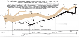
Napoleon’s invasion of Russia: A data chart.

Long before we had sophisticated tools to create visualizations, we used to rely on charts to convey our messages. These charts had to be manually drawn with precision and patience. One such chart which is famous for its precision and content is Charles Minard’s map of Napoleon’s invasion of Russia in the early 1800’s. A cursory look at the map below shows data labels strewn across as if it’s a painter’s canvas.

Blog2

However, a deeper look at this chart points out why this is considered as one of the pioneering works in the field of statistical graphics. To lay the details in simple terms, the chart combines five data plots:

  • Size of Napoleon’s army: The size of the army while marching into Russia is denoted by the width of the brown/beige bar, whereas the size while retreating is depicted by the thinner black band.
  • Direction of invasion: The direction is depicted in standard notation by using left-to-right as invasion and the reverse to denote retreat.
  • Geographical plot of invasion: The chart shows a map of Russia in terms of the places visited during invasion and retreat.
  • Temperature: Plot of the temperature recorded during the retreat.
  • Time plot during invasion: Shows the duration of retreat as a time series.

What impressed me the most in this chart?

  • The chart is able to incorporate and explain different dimensions in simplistic terms.
  • Even with the complexity of having a wide variety of dimensions, there is no loss or over-loading in details.
  • The addition of temperature is a clever one, since it allows the reader to make cause-and-effect analysis.

Reference:

Understanding the origins of data visualization

In today’s world, data analytics and visualization have become an indivisible part of the industries. One cannot imagine processing of data without dashboards, data visuals, charts, graphs and stats. All these modern tools and techniques make understanding and processing data very convenient. Instead of convoluting the mind with intense number crunching, data visuals illustrate the same information, making the most of human’s unique photo memory.

image (1) image (2) image

This post isn’t about a visualization itself, but the origins of it. Born in Scotland in 1759, William Playfair, was a graphical illustrator who visualized and created amazing illustrations from pieces of information. His older brother John taught him that whatever could be expressed in number could be done using lines. This laid the foundation of many of his successful visualizations. Over time, he created many pie charts, graphs and bar graphs for data like Scotland’s trading partners, exports and imports and prices affected by war. He later assisted James Watt who streamlined the steam engine and served as his clerk copying complex drawings of his inventions. He went on to create the pie chart: dividing a circle into proportionate slices to represent corresponding data. Over time, his knowledge and acumen to understand and present data, helped him to create many such illustrations which would later lay down the basis of modern day visualizations.

Reference:http://www.atlasobscura.com/articles/the-scottish-scoundrel-who-changed-how-we-see-data

Wind Trend Around The World

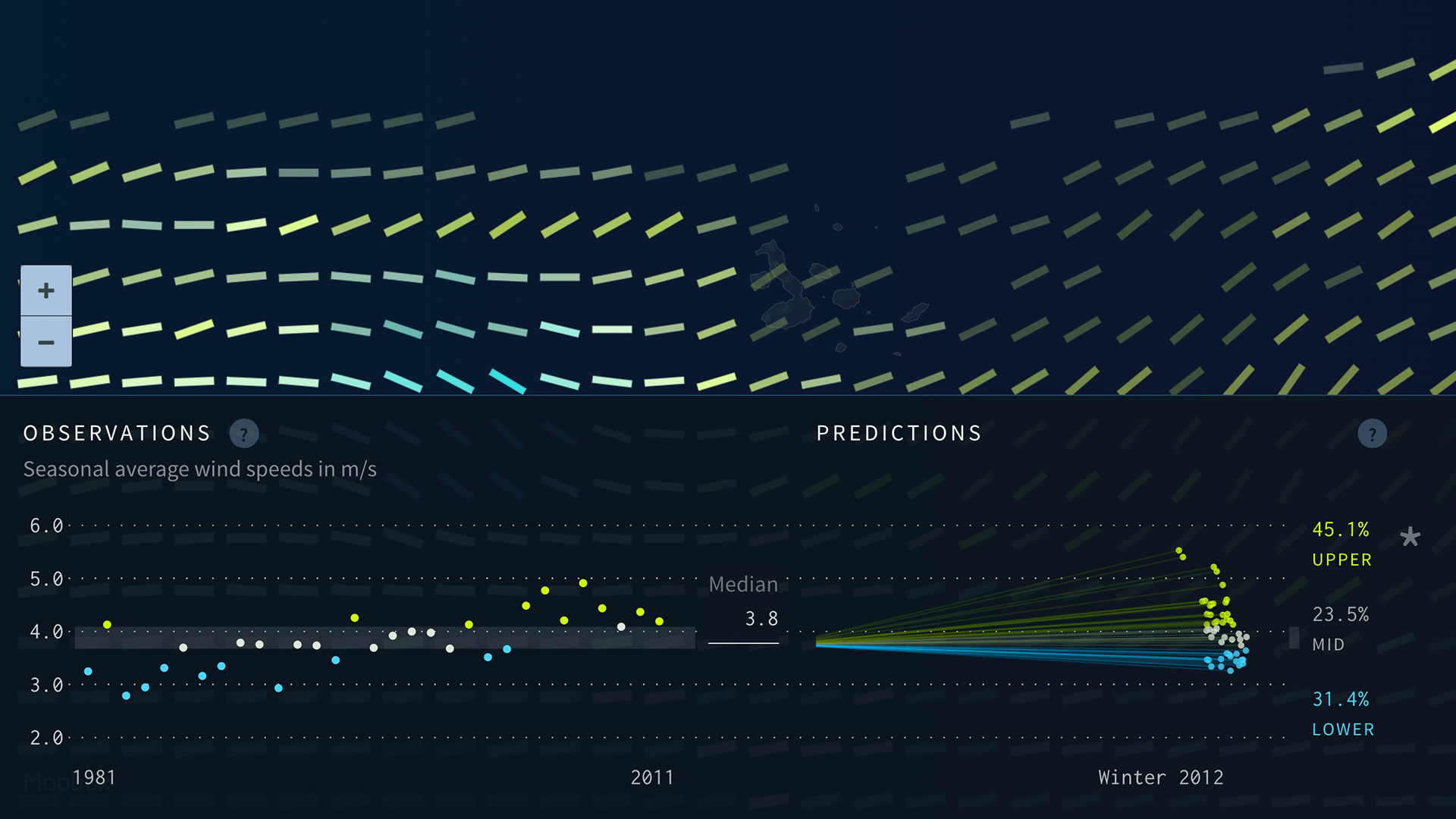
Project Ukko is an interactive data visualization jointly created by EUPORIAS, Barcelona Supercomputing Center and data vis designer Moritz Stefaner.

The project aims to create a seasonal wind prediction model that can be used in energy industry and scientific researches by analyzing and processing over 100,000 data points drawn from Euporias, a European environmental organization.

The most prominent part in this project which I would like to discuss with you is its expressiveness and effectiveness using of mark and channels.

The project use thousands of rectangles, each of them is a mark to represent the dataset in a specific location in the world. There are 4 channels which encode data into the mark:

  • The color opacity represents how well the prediction model performed.
  • The size represents the predicted wind speed.
  • The color and tilt together represent predicted wind speed trend.

By using these 4 type of visual channels, the project presents an aesthetic, simple yet high data-density visualization to us. However, we couldn’t know the wind direction from it, it would be better if it could encode this data in future.

Reference:

https://www.wired.com/2016/02/project-ukko-is-a-clever-way-to-visualize-the-complexities-of-wind/

https://blogs.scientificamerican.com/sa-visual/the-data-my-friend-is-blowing-in-the-wind/

Visualization Redesign: The Ambiguity of Presidential Election Map

Data Visualization always aims at providing clarity to the audience. More clear the visualization, easier it is for the audience to better judge the numbers they are seeing. Having said that, on account of the completion of recent presidential elections, I would like to shed some light on the ambiguous presidential election map we are shown during the elections.

Map of 2012 presidential election results

Our TV screens are bombarded with the above image trying to tell the audiences who might win. But this map is of little use considering the priority of this map is geographic accuracy and NOT electoral importance. In the elections, the electoral importance of a state and not its geographical size decides the results. Massachusetts has four times as many electoral votes as Montana but a much smaller geographic area. Now you see where the confusion is! To give a clearer understanding of the election proceedings, The New York Times designed this “nifty alternative”.

The Redesigned Alternative

As you can see the states are depicted by a square and the state’s electoral importance decides the size of the square.The size is approximated in proportion to the number of electoral votes. The squares are arranged according to the geographical location so as to not cause any confusion over the location and can locate the states easily.


Reference: http://elections.nytimes.com/2012/ratings/electoral-map

D3

D3.js (Data Driven Documents) is a JavaScript library used to produce interactive and dynamic visualizations on web browsers. It is the successor to the Protovis framework with better performance and with a focus on web standards. Many companies like Datameer, The New York Times use D3 for their visualizations. Moreover, the OpenStreetMap project also uses D3 to build interactive, editable map of the world.

D3 was developed by Mike Bostock, Vadim Ogievetsky along with Prof. Jeff Heer from Stanford University in 2011, when the development of Protovis was stopped.

D3 makes use of SVG (Scalable Vector Graphics), HTML5 and CSS standards. The most commonly used input file formats are JSON, CSV, geoJSON. It makes the user control the final visual effects to a great extent. The API is very easy to use and it makes a different level of visualizations with a reasonable amount of codingtumblr_msxucqhY061stz40uo1_500.

Here are some of the mindblowing examples implemented in D3.
http://bl.ocks.org/mbostock

Choose Your Ideal Analytic Job Market

Screen Shot 2017-01-22 at 1.29.06 PM


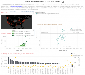
The dashboard above is to show which cities should a software developer choose. Four data visualizations are showed to audience including 2015 software developer job distribution in US, Jobs vs. Income, City live ability Score vs. Median Salary, and % Change in Jobs. The project is posted in the tableau website, and users can also check other kinds of jobs visualization including Research Scientists, etc.

The first impression I make is there are so many information in this dashboard. If a data analytics show this dashboard to his boss, the boss will probably get confused by those words. One solution can be implemented to this project is the author can create another visualization include all four aspects, and ranking those cities. When the author shows his work to other people, he can show top three cities for each aspect. I do not think anyone prefers staying at those bottom cities.

Reference:

https://public.tableau.com/profile/matt.wheeler#!/vizhome/ComputerandAnalyticsJobMarketsAcrossUS/WheredoTechiesWanttoLiveandWork


The Movingness of Drought

droughtmovement

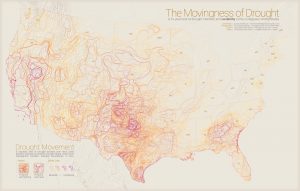
Drought has always been a hot topic of discussion in United States. Drought in United States is similar to the other parts of the world. If the precipitation level goes below the normal precipitation, then it leads to the phenomenon known as drought. Droughts are usually more dangerous and destroying in nature than tornadoes, cyclones, winter storms and flood all together combined. Drought is more destructive in nature because its effects doesn’t show up immediately but shows up gradually over a long period of time.

I am personally amazed by this visualization because it represents the effects of drought over a span of 5 years in a single static map. The map above has aggregated D1, D2, D3 and D4 . Following is the description of the effects caused by these drought levels

D1

  • Damage to crops, pastures
  • Request of restrictions for water use

D2

  • Crop or pastures losses likely
  • Water bodies start showing reduction in water levels
  • Water restrictions imposed

D3

  • Major crop losses
  • Widespread water restrictions

D4

  • Exceptional crop losses
  • Drying of water bodies
  • Water emergencies

Some places in USA are experiencing severe drought conditions and such visualizations can be really informative and useful to take serious actions to prevent drought

Reference:

Five Years of Drought

A Quick Guide to Spotting Graphics That Lie

1. BROKEN SCALES SHOW DRAMA WHERE IT DOESN’T EXIST.

This might be the most common way graphics lie. Something that changes by 1% over 10 years and something changes by 100% over 1 year could look like exactly the same trend and range on the chart. Be careful with the truncated Y-axis, which is quite misleading.  A good example is:

At a glance, the blue bar looks much bigger than the red bar, as the Y-axis starts from 0.400 and each point is 0.05 more. However, when displaying the data with a zero-baseline Y-axis tells a more accurate picture, where the difference is not that much.

2. SHOWING DATA ON TWO DIFFERENT SCALES CAN MAKE FOR AN UNFAIR COMPARISON.

Is 100kg more or less than 10 feet? You can’t give the answer, right? Because the units are different. We can’t compare two different elements, even though they are in the related field. A good example is:

Looking at the chart on the left could make you think U.S. gross domestic product (GDP) surpassed the unemployment rate around March 2015. But that comparison is meaningless if you put them in the same graph.

3. IGNORING POPULATION SIZE MAKES RATES IMPOSSIBLE TO COMPARE.

When talking about number, translating to percentage is usually more convincible and scientific, as you should keep in mind the whole population or the total. A good example is:

Chicago suffered more murders in 2014 than Detroit, but that doesn’t mean they’re more dangerous. If you consider the population of each city, the comparison changes greatly, as Detroit came to the most dangerous position.

4. DECORATION CAN BE DECEIVING.

Be careful when you choose some very shinning charts. Too many decorations may display the real value in a misleading vision. A good example is:

A 3-D model looks more modern. The number shows that Christians should be the biggest group. But due to the 3-D effect, the Muslims seems occupies a larger amount of green on the left chart.

Reference:

http://blog.heapanalytics.com/how-to-lie-with-data-visualization/

http://news.nationalgeographic.com/2015/06/150619-data-points-five-ways-to-lie-with-charts/

Which cities have hosted the Olympics

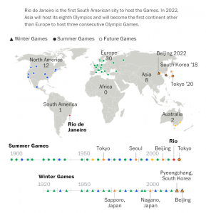
This visualization shows a basic distribution of which cities hosted the Olympics from 1900. Interestingly, in 2022 Asia will be hosting its eighth Olympics at Beijing.

Blogpost2


The map is meant to represent all the cities which have hosted the Olympic games since 1900, whereas its main focus seems to be only on a few cities. The labeling in the map and timeline is inconsistent. There are certain data points with both cities and countries mentioned while most of them don’t. The format of hosting year is not uniform either. The header of the post which says that Asia is hosting the games for the third consecutive time does not correspond to what is portrayed on the timeline. Also, the labeling of each continent is unnecessary as that is evident from the map itself.

Map can be made more interactive by providing a hovering feature for each data point or bubble to give details on the hosting city such as name, year it hosted, size of each bubble can represent total budget allocated or total spent. Milder color coding could be used with milder shade showing past data (wrt hosting year) and brighter shade for more recent data.

Reference:

https://www.washingtonpost.com/graphics/sports/olympics/olympics-collection/