The Rise and Rise of Fin-tech!

When we consider Fintech, we think online payments, banks and money related stuff. There have been transformations with huge investments and by innovations like peer-to-peer models, crowdfunding, and contactless payments in Finance and banking. But there is so much more with the increasing tech like Robo advisors, Smart Contracts and Colored coins.

Fintech, has exploded over the last 5 years. The growth over years and to understand different types of Fintech companies from various sectors, the below infographic gives a clear insight. It also gives the spike in technology start-ups in 2012, or to see how new technology is reshaping the financial industry.

So far, the industry’s primary focus has been P2P lending and P2P wire transfers. Now the companies are moving towards areas like insurance, wealth management and corporate finance, the lesser ventured segments.

The visualization is appealing to me in multi-fold. It represents the data clearly separated as categories, shows the growth over years and presents the companies sorted per their sector and year.


img src: http://www.valuewalk.com/wp-content/uploads/2016/11/infographic-fintech.png

http://www.valuewalk.com/2016/11/financial-technology-fintech/

http://www.businessinsider.com/how-fintech-transforming-finance-2015-9

http://www.forbes.com/sites/nikolaikuznetsov/2016/11/22/the-next-phase-in-fintech/#736e473a4a29

What is the most popular major in the US?

http://degreesearch.org/blog/the-most-popular-college-majors/

This blog post is about the info-graphic I came across while searching for what degrees do the students of US opt for. The data is a little old, this info graph was created in 2013.

In the above mentioned infographic, there is a pie chart, which lists down the top majors preferred by students for undergraduate studies.

Things that went wrong about the pie chart –

  • It is a PIE chart!
  • There are too many slices, and hence it becomes difficult to comprehend the data

Things which are okay-

  • They have percentages for each major, and color coded the labels, so interpreting gets relatively better from a pie chart.

Major Takeaways

  • More men prefer engineering majors than women.
  • Women tend to pursue health care and psychology disciplines.
  • People prefer education and business degrees more for masters/ further studies. This chart breaks a myth that I have, which was engineering is the most chosen major for masters.

References – http://degreesearch.org/blog/the-most-popular-college-majors/

How to Use Visualization to Achieve Your Goals

In life and work, success begins with a goal. Before we can believe in a goal, we first must have an idea of what it looks like. This is where visualization comes in, which is simply a technique for creating a mental image of a future event. When we visualize our desired outcome, we begin to “see” the possibility of achieving it.

According to research using brain imagery, visualization works because neurons in our brains, those electrically excitable cells that transmit information, interpret imagery as equivalent to a real-life action. When we visualize an act, the brain generates an impulse that tells our neurons to “perform” the movement. This creates a new neural pathway — clusters of cells in our brain that work together to create memories or learned behaviors — that primes our body to act in a way consistent to what we imagined. All of this occurs without actually performing the physical activity, yet it achieves a similar result.

There are two types of visualization, each of which serves a distinct purpose, but for greatest effect, they should be used together. The first method is outcome visualization and involves envisioning yourself achieving your goal. To do this, create a detailed mental image of the desired outcome using all of your senses.

The second type of visualization is process visualization. It involves envisioning each of the actions necessary to achieve the outcome you want. Focus on completing each of the steps you need to achieve your goal, but not on the overall goal itself.

Visualization does not guarantee success. It also does not replace hard work and practice. But when combined with diligent effort (and, I would add, a strong support network), it is a powerful way to achieve positive, behavioral change and create the life you desire.

Reference:

http://www.huffingtonpost.com/frank-niles-phd/visualization-goals_b_878424.html

Cherry-picked data

There are several data collections on Mass Shooting. All of the data defines mass shooting in different ways. Some only count incidents where four or more people were killed, others count any where four or more people were shot (whether they died or survived). The problem is that, depending on the criteria, the number of mass shootings that take place each year can range from dozens to hundreds.

As per the story published in Truth Stream Media “Why Have There Been More Mass Shootings Under Obama than the Four Previous Presidents Combined?”, they represented following graph:

It included the following chart, which it said was based on several data sources. One was the Mother Jones database on mass shootings, which uses the four-killed-or-more criteria. Two others were from Wikipedia.

Based on the data collected form different sources, the truth was misrepresented. Cherry picked data gives incorrect representation of data and misleads audience with the facts.

Below is the reality for number of shootings by presidential terms using only the data from the same database:

https://www.theatlas.com/charts/41Y3HT7Ux


Source: http://truthstreammedia.com/2015/12/02/why-have-there-been-more-mass-shootings-under-obama-than-the-four-previous-presidents-combined/

US Mass Shootings, 1982–2023: Data From Mother Jones’ Investigation

https://qz.com/580859/the-most-misleading-charts-of-2015-fixed/

Happy 10th Birthday to iPhone

Today’s blog is about the iPhone sales and how the trend has been. The iPhone hit a milestone when it turned 10 years old but the graph doesn’t look very encouraging. The iPhone sales shows a dip of 19.34 million units in fiscal year 2016.

a

As seen in the initial years, the growth of iPhone sales increased at a rapid rate showing an outright success story till 2015. However, the percentage growth in sales, as compared to previous year, had already started declining.

One might infer from this graph that since the iPhone sales declined in 2016, Apple faced losses. But in fact this is not true. Apple has multiple other businesses apart from iPhone. So if seen otherwise, overall Apple is doing exceptionally well. Apple reported its quarterly revenue of whopping $46.9B, making it one of the most profitable companies in the world.

Since 2017 marks the 10th birthday of the iPhone, people are eagerly waiting for the new iPhone release this year and hoping that the graph also shoots up for the new iPhone.

Source:www.apple.com/newsroom/2016/10/apple-reports-fourth-quarter-results

https://www.statista.com/chart/7469/the-iphone-still-is-apples-cash-cow-despite-declining-sales/?utm_source=Infographic+Newsletter&utm_campaign=9874be6e6c-InfographicTicker_EN_Early_00004&utm_medium=email&utm_term=0_666fe64c5d-9874be6e6c-295733669


Tennis: Analysis of 1st time Grand Slam winners.

As the Australian Open 2017 advances, the tournament draw is getting more unpredictable day by day. With the top players not matching the expectations and unseeded players taking full advantage of the opportunity, it will be interesting to see who gets the trophy in the end.

Australian Open collaborates with IBM to gather and analyze the match stats as well as evaluate how all the players are performing here in comparison with other Grand Slam tournaments.

The two visualizations below show the no. of Grand Slam winners who are also First time winners and how many of them win more grand slam titles in the future.

DashboardMen

This visualization represents the Men’s Singles 1st time Grand slam winners.

Dsh2

This visualization represents the Women’s Singles 1st time Grand slam winners.

The colors which represent each tournament are their official colors due to which it is easier to associate them with their respective charts. The yellow dots which represent the tennis balls give the precise depiction of the no. of winners and in this case, the pie chart gives clear idea of the % of winners who go on to win more tournaments.

The graph shows that 1st time US Open winners are more likely to go on and win more Grand Slam titles in both the Men’s and Women’s categories. But going by the difference in  % , we can deduce that it is more challenging for Men’s 1st time winners to secure multiple grand slam titles than Women’s 1st time winners.

Source: http://www.si.com/tennis/2015/01/20/daily-data-viz-first-time-slam-winner-odds-australia-open


Two Centuries of U.S. Immigration

Capture3

This visualization represents the immigration growth in the United States from the year 1820 to 2013. The visualization represents 10,000 people using 1 dot. The dots change dynamically to depict people migrating from different countries across the world. This visualization also enables users to see the top 3 countries from where the immigration has be the highest in a given year.

Good points about this visualization:

  • Dynamic data changing which enables user to understand the meaning of the visualization without spending a lot of time to understand it.
  • Color coding: Changes in the colors of the countries when migration occurs helps the user to spot the countries from where people are coming to the United States.
  • Visualization Speed: The density and speed of dots changing also helps in understanding the increase in the immigration over the period of years.
  • Scaling: The year range scale also gives a clear understanding of the visualization without giving any room for ambiguity regarding which year the data is representing.
  • Legend: The legend also helps in giving exact numbers for the years and the top 3 nations the immigration has been the highest from.

Points to be improved:

  • A comparative visualization could have helped to understand the variation in immigration from the different countries by using dynamic bar charts. This would have helped the user to see the density of immigration coming in from different nations.
  • A legend depicting whether the colors assigned to the different countries have any significance would have enhanced the user experience.

Conclusion: A good visualization clearly depicting the insights of the observation.

Source: http://blog.visme.co/best-information-graphics-2016/ 

Reference: http://metrocosm.com/animated-immigration-map/


Creating an impactful data experiences

Artist Amy Radcliffe is exploring the relationship of emotion and smell with the Scent-ography device, an analog system designed to capture and reproduce odors. While this is a speculative device, the principles illustrated point to the power of capturing and replicating smells. Given how tightly our emotions are linked to our olfactory senses, capturing and replicating the scent of objects and places could be enormously potent in creating impactful data experiences.

As we move into the extra-visual era of data representation, it is important to remember that the goal is not simply to find the best alternative or complement to visualization. Rather, the ideal is to experience the data more richly. This means that anyone can take a data set and begin to map the parameters to different sensory modes, exploring the data and uncovering new insights. Experiencing data is what humans are evolved to do. Yet, in terms of our ability to understand and use data in meaningful ways, we have only scratched the surface. Moving past visual representation offers new opportunities to discover and communicate insights from data.

Source: https://designmind.frogdesign.com/2014/05/beyond-data-visualization-experiencing-data-senses/

Were you under wrong perception as a kid?

One of the few things I remember from my Geography class is my teacher showing me different countries on a world map. But as I look back now, I feel I had a very contorted image of the world as a kid and the reason is misrepresentation of world on flat map.
The Mercator Map projection which we all commonly use and are aware of converts circles of latitude and lines of longitudes into straight lines perpendicular to each other which completely distorts the shape and size of the countries especially when you move away from the equator and move towards both the poles.
Imagine a tube around the world:

pic1
For drawing a flat map, countries are projected on this tube. The poles which otherwise do not touch the tube are on purpose sketched on the tube.  Unrolling this tube results in projection of world on x-y plane which completely distorts the Y plane.
When a kid sees this map, he tends to imagine the world and size of each continent with respect to other as shown in the map and create a flawed mental picture.

pic3
For instance, Greenland (which lies on the North Pole) is interpreted approximately the same size as that of Africa but the fact is Greenland is just as big as Congo (which is just a small part of Africa). Moving Greenland to equator (as shown in below diagram) reveals that Africa is almost 14 times larger than Greenland.
image4
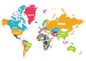
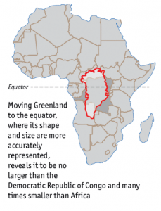
It was only after research and travelling, I got to learn about real shapes and sizes of various continents but there might be many students who leave school with such wrong perception caused due to poor visualization.

References:
Google US. 2017. world map – Google Search. [ONLINE] Available at: www.google.com [Accessed 23 January 2017].
The Economist. 2017. Daily chart: Misleading maps and problematic projections | The Economist. [ONLINE] Available at: http://www.economist.com/blogs/graphicdetail/2016/12/daily-chart-1. [Accessed 23 January 2017].


The Most Stunning Data Visualization of All Time

Redditor Andrew Elliott

This is a visualization that represents six months of a baby sleep and wakefulness. A father recorded his daughter’s sleeping habit during six months. Dark blue is asleep and yellow is awake. The spiral begins at the interior of the circle. It is her birth and then wraps outward as she gets older. Each circle represents one 24 hours a day. Top of circle means midnight and the bottom of circle means noon. There is chaos near the center of the circle. Baby tends to alternately wake and sleep during the day, night, and everything in between. Shortly thereafter, the upper right-hand side of the circle starts to sort themselves out and begins to show consistently dark blue. It means baby’s sleeping habit becomes like adult’s.

Screen Shot 2017-01-22 at 7.51.30 PM
Neuroscience Top to Bottom

Moreover, the designer uses another visualization picture to support his record. Newborns alternate rapidly between sleep and wakefulness. As they get older, those sleep cycles begin to consolidate.

Both of these data visualization pictures effectively tell us that baby’s sleeping habit and the pattern they develop to adult’s sleeping habit

Reference: https://www.washingtonpost.com/news/wonk/wp/2017/01/05/what-its-like-to-sleep-like-a-baby-visualized-by-a-dad/?utm_term=.9afa48498bb2