Good conversation topics for a social party -2016 major events

Here are all the cool topics of year 2016 on one map that can bring to a cocktail party. http://www.mapsofworld.com/events/year-2016/

In year 2016, there were so many things happened around the world. As a global citizen, it is good to be aware of what happened in a year of 2016. Good visualization can help us to sort out that information easily.

This visualization clearly shows year 2016 major events in a world map. Here’s three points why this visualization is a good visualization.

  1. On the map, detailed information is clearly displayed. It includes event occurred month, country as well as key words for the events.
  2. Different color clearly distinguishes different country or region. Color with detailed written explanations makes the information stronger and it help readers to have a better understanding about the event.
  3. On top of the map, under each month there’s detailed explanation about the event’s major information. Readers don’t need to click the months but just need to move the mouse to the month and the information will display itself.

However it could be a flawless visualization, if all the detailed information on the map displays by a certain order, for example by country, event, and year.

Reference: http://www.mapsofworld.com/events/year-2016/

Countdown of Top 10 Reasons to Never Ever Use a Pie Chart

An Oracle blog listed 10 reasons that why we should get rid of using pie chart.

Number 10 – Pie Charts Just Don’t Work When Comparing Data

Number 9 – You Have A Better Option: The Sorted Horizontal Bar Chart

Number 8 – The Pie Chart is Always Round

Number 7 – Some Genius Will Make It 3D

Number 6 – Legends and Labels are Hard to Align and Read

Number 5 – Nobody Has Ever Made a Critical Decision Using a Pie Chart

Number 4 – It Doesn’t Scale Well to More Than 2 Items

Number 3 – A Pie Chart Causes Distortions and Errors

Number 2 – Everyone Else Uses Them: Debunking the “Urban Legend” of Pie Charts

Number 1 – Pie Charts Make You Look Stupid and Lazy

Here’s an example which shows how bad the pie chart in visualization. First, the pie chart did not display information in an elegant visual form with some numbers placed inside the pie while others placed outside. Second, it’s hard to catch the point of what the visualization wanted to express because we have to take time to check all the numbers and scan the legend to say that the biggest section is media and the smallest section is electricity. Also, people may be confused with the close colors as such as those light blues. Therefore, this is an inefficient visualization.

Reference: https://blogs.oracle.com/experience/entry/countdown_of_top_10_reasons_to_never_ever_use_a_pie_chart

Pie Charts Suck

In class this week we learned the do’s and do nots for visualization. One of the do nots that stuck out to me is to never use pie charts as a visualization tool. I wanted to see if anyone could give a good reason to use pie charts. Unfortunately, the general consensus is to avoid using pie charts. Pie charts in general can be used to show how related information can be split up into different sub-parts. However pie charts have a of distorting the information being presented. Take for example the pie chart below of the European Parliament Party Breakdown.

While it shows the breakdown of the party, it does not show how much of a difference there is between each segment. There could be segments that are the same or even some that are only different by a percent. It would be really hard to determine the size of each segments proportion.

Pie charts can always be converted into another chart type like the bar chart shown above which is able to show the same data as the pie chart but in a more clear and readable format.

Source: http://www.businessinsider.com/pie-charts-are-the-worst-2013-6

Wharton’s Ad: What do you interpret?

This was an ad that appeared in The Economist by Wharton University.

Ad - Wharton University
Ad – Wharton University

While the visualization is eye catching, what it is trying to convey is confusing. The first glance explains nothing, but based on the caption, I was able to figure out that this is a frequency wave that the university is using to reflect the experience level (in the number of years) of various professors in their Finance department. We can see that some professors are highly experienced while others are not.

Now comes the confusing part. I was not able to understand what the different colors symbolize – were they only used to make the image more striking or do they have some other meaning. Also, this graphic does not emphasize on the professor’s teaching experience and specializations in the finance field, rather it shows that around 1/3 of the professors do not have a lot of experience. There is no way to understand how the different professors can impact prospective students, based only on their level of experience. Also, I see no connect between the graphic and the perception that Wharton is trying to create about their finance department (or the text written in the ad).

This visualization is an empty graphic designed to look pretty with no real takeaway.

Source – http://creativegood.com/blog/the-wrong-info-visualization-whartons-ad/

San Francisco Uber Commuters’ Route

Uber did an interesting study of San Francisco’s Commute flow. They raised a question: Where do people work and play?They created a map chart showing the probability that a ride stars in neighborhood and ends in another.

They created a map chart showing the probability that a ride stars in neighborhood and ends in another.

This map clearly explains the route that commuters travel from one neighborhood to another. Moreover, the size of circles represents the proportion of ride that goes from the source neighborhood to its target. Uber got a conclusion that almost all the action is going on between neighborhoods in a radius around downtown.

By viewing the data in alternative graph, we can see more details that what are the major neighborhoods people travel from and their target. Moreover, it changes what we conceive from same data.

This picture clearly presents:

  1. Individual connection. The route from a certain district to another. Although it can’t show the geographical position, it presents the clusters and central components of data.
  2. It effectively shows that the frequency of rides between two neighborhoods.
  3. Although San Francisco’s 35 districts show up simultaneously on a single map, it looks like they scatter in different areas. However, the circle shows that those districts united as a city.

Reference:

  1. https://newsroom.uber.com/us-california/uberdata-san-franciscomics/
  2. https://bost.ocks.org/mike/uberdata/


Clarity or Aesthetics? –A Quantify Way To Achieve Both

An Analogy to translate the world of data visualization from mechanical engineering.

To somehow quantify the “clarity” and “aesthetics”, we create a Cartesian coordinate system with clarity mapped to the horizontal (x) axis and aesthetics mapped to the vertical (y) axis. Therefore, four quadrants are created:

  • Northeast-Quadrant I : clear + beautiful;
  • Southeast-Quadrant II: clear+ ugly;
  • Southwest-Quadrant III: confusing + ugly;
  • Northwest-Quadrant IV: confusing + beautiful.

Tips to achieve both:

  1. Avoid confusing your audience with the wrong chart type.

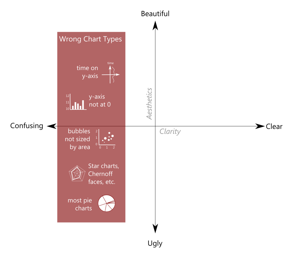
2. Avoid horrifying your audience with poor design elements.

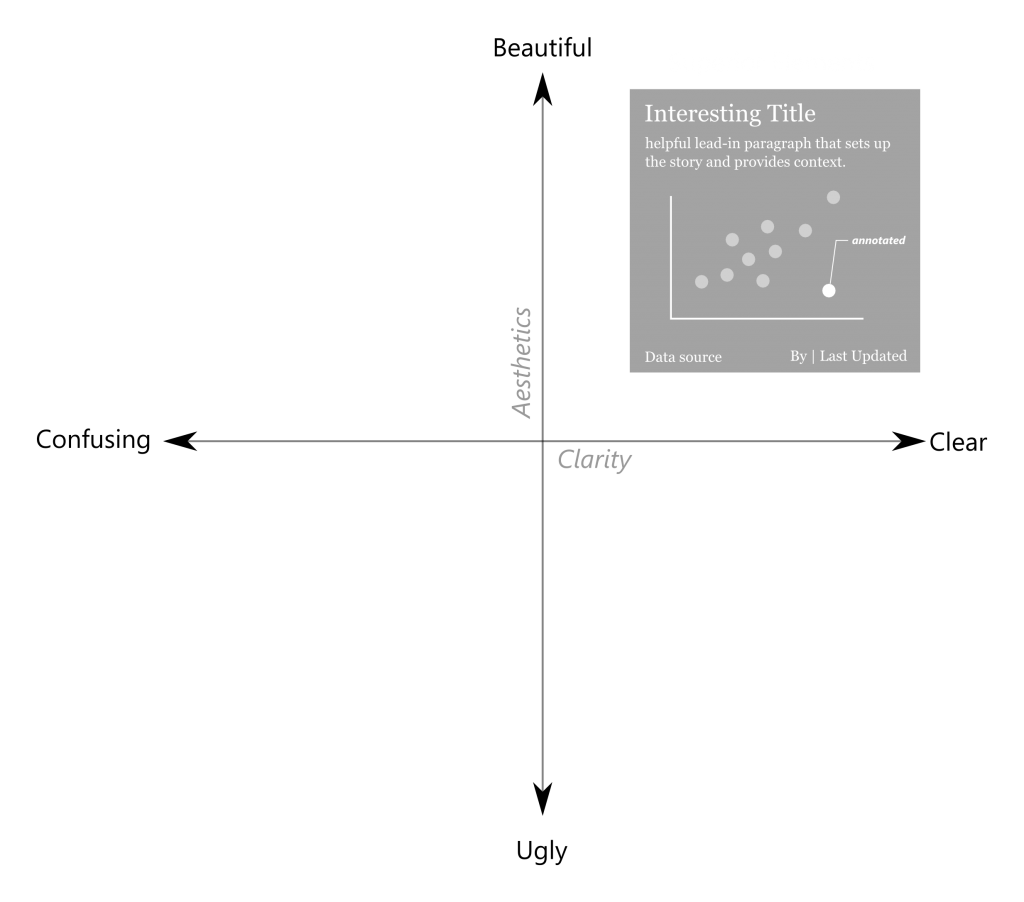
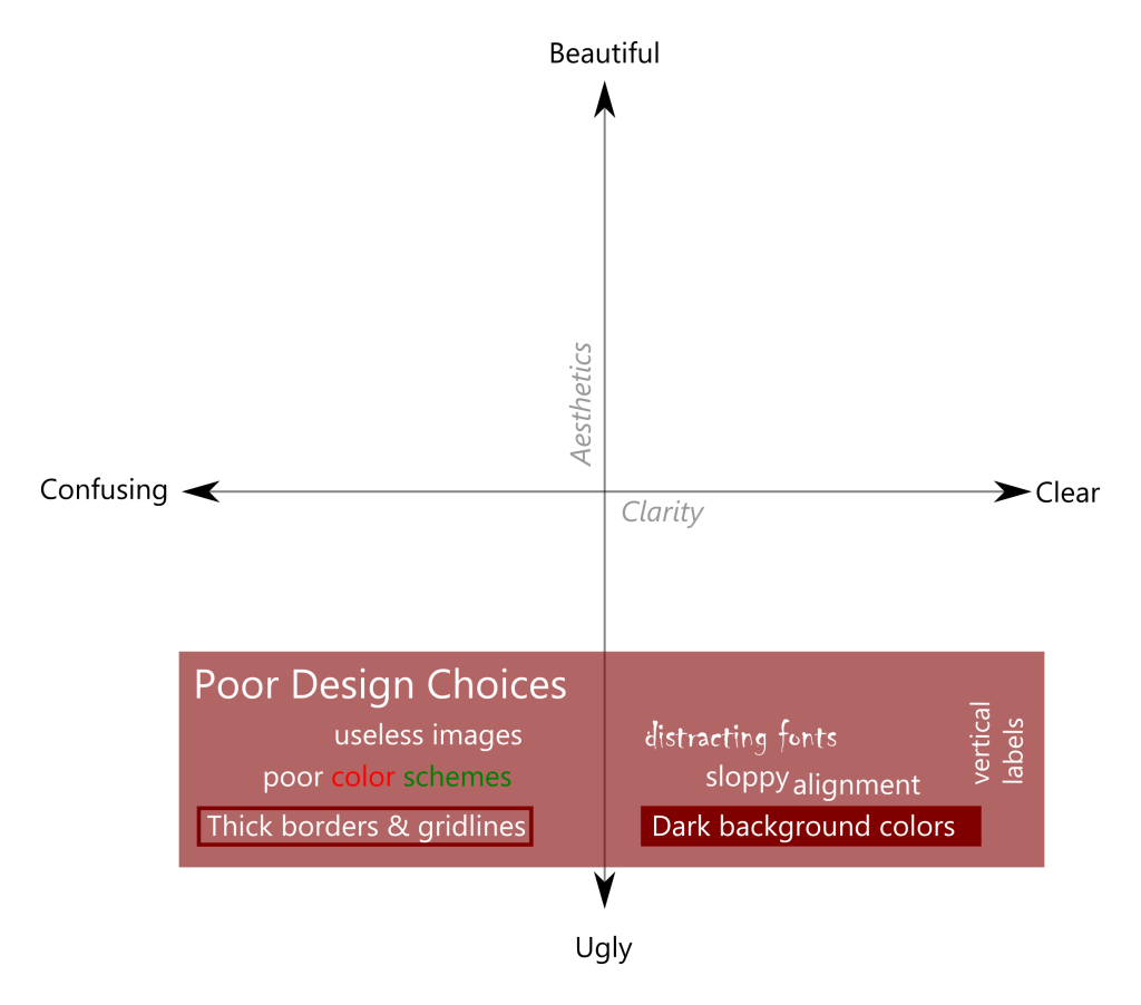
3. Incorporate helpful elements to increase both clarity and aesthetics.

Reference: http://dataremixed.com/2012/05/data-visualization-clarity-or-aesthetics/

The Fallen of World War II : A Masterpiece Of Data Storytelling

We all know the tragedies surrounding World War II. The human loss over that period was beyond any measure. Neil Harron made this highly engaging data-driven story comprehending the fatalities of the tragic event and conceptualizing the large numbers pertaining to human tragedies.

This interactive 18 min video is divided into 3 parts. The first is an analysis of soldier fatalities by nation, while the second tackles civilian deaths (including the Holocaust). The final section provides a fascinating and illuminating overarching perspective of WWII in the context of previous conflicts and those that followed.

This visualization has all the necessary elements needed for storytelling. The charts are loud and clear, the comparisons are accurate and the visualizations give you not one but many jaw-dropping moments. The details provided in the visualizations are very rich and unambiguous. There is an interactive part which shows you the exact figures of the deaths and the background surrounding it. The visualizations for most of the part shows the death toll in different part at different times but the end gives you that staggering moment when it focuses on peace and compares the fearful tragedies of the past and how comparably at peace we are now.

Please do watch this video, It’s worth your time!

Ref: The Fallen Of World War II

Use circles and color cautiously!

The following graph was posted in 2011 and tried to use proportionally sized circles to depict the visualization.


If we closely observe the visualization, we can spot many pitfalls in the used media.

  • The first flaw is with the size of the circle; the size does not match the associated data values and hence exaggerates the small amount of money donated and number of deaths caused by each disease. This is a very common mistake which designers make while using circles to show their graph. Various design software only allow height and width adjustment and designers often fall into trap of adjusting diameter of the circle rather than area to match their data.
  • The other flaw is with choosing the inappropriate display media. It’s difficult for one to track different colors and then match information on the legend accordingly. The image involves 3 way process of first looking at circle in “Money Raised” area; then mapping the color and finding details in the legend and finally looking for the same color in “Deaths” area. It would have been easier for the reader if the name of the disease and respective money raised and deaths were placed together.
  • Third issue is with use of colors. As discussed in our class, a good number of people are color blind and therefore it is not a good idea to use too many colors. Colors are also an issue when somebody wants to take a handout of your visualization for their reference. Also, as the size of last few circles are very small, it is difficult to spot the color and map it with the colors in the legend.

References:

Image Source: http://cdn3.vox-cdn.com/uploads/chorus_asset/file/663618/Donating.vs.Death-Graph.0.jpg

Other Source: http://www.huffingtonpost.com/randy-krum/false-visualizations-when_b_5736106.html


Visualizing ‘Friendships’

The world is connected through different forms mainly calls, text messages, emails, social networking websites. Among these social networking media has become more popular. There are definitely higher number of people in your “Friends list” than in your contact list. Why? Because, the world is small! Social apps like Facebook, twitter, Snapchat give opportunity to connect and build relations with others irrespective of country, race etc.

I found this amazing visualization created by one of the intern on Facebook’s data infrastructure engineering team. He used R programming to create such a pretty picture. His main curiosity was to know in what locations people have most connections. The boundaries are not visible clearly but we can identify the country/continent. The brightest region are middle-east part of USA and European countries which represent relationship between people living in those areas. The circular arcs which are routes between two points on earth give resonating effect to the visualization.

He used dataset with millions of records of people with their friends list, location etc. He has shared the details of how he came up with this visualization on the following link.

Source: https://www.facebook.com/note.php?note_id=469716398919

Image source:https://www.quora.com/What-are-some-cool-examples-of-data-visualization-done-in-R

Visualization for Advanced Big Data Analysis Five-Step Approach Can Ensure Repeatable and Significant Results

The first step is to reduce high dimensional data to lower dimension through Principal Component Analysis (PCA).

The second step is to access the signal- to –noise ratio in the data using project score and randomization.

The third step is to remove noise by variance filtering.The fourth step is to perform statistical test. And the last step is to use the graphs to refine the search for subgroups or clusters.

Source:http://www.genengnews.com/gen-articles/visualization-for-advanced-big-data-analysis/5947