The Changing American Diet

food

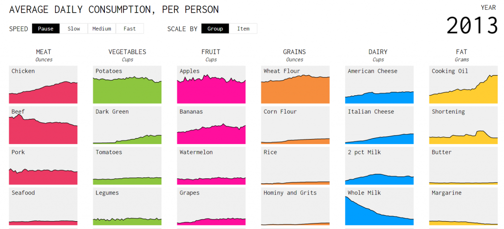
The Food Availability Data System helps the US Department of Agriculture to keep a track of the type and consumption of food on an average day for the past several decades. The data in this database reflects the amount of food available for human consumption in the United States and is the only source of time-series data on U.S. food availability in the country.

This system which they have built keeps a track of how much food is produced as well as the consumption of food starting from 1970 through. The major food categories include meat, veggies, and fruits. This database takes regularly consumed foods and aggregates them into approximately 800 core foods with similar raw agricultural commodities. Converting these regularly consumed foods into raw agricultural commodities allows for easier cross referencing with chemical residue databases.

The visualization which they have constructed is very helpful to keep a track of the food consumption in the US. The columns represent the food categories and each chart in the column highlight, in the timeline format, the food consumption. Items move up and down based on their ranking in each group during a given year.


Reference – http://flowingdata.com/2016/05/17/the-changing-american-diet/


A visual depiction of Tech IPO’s.

The visualization being analyzed describes how Facebook’s IPO in 2012 compares with other tech IPO’s since the 1970’s. The IPO trends are presented as a series of five scatter plots by varying the y-axis alone. Though the visualization does a good job in explaining the comparison, I feel the entire analysis could have been demonstrated by a single visualization. My opinion is based on the following:

  • There are three main colors used to represent the companies. The manner in which these colors are used, shows that the companies have been grouped based on a time range – orange ranging from 1970 to 1994, purple ranging from 1995 to 2002, and blue from 2003 to 2012. This color based grouping is redundant since there is an x-axis representing the time range. I feel the color mark should have been used to depict one of the measures being discussed, say for e.g. first day change or three-year change.
  • The first two visualizations use a standard numeric scale to show differences in the company value, in current dollar terms. Since this difference varies greatly between companies and over such a wide range of years, the scale to be used should have been logarithmic. The reason behind this is, whenever we are trying to represent values which have a huge difference between min and max, using a logarithmic scale ensures a readable plot of the values, without distorting the actual percentage differences between them. The creator of the visualization has used logarithmic scale from the third chart onwards.
  • The visualization plots company value data for more than 100 companies. Even with the logarithmic scale, it is very hard to know the companies and their data points. There is a search bar which helps in locating companies if you knew what to search for. Since the number of companies is large and not everyone looking at this visualization may know of companies since the early 1970’s, I feel the creator should have added a sorted list of all companies in a separate group box to the side of the main visualization. The reader could then just scroll through the list and look at the various companies for which data was plotted.
  • The fourth and fifth visualization shows the trend as per the other two measures i.e. first day change and three-year change. The trend of average stock rise and negative returns which the creator is describing is depicted using change in size of each bubble. I feel this was not required because these measures were also present in the first three visualizations as well using a tooltip.

References:

http://www.nytimes.com/interactive/2012/05/17/business/dealbook/how-the-facebook-offering-compares.html

Endangered Safari – A complete guide to African animals in today’s World


The visualization aims to give a comprehensive status of large African mammals. The visualization is unprecedented in its information and the design is novel and unique.

Things I liked in the visualization –

  1. The use of animal symbols for selecting the animal.
  2. The facing of animal to emphasize decreasing or increasing population.
  3. The highlighting of the area in Africa to identify the habitat of the animal.

Things for improvement

  1. The segregation of the animals is nicely done but the animals cannot be searched by names and identifying the specific species of deer/apes based on its silhouette is difficult for an average person.  
  2. Selecting of animals based on country is not available. It would be nice to see the country names and borders as it would help an average reader.
  3. Metrics like the current numbers or the increase/decrease numbers/percentages can be added.

Although the addition of names of countries, animals, metrics like population will make it more interesting, I believe the visualization is fresh and unparalleled in showing the data about large mammals in Africa.
Resource – https://public.tableau.com/en-us/s/gallery/endangered-safari

Which Country Won the Olympic medals

The streamgraphy below was created by two New York Times data visualization designers and it demonstrates the distribution of Olympic medals by country/area for each Summer event.

The time is on horizontal axis and each stack in the graph represents a country or an area. The more medal that country won at the event, the greater the height is on that point.

The graph looks fine, it has nice labels and appropriate color/contrast. It could help us easily understanding the trend of Olympic medals won for a country.

However, the data density in this graph is low. More channels shall be required here to encoding more essential data, such as the number of medals. Also, the graph might confuse people because the Olympic event is quadrennial, not as continuous as the graph represents. The simple mark of line could convey the same meaning, and the using of line chart might be more suitable  for this topic.

Reference:

www.nytimes.com/interactive/2016/08/08/sports/olympics/history-olympic-dominance-charts.html


Different types of Map Visualizations.

Map Visualizations are one of the most interactive ways to represent raw geographical data and transform it into visual representation that is easy to understand and interpret. There are different types of maps that are used to represent different types of attributes and features:

  1. Choropleth Map: These maps show divided geographical regions that are colored, shaded or patterned in relation to a data variable. But this makes it difficult to read or compare values from the map.
  2. Cartogram: Cartogram maps are used to show data that combines statistical information with geographic location like population and terrain, etc. But sometimes they tend to exaggerate variables by using polygon geometry.
  3. Dot distribution map: Dot maps used dots to display a feature or phenomenon. They use visual scatter to show spatial pattern.
  4. Proportional symbol map: These are most commonly used for thematic mapping. A symbol is selected and its size or area is altered in relation to the value of data variable.
  5. Contour/ Isopleth map: Isarithmic map is a two-dimensional representation of a three-dimensional volume and isopleth maps is a type of isarithmic map that shows data that occurs over geographical areas. Contour lines or filled contours are used to show how features differ in quantity over surface.
  6.   Dasymetric Map: The purpose of this map is also thematic mapping but it utilizes standardized data and places areal symbols by taking into consideration actual changing densities within the boundaries of the map. They are generally created by geographical information systems and widely used for conservation and sustainable development.

Image source: http://guides.library.duke.edu/datavis/vis_types – category: 2D/Planar

Source: www.datavizcatalogue.com

Scorecards vs. Dashboards

Very often, many organizations use both the words – ‘scorecards’ and ‘dashboards’ so interchangeably that is it difficult to differentiate between the two. Here’s the difference:

Scorecards

A scorecard is a type of report that measures and compares your performance against your projections and goals. It evaluates the success and failure of your efforts, based on key performance indicators (KPIs).

Dashboards

Dashboards are made up of multiple reports, allowing you to easily compare and contrast different reports or access diverse data sets in one place. Scorecards can be included and viewed on a dashboard with other types of reports as well. Dashboards can be customizable and present different views from the CIO to a staff member in the company. Ideally, you want all the data to be pulled from a single data repository to ensure accuracy within your reports.

Scorecards provide serious value to an organization if done correctly. With scorecards, businesses can evaluate their goals and direction, determine if they are on track, assess trends and patterns and utilize resources in the most efficient way possible.

References:

http://www.bscdesigner.com/dashboard-vs-balanced-scorecard.htm

How recession reshaped the economy of USA

The USA underwent many recession periods and one of the most significant was the recession of 2009. It affected the USA’s economy and changed the future for many industries. The interactive visualization below depicts the growth of different industries pre and post-recession.

Reference: https://www.nytimes.com/interactive/2014/06/05/upshot/how-the-recession-reshaped-the-economy-in-255-charts.html

This is an excellent interactive visualization which is detailed and depicts lots of information at a first glance without overcrowding the visualization. The information is classified very well and presented via two different dimensions.

  • Firstly, via the usage of colors ranging from deeper shades of green to deeper shades of red depicting the industries which have recovered and booming and the once which are declining.
  • Secondly, via dividing the industries according to either lower or higher wage that particular industry generates.

The visualization automatically drills down to specific industries when one scroll down helping to understand the trends. One amazing thing is that a detailed description pops up whenever one hovers over any line graphs. This contains area graph of the average salary and also the number of jobs at any year from 2004 to 2014. By analyzing this we understand that consulting, computing, oil and gas industries have recovered and grown whereas apparel manufacturing and construction industry have greatly declined.

A visual guide to Donald Trump’s media habits

If you are an heavy social media user, your life could be easily visualized like the following graph. As we know, the new president of United States of America Donald Trump is a heavy twitter user. He tweets almost about everything in his life including the newspaper he reads, the movie he watches, etc. As a result, the Washington Post posts a week visual guide to Donald Trump’s media.

https://www.washingtonpost.com/news/politics/wp/2017/01/24/a-visual-guide-to-donald-trumps-media-habits/?utm_term=.2ce7d83b2136

As we can see, if Trump does all his tweeting by himself online, we can generate a week schedule by visualizing the data. Today, CNN reports that White House discussing asking foreign visitors for social media info and cell phone contacts. I believe visualizing the social media data is one way to track and forecast terrorist attack.

Next bar chart shows what Trump has tweet about watching:

https://www.washingtonpost.com/news/politics/wp/2017/01/24/a-visual-guide-to-donald-trumps-media-habits/?utm_term=.2ce7d83b2136

In the original post, the author does not explain what is the axis stands for. So one improvement the visualization could make is to say more about the above picture. I assume the figure stands for the frequency in one week.

Reference:

https://www.washingtonpost.com/news/politics/wp/2017/01/24/a-visual-guide-to-donald-trumps-media-habits/?utm_term=.2ce7d83b2136

Diversity in Tech

http://www.informationisbeautiful.net/visualizations/diversity-in-tech-static/

The visualization is appealing and gives the percentage of people working in tech according to gender and their ethnicity. But does it really realize its purpose of visualization?

Every good visualization should have the following:

  1. Clarity: the ability to quickly understand what data the visual is displaying, and how it is displaying it.
  2. Connectivity: The ability to connect different parameters of the data and get useful insight
  3. Concentration: Whether your visualization focuses on solving the underlying problem statement (Prescriptive analysis) or it focuses on describes the current problem (Descriptive analysis)

It is difficult to understand the visualization because it displays the data in percentages and not numbers. Moreover, it gives an overview about the gender and ethnicity across different domain.  If I wanted to redesign this, I would have different visualizations for tech, social, top 50 US companies, most female company and last one for overall. By comparing data across each of the domain, I would have more clarity, connectivity and concentration to the relevance of the data.

Effective visualization of survey results

Communicating the results from an exhaustive survey is not an easy task. Let us consider the dashboard posted in the link https://public.tableau.com/en-us/s/gallery/attitude-towards-migrants

The dashboard represents the perception of social reality between young and old people in the UK. The questions are grouped neatly into categories and every survey result for a question represents the opinion of participants under 31 and over 60. The limited use of colors make the dashboard appealing and effective. All the survey results visualized here represent what percentage of participants in an age category responded in a particular way. But the choice of different forms of visualization for every category of question makes the dashboard interesting.

This simple visualization succeeds in communicating numerous findings from the survey without overwhelming the reader.

Reference: https://public.tableau.com/en-us/s/gallery/attitude-towards-migrants