An appealing but failed visualization

pie chart

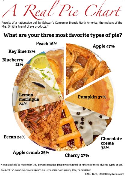
The Pie Chart shown in the image would have been more meaningful if it had depicted the results of a simple survey – “What is your most favorite type of pie?” But it is trying to represent the top three favorites. The participants were in fact asked to rank their three favorites. Hence it is quite impossible to understand from this chart which pie was ranked No. 1 favorite by maximum number of participants. For example, though Apple pie tops the chart with 47%, it is quite possible that several participants voted Apple pie as their 3rd favorite, not their top favorite. Hence, in spite of attractive graphics, this chart is quite misleading, fails to communicate the survey results effectively and hence a failed visualization.

To avoid this kind of failure, understanding the data we are trying to visualize is extremely important. In this example, if pie charts were the way to go, a single pie chart would not suffice to depict the survey results. Also, while designing a visualization, giving too much importance to the graphics is good only if it does not take away the focus from the fundamental objective of the visualization – effective representation of data.

Image source:

http://euclid.psych.yorku.ca/datavis/gallery/images/pies/pie-chart-02.jpg

Reference:

http://euclid.psych.yorku.ca/datavis/gallery/evil-pies.php

Less is More

In a world overflowing with data, using it in the right way so as to extract maximum information and perform meaningful analysis to make right decisions is the key. The management needs information quickly and at a glance. Hence, it is important to have a dashboard design that highlights the key points, is structured, focused on management’s requirements and not overly complicated and confusing. Simplistic dashboard designs can help in better decision making than dashboards that are flooding with information.

Sales Dashboard

For example, this is a telesales dashboard that emphasizes on some of the important features that the company will want to track in order to understand their overall performance. It is easily understandable and the information displayed is not overpowering. The graphic mediums are subtle and red color is used to make it easier to notice details. The dashboard has a flow with the most important piece of data on the upper left corner. It is not highly decorated and only displays what’s necessary. It contains clear legends with properly marked headings and descriptions (where needed).

Sometimes, poor visualizations and displaying too much information can take away the most important aspect of a dashboard – easy data availability.

Source – https://www.perceptualedge.com/articles/Whitepapers/Dashboard_Design.pdf

2016 Electoral Map

Screen Shot 2017-01-13 at 8.59.43 PM

The above image is the electoral map of the United States for the 2016 Presidential Elections between Donald Trump and Hillary Clinton. In the end Donald Trump won the election with 306 Electoral Votes against Hillary Clinton’s 232 votes. The map however does not show the actual distribution of votes based off of each vote casted. The map only shows what the result of the electoral vote is and because of that, the additional information of the popular vote which the electoral vote is based off of is left out. The votes for the candidate that came in second are omitted and therefore the impact of their votes in the bigger picture is left unsaid. For example, there are more states that are red than blue and therefore someone could draw to a conclusion that Donald Trump also won the popular vote too. However, this is not true since more people voted for Hillary Clinton over Donald Trump.

Image Source: http://electoralmap.net/2016/results.php

Four ways to slice Obama’s 2013 Budget Proposal

The federal budget is a political document released by the president every February to the Congress. This is a highly important, as it shows the president’s priorities set for the upcoming fiscal year and the funding required by each federal agency among other aspects. The key users are federal agencies, corporations, tax payers, SMB’s, etc. almost everyone in the country. Hence it is important for the budget graphic to portray the information, story, goal and visual form articulately to the users.

The primary budget measures are total revenue, total expenditure, ten year projections, deficit, debt, GDP, percentage of increase or decrease over the year each of these broken down by type and departments. The below data visualization was done using D3.js and SVG.


Capture
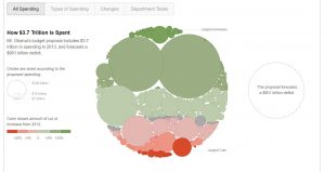
It gives four distinct views of what the budget looks like and the transition between the views is excellent as the existing bubble itself divides into the two types which helps the user look at the underlying data from a different perspective. The size of the bubble is proportional to the amount of money allocated. The color combination is also apt with green showing increase in money from 2012 and red showing corresponding decrease.

Reference:

http://www.nytimes.com/interactive/2012/02/13/us/politics/2013-budget-proposal-graphic.html

https://flowingdata.com/2012/02/15/slicing-obamas-2013-budget-proposal-four-ways/

https://www.nationalpriorities.org/analysis/2012/presidents-budget-fy2013/


Friend or foe? A visual guide to understanding who’s with whom in the Syrian War.

Syria has been in the center of world attention for quite a while now, and not exactly for the merited reasons. Syria’s seven-year-old civil war, that began in 201 started off as a movement to overthrow Bashar-al-Assad and his government. The war is being fought between various “factions”-rebel groups, democratic forces and Sunni rebels, opposition groups that formed the Free Syrian Army (FSA) that are backed up by various foreign and regional powers and the government. In a web of intricate relationships and complicated loyalties it is difficult to deduce which power is backing up which group.With new internal and external entrants, entangled dynamics have taken a convoluted dimension. This data visualization chart is an interesting and orderly way of presenting the relationships of this civil war.Capture

Each party or group in the war is represented on the XY axis to be able to show multiple relationships that each of them has with the other. The legend and symbols are simple and makes the entire complex relationship easy to understand. I also loved the part where clicking on each symbol would present you with detailed status of the relationship. Overall, the chart is clean, systematic and provides easy to process information.

References-http://www.slate.com/blogs/the_slatest/2015/10/06/syrian_conflict_relationships_explained.html

https://en.wikipedia.org/wiki/Syrian_Civil_War

State wise percentage depiction of HIV unaware population in United States of America

Today, we live in a world where unaware HIV is a huge risk, to those individuals and to others. So, it is of high importance that the US Government and people become aware of this and take necessary actions. This graph explains the percentage of the population(age>13) who are unaware of their HIV status in each state of USA.

Depicting this information in a color map graph is an excellent chart selection to visually explain how each state is affected by unaware HIV population. This graph can also be represented using a line graph, scatter plot or bar chart indicating the percent of the unaware population on the y-axis and different states on the x-axis. But, illustrating the information on a map of USA, allows readers to easily locate their own state or any particular state and view the percentage.

Also, the use of two different colors and varying intensities gives the viewers a holistic view of the situation of the country. It is easily determined that the south and mid-west regions are the most affected. Therefore, the health authorities of USA and the various states should come up with ways of dealing with this persistent issue.

Reference: http://dadaviz.com/i/4328/

New Year Resolutions

All of us at some time resolved to exercise more, eat healthy and lose weight. But the spirits that we start our resolutions slowly dies down over time and we give up unless we have someone guiding us till we have achieved what we started out to do. Today, we have apps to thank for, that track our movement, count the number of steps, monitor our breathing rate, help us exercise and do multiple analysis that help motivate us.

Setting a goal and following it has become easier and considering, reaching a goal gives you points or credits is an added encouragement. These apps have a clear structure that define different parameters that people want to track and work on.

fitbit

The above image is from Fitbit mobile dashboard. The representation influences the user as the measure for each unit of data is clear-cut. It shows the analysis for the day, summarize the overall performance, highlights the best you have done so far and guides to the target you want to reach. This improves the user’s performance as it drives them to push hard as they can continuously monitor and see themselves closer to the goal.

Image link: https://s-media-cache-ak0.pinimg.com/736x/3f/35/5a/3f355ae19bd41e86f14199056353ed2e.jpg

Uber vs. Cabs

Like Startbuck coffee, Uber became an affordable lifestyle in our daily life. When Uber launched the service in New York City in 2011, it became Uber’s biggest market. Variety of Uber’s services are expending all over the map. The traditional car service cab, affected directly since Uber has launched the services. Along with the fact, there are high tension between Uber and Cab industry. Without a good visualization it is hard to explain how does the Uber expending the market and how is the competition zones look like between Uber and cab industry.

Uber and cabs

This visualization map is effectively explaining where Uber pickups are increasing and where taxi rides are decreasing in New York City, and it also give answer of where the two parties’ conflict might occur.

This data visualization is a successful example. It is efficiently presenting the growing Uber market and submerging cabs market in New York City with three same geographic map. It not only clearly generates Uber pick up and Texi zone with deferent color but also evidently answers the title question “Are Ubers Supplementing or Replacing Cabs?”

Reference:

  1. https://fivethirtyeight.com/features/uber-is-taking-millions-of-manhattan-rides-away-from-taxis/
  2. http://www.businessinsider.com/ubers-history/#june-1998-scour-a-peer-to-peer-search-engine-startup-that-kalanick-had-dropped-out-of-ucla-to-join-snags-its-first-investment-from-former-disney-president-michael-ovitz-and-ron-burkle-of-yucaipa-companies-1


Twitter Sentiments Analysis

Today, businesses want to know what buyers say about their brand and how they feel about their products and the best way to do so is social media where users can express their opinion freely. Whether it is a launch of a new product or feedback of an existing product, user opinions or tweets are used to gather critical feedback to provide Brand Management and Customer Satisfaction.

Blog1

This dashboard consists of US Airlines twitter data. First graph shows which US airlines received the best to worst sentiment as well as the most tweets. In this case, United Airlines have been most positively tweeted about. The second graph shows distribution of top reasons for negative sentiment across each airline. The third graph shows the most common reasons for negative sentiment which are Customer Service and Late Flight. The line graph shows sentiment over a period. The pie chart helps us to understand distribution of tweets by sentiments. The word cloud of Most Common Negative Words further supports the reasons for the high frequency of negative sentiment in the tweets in the data.

Hence, based on this dashboard, one can understand common reasons for customer dissatisfaction and take corrective measures.

Reference: http://www.heidislojewski.com/blog/


Word Cloud from Resume

Word Cloud

This is the quarter when I am applying for internships. After speaking to the career counselor at school , she suggested me to generate a word cloud out of my resume. I tried to create a word cloud via an online word cloud generator. I used https://worditout.com/word-cloud/create to create the word cloud.

For creating the word cloud , I copied the text of my resume and clicked on generate. Essentially, word clouds represent the frequency of the words used , higher the frequency bigger the font of that specific word.

This is the visualization which resulted from my resume. I am interested in data analytics and new product development, hence words like data, analytics, business, design, database, SQL are used more, and that is reflected in the cloud.

Upon first look , I was able to spot the words data, analytics, and Microsoft. It can be inferred that these words are used the highest number of times in the text on my resume. This word cloud gives an overview of the words and my interests out of my resume. By simply looking at it, certain domains can be identified within a second, where as it takes time to read through the whole resume document.