An Oracle blog listed 10 reasons that why we should get rid of using pie chart.
Number 10 – Pie Charts Just Don’t Work When Comparing Data
Number 9 – You Have A Better Option: The Sorted Horizontal Bar Chart
Number 8 – The Pie Chart is Always Round
Number 7 – Some Genius Will Make It 3D
Number 6 – Legends and Labels are Hard to Align and Read
Number 5 – Nobody Has Ever Made a Critical Decision Using a Pie Chart
Number 4 – It Doesn’t Scale Well to More Than 2 Items
Number 3 – A Pie Chart Causes Distortions and Errors
Number 2 – Everyone Else Uses Them: Debunking the “Urban Legend” of Pie Charts
Number 1 – Pie Charts Make You Look Stupid and Lazy
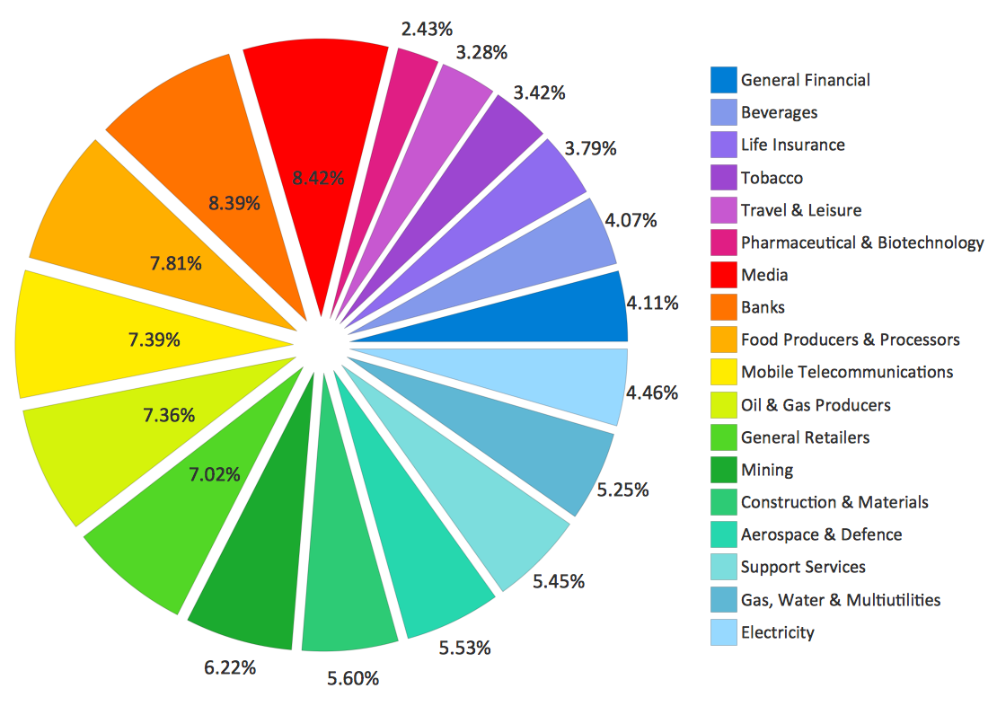
Here’s an example which shows how bad the pie chart in visualization. First, the pie chart did not display information in an elegant visual form with some numbers placed inside the pie while others placed outside. Second, it’s hard to catch the point of what the visualization wanted to express because we have to take time to check all the numbers and scan the legend to say that the biggest section is media and the smallest section is electricity. Also, people may be confused with the close colors as such as those light blues. Therefore, this is an inefficient visualization.
Reference: https://blogs.oracle.com/experience/entry/countdown_of_top_10_reasons_to_never_ever_use_a_pie_chart