The following graph was posted in 2011 and tried to use proportionally sized circles to depict the visualization.
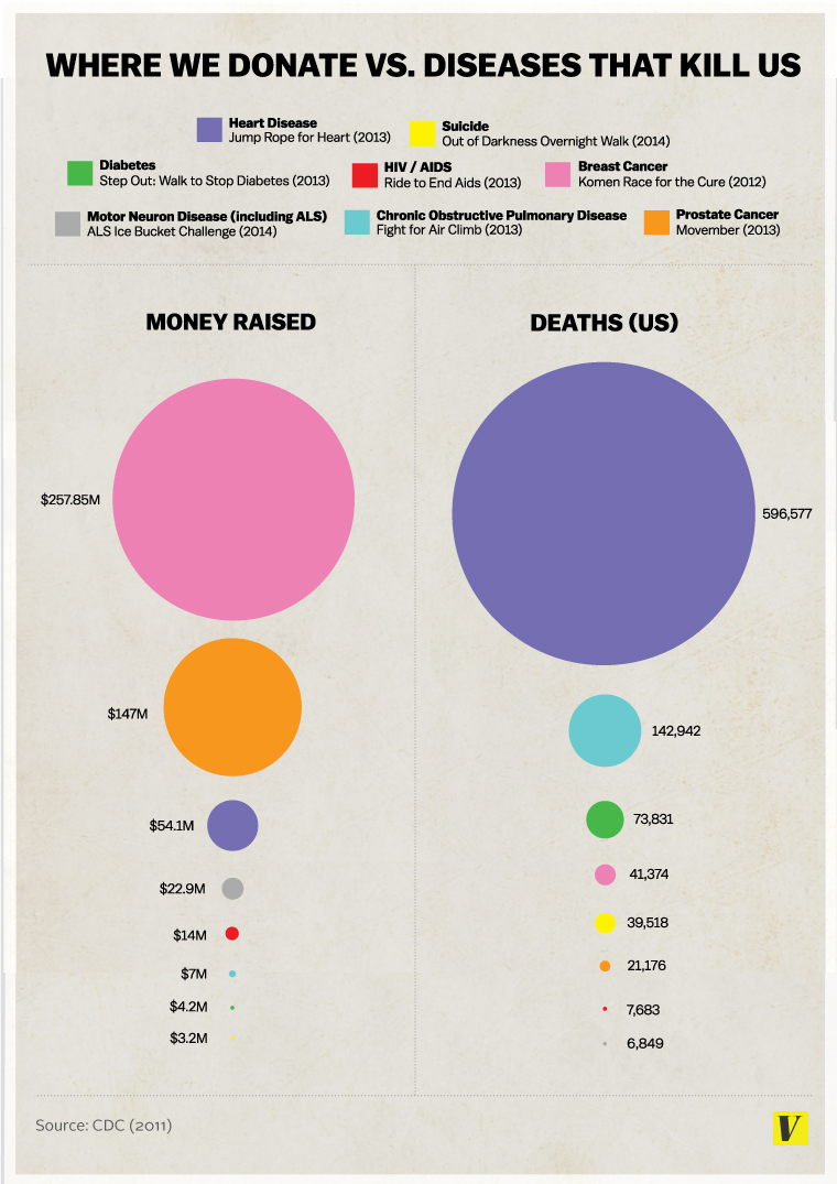
If we closely observe the visualization, we can spot many pitfalls in the used media.
- The first flaw is with the size of the circle; the size does not match the associated data values and hence exaggerates the small amount of money donated and number of deaths caused by each disease. This is a very common mistake which designers make while using circles to show their graph. Various design software only allow height and width adjustment and designers often fall into trap of adjusting diameter of the circle rather than area to match their data.
- The other flaw is with choosing the inappropriate display media. It’s difficult for one to track different colors and then match information on the legend accordingly. The image involves 3 way process of first looking at circle in “Money Raised” area; then mapping the color and finding details in the legend and finally looking for the same color in “Deaths” area. It would have been easier for the reader if the name of the disease and respective money raised and deaths were placed together.
- Third issue is with use of colors. As discussed in our class, a good number of people are color blind and therefore it is not a good idea to use too many colors. Colors are also an issue when somebody wants to take a handout of your visualization for their reference. Also, as the size of last few circles are very small, it is difficult to spot the color and map it with the colors in the legend.
References:
Image Source: http://cdn3.vox-cdn.com/uploads/chorus_asset/file/663618/Donating.vs.Death-Graph.0.jpg
Other Source: http://www.huffingtonpost.com/randy-krum/false-visualizations-when_b_5736106.html