An Analogy to translate the world of data visualization from mechanical engineering.

To somehow quantify the “clarity” and “aesthetics”, we create a Cartesian coordinate system with clarity mapped to the horizontal (x) axis and aesthetics mapped to the vertical (y) axis. Therefore, four quadrants are created:
- Northeast-Quadrant I : clear + beautiful;
- Southeast-Quadrant II: clear+ ugly;
- Southwest-Quadrant III: confusing + ugly;
- Northwest-Quadrant IV: confusing + beautiful.
Tips to achieve both:
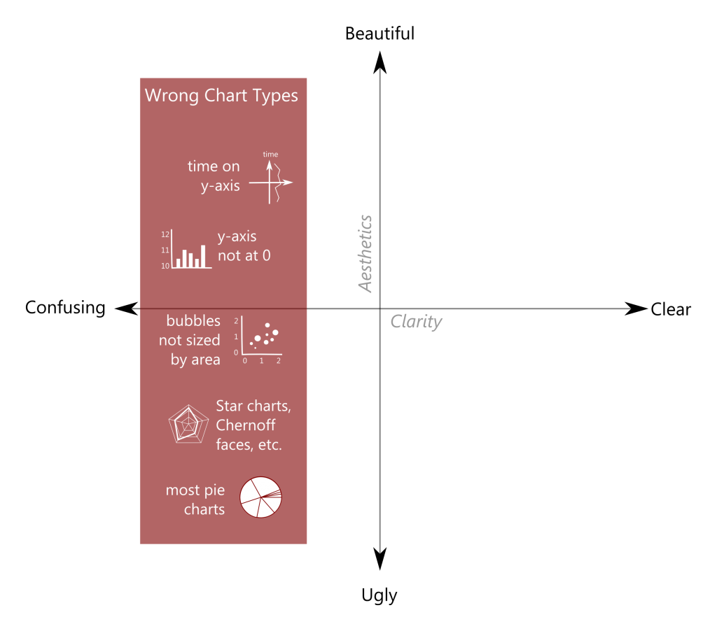
- Avoid confusing your audience with the wrong chart type.
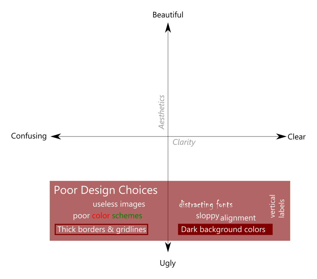
 2. Avoid horrifying your audience with poor design elements.
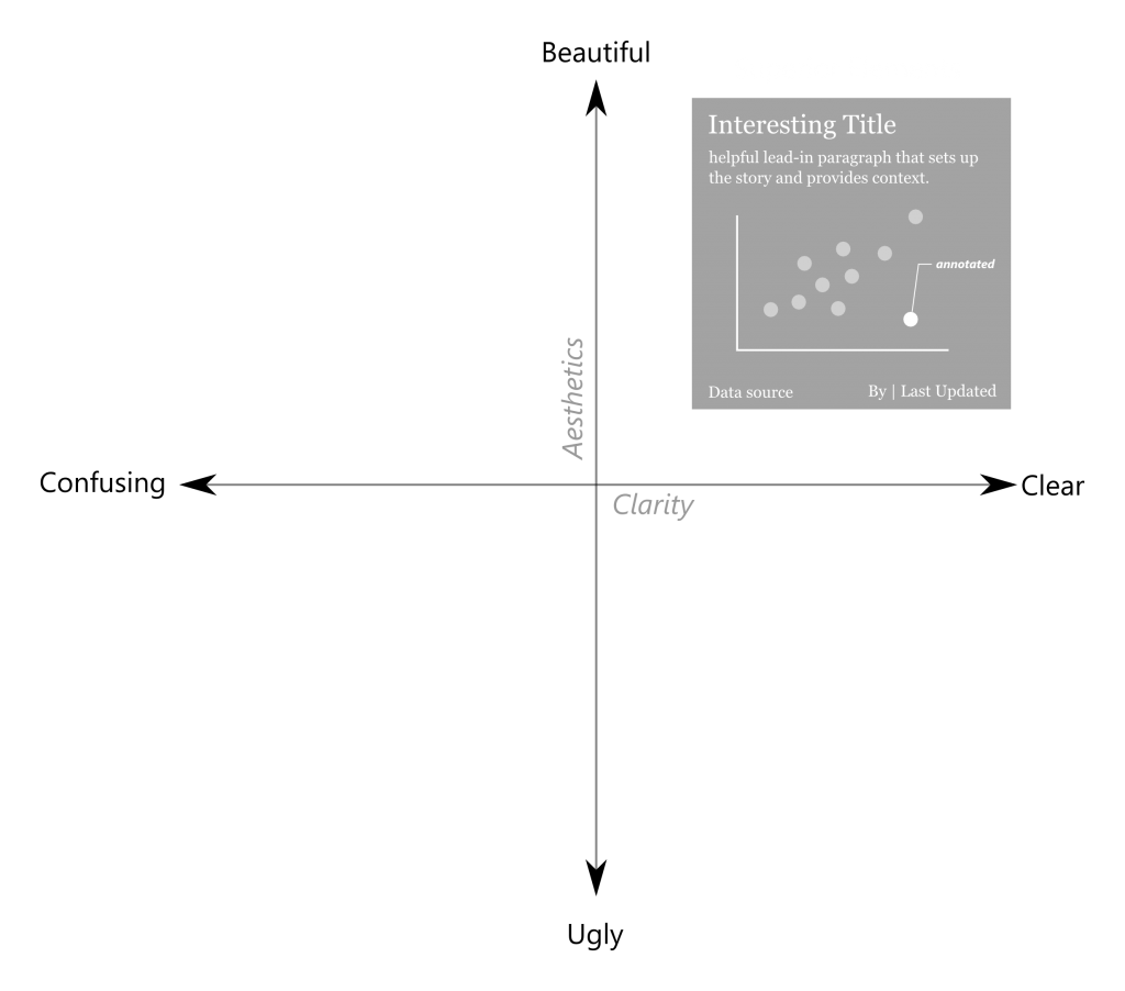
 3. Incorporate helpful elements to increase both clarity and aesthetics.
Reference: http://dataremixed.com/2012/05/data-visualization-clarity-or-aesthetics/