This visualization shows a basic distribution of which cities hosted the Olympics from 1900. Interestingly, in 2022 Asia will be hosting its eighth Olympics at Beijing.
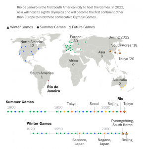
The map is meant to represent all the cities which have hosted the Olympic games since 1900, whereas its main focus seems to be only on a few cities. The labeling in the map and timeline is inconsistent. There are certain data points with both cities and countries mentioned while most of them don’t. The format of hosting year is not uniform either. The header of the post which says that Asia is hosting the games for the third consecutive time does not correspond to what is portrayed on the timeline. Also, the labeling of each continent is unnecessary as that is evident from the map itself.
Map can be made more interactive by providing a hovering feature for each data point or bubble to give details on the hosting city such as name, year it hosted, size of each bubble can represent total budget allocated or total spent. Milder color coding could be used with milder shade showing past data (wrt hosting year) and brighter shade for more recent data.
Reference:
https://www.washingtonpost.com/graphics/sports/olympics/olympics-collection/