This is a visualization that represents six months of a baby sleep and wakefulness. A father recorded his daughter’s sleeping habit during six months. Dark blue is asleep and yellow is awake. The spiral begins at the interior of the circle. It is her birth and then wraps outward as she gets older. Each circle represents one 24 hours a day. Top of circle means midnight and the bottom of circle means noon. There is chaos near the center of the circle. Baby tends to alternately wake and sleep during the day, night, and everything in between. Shortly thereafter, the upper right-hand side of the circle starts to sort themselves out and begins to show consistently dark blue. It means baby’s sleeping habit becomes like adult’s.
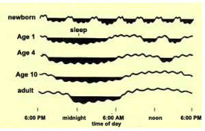
Moreover, the designer uses another visualization picture to support his record. Newborns alternate rapidly between sleep and wakefulness. As they get older, those sleep cycles begin to consolidate.
Both of these data visualization pictures effectively tell us that baby’s sleeping habit and the pattern they develop to adult’s sleeping habit
Reference: https://www.washingtonpost.com/news/wonk/wp/2017/01/05/what-its-like-to-sleep-like-a-baby-visualized-by-a-dad/?utm_term=.9afa48498bb2
This is a really interesting visualization. I have a new born baby nephew and after looking at this visualization I can relate so much more to his sleeping patterns!
Congratulate on your new born baby nephew!