Source: © Understandingusa (2007).
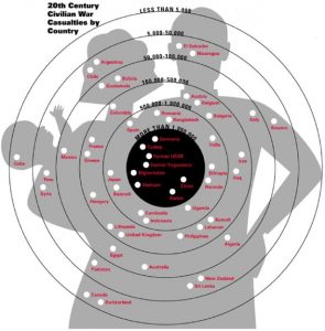
The above picture was published in www.understandingusa.com in 2007 and represents Civilian War Casualties in 20th Century by country.
The designer had idea of a “shooting target” as a reference behind the above visualization and as maximum points are earned in the center, the innermost circle represents the countries with maximum casualties.
The flaw with above visualization is related to “how different people perceive same thing”. In this case, the problem is, not all people are aware of shooting sports and a lay man would correlate this with concentric circles and without looking at the description would infer the biggest circle to be countries with maximum number of deaths, which is not true. Only, reading the graph carefully with description would make it clear that such is not the case.
The other issue is regarding choice of image; image of a family is used as a target which might induce emotional harm to some of the viewers. Again the issue is related to perception, this graph might be acceptable for people who regularly use such visualization to gain attention of audiences but might be inappropriate for people less inclined towards such crude representations. Therefore, it is always better to consider various perceptions and alternative methods of raising awareness than using such arousing graphics before designing a graph.
Reference:
- Sabrina Bresciani. 2008. Disadvantages Associated with Graphic Representations of Information . [ONLINE] Available at: https://pdfs.semanticscholar.org/23d2/3f5152c9b8b34f104b43d1c862ee62d2edac.pdf. [Accessed 17 January 2017]
- SAGE Journals: Your gateway to world-class journal research. 2017. SAGE Journals: Your gateway to world-class journal research. [ONLINE] Available at: http://journals.sagepub.com/doi/figure/10.1177/2158244015611451?. [Accessed 22 January 2017].