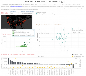
The dashboard above is to show which cities should a software developer choose. Four data visualizations are showed to audience including 2015 software developer job distribution in US, Jobs vs. Income, City live ability Score vs. Median Salary, and % Change in Jobs. The project is posted in the tableau website, and users can also check other kinds of jobs visualization including Research Scientists, etc.
The first impression I make is there are so many information in this dashboard. If a data analytics show this dashboard to his boss, the boss will probably get confused by those words. One solution can be implemented to this project is the author can create another visualization include all four aspects, and ranking those cities. When the author shows his work to other people, he can show top three cities for each aspect. I do not think anyone prefers staying at those bottom cities.
Reference: