Deceptive Visualizations can be broken down into two different types of deception. The first is message reversal and the second is message exaggeration or understatement. A message reversal deception happens when a chart or image causes the viewer to understand and view the chart/image in the wrong way. Figure 1, shows an example of message reversal where someone would perceive the data in the chart as flowing negatively while in fact it is actually flowing positively.
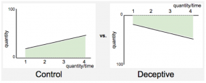
Figure 1
The second type of deception is where the message is exaggerated or understated. For example, you can see in Figure 2 that the quantity in Y is bigger than X by only a little bit in the Control Chart. While in the Deceptive Chart there is a larger difference because the same data is exaggerated due to the starting value of the vertical axis being changed.
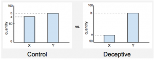
Figure 2
Little changes such as these can create a great deal of misunderstand. Most make the basic assumptions that on a vertical axis, the positive direction would be upward and negative direction would be downward. Also that the beginning value of an axis would usually be starting at zero. Because of general assumptions like these, people are easily able to deceive others into believing whatever they would like them to believe.
Source: http://www.cs.tufts.edu/comp/250VIS/papers/chi2015-deception.pdf