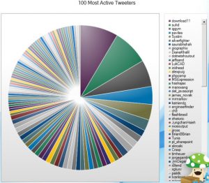
The pie chart in the image above reflects 100 most active Tweeters. The chart is neither conveying the information which it claims to nor is appealing to explore the information presented. The colors used to spread the data information makes it attractive and pretty. But representing the top 100 of anything and especially in the pie chart is always a bad idea. Plus the colors are spread out in smaller to smaller wedges making this visualization more like a puzzle to match the colors.
Also I think the data lacks with the percentage share. It would be better to limit such analysis to top 20 users with bubble or gantt chart. While using pie charts its better to limit pie wedges to maximum 6.
Source: http://chandoo.org/wp/2009/08/28/nightmarish-pie-charts/