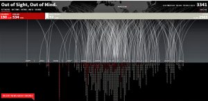
This is a dynamic interactive visualization of the fatalities in drone attacks on Pakistan in the time frame of 2004 to 2015. As the title suggests after 1 or 2 weeks, the news goes out of mind. But the plight of the people lingers, despair over lost ones, destroyed homes. This stunning visualization illustrates the frequency of drone attacks on Pakistan which increased drastically after 2009. As a result, a lot of innocent children and civilians lost their lives.
This infographic dramatically brings to light disturbing facts that should not go unnoticed. In order to eliminate high-profile targets innocent blood is spilled. Only 1.6% of the population killed constitute terrorists compared to 5.7% children and 16% civilians. Can this be justified in any way? A description pops up giving detailed facts of the attack when one hovers over a particular point on the visualization. The replication of bombardment as a technique narrates more than what words can express. Also, use of red color to symbolize the blood of innocent children is very thoughtful. This visualization is really captivating and generates serious thoughts about the people living in Pakistan, fearing their impending doom.
Please refer to view the full interactive visualization: http://drones.pitchinteractive.com/