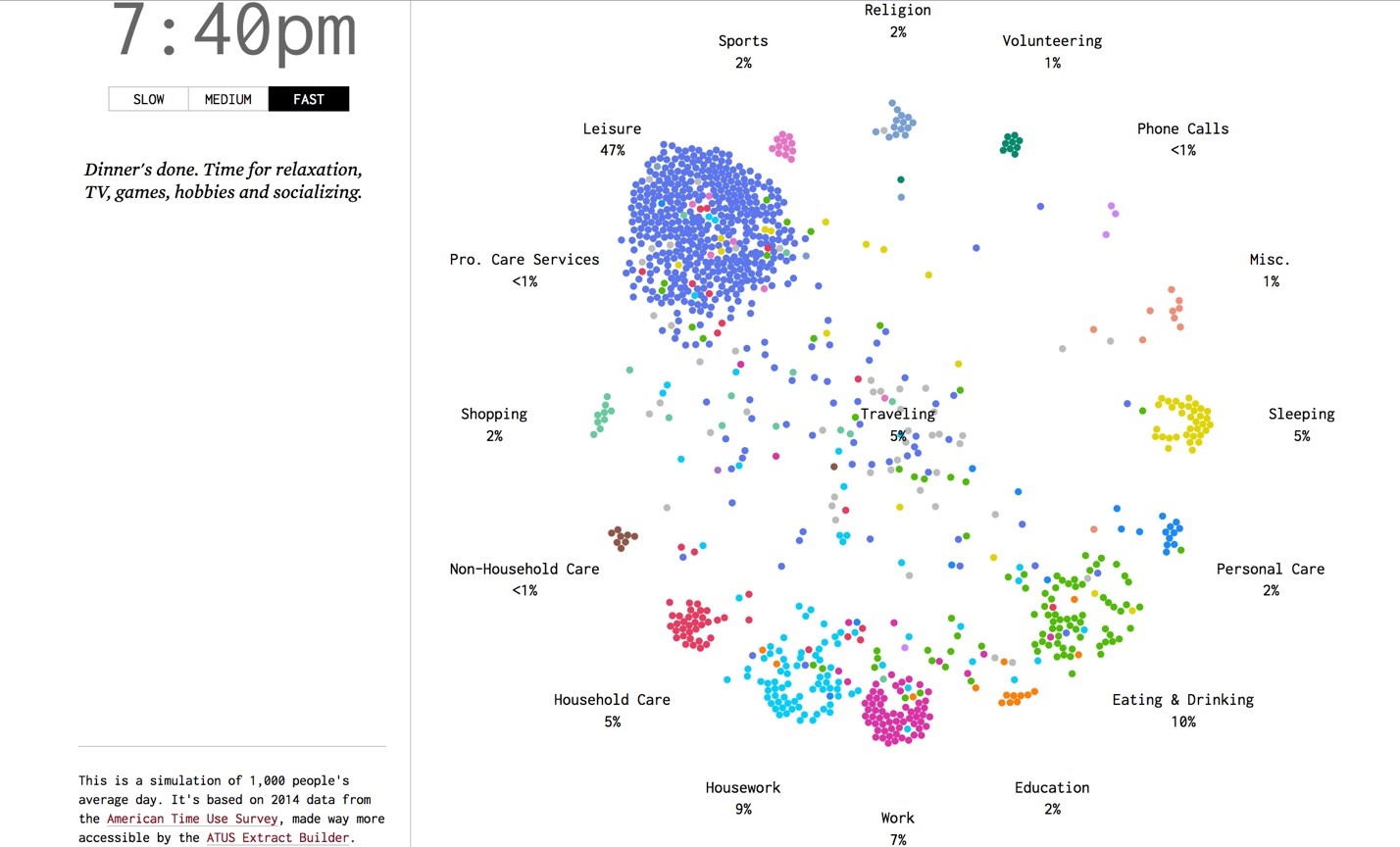

The visualization shows the tasks which Americans are engaged in at any given point in the day. The basic concept being each dot represents a person. The data is for 1000 people surveyed in 2014. The study of the data will help us to know daily habits of Americans and assist us in determining why so many are still in bed at 8:00 in the morning.
The activity beehive shown above is intended to be animated. As in, it changes every minute and updates the activities being carried out by people.
The result may help in determining problems with daily routines.
Good Points about the visualization:
• Easy clustering observed: The clustering of points easily shows what most of the people are doing
• Coloring segregation: Each activity is assigned a color, making spotting different clusters easier
• Color changes: The dots change color before switching from an activity to another. This makes it convenient to see how many are about to get to another activity from the current one.
• Minute data: The data is displayed per minute, which is a good precision considering there are 1440 minutes in each day.
• Visualization speed: An option to modify the transition speed is given. This makes it customizable for the user to look at leisure as well as a highlight, whatever suits.
Points for improvement in the visualization:
• Too dynamic: the data changes every second even in the slowest mode, which may not be desired in case the end users need time to process the visualization.
• Alternative: This type of visualization needs more area and dots moving from one point to another. We could use dynamic bar graphs changing to indicate comparative activity study. Pie charts could also be suitable as the total area remains constant with just the sub-sections changing.
Conclusion: It is a fair representation given the changing points in time, although some slight improvements could be made depending on the intended audience.
Source : http://flowingdata.com/2015/12/15/a-day-in-the-life-of-americans/
Reference : http://www.scribblelive.com/blog/2015/12/28/9-best-data-visualization-examples-2015/