Global Warming has been a “Hot” topic around for some time now. With all the ambiguity surrounding the topic, one almost always hears some contradicting statements about the climate getting hotter or not. On one side we are given some scientifically calibrated data while on the other hand, we hear about colder and prolonged winters on most of the part of the world. While people try to understand global warming relatively, it is a fact irrespective of where one stays that “We are living in a hot world which is getting hotter!”
To give an evident revelation about Global Warming, Dr. Ed Hawkins, a scientist of the National Centre for Atmospheric Science at the University of Reading, gave this mesmerizing visualization on what’s exactly the situation is on global warming giving an excellent overview.
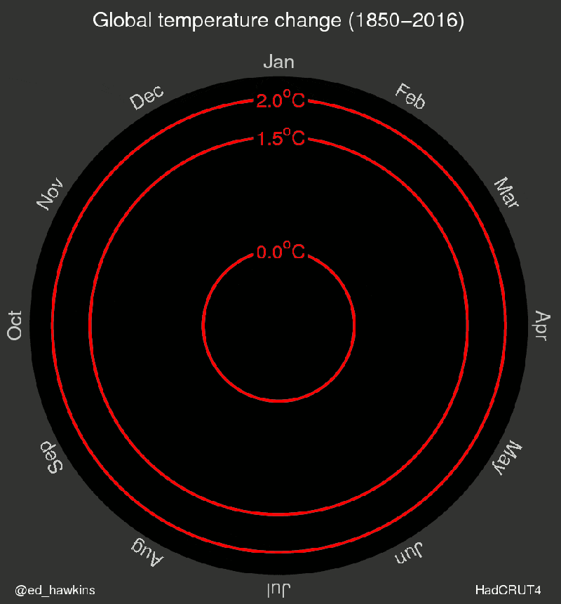
The above visualization appealingly shows the undeniable trend of the growing temperature spiraling out since 1850. It very aesthetically shows month wise temperature change observed till 2016 with the baseline of 1.5-degree celsius and 2-degree celsius which are goal limits of global warming according to international standards. It clearly depicts how the global warming has accelerated in the past few decades.
Reference : http://mashable.com/2016/05/10/visualization-global-warming/#rrBnE43gIgqT