In a world overflowing with data, using it in the right way so as to extract maximum information and perform meaningful analysis to make right decisions is the key. The management needs information quickly and at a glance. Hence, it is important to have a dashboard design that highlights the key points, is structured, focused on management’s requirements and not overly complicated and confusing. Simplistic dashboard designs can help in better decision making than dashboards that are flooding with information.
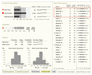
For example, this is a telesales dashboard that emphasizes on some of the important features that the company will want to track in order to understand their overall performance. It is easily understandable and the information displayed is not overpowering. The graphic mediums are subtle and red color is used to make it easier to notice details. The dashboard has a flow with the most important piece of data on the upper left corner. It is not highly decorated and only displays what’s necessary. It contains clear legends with properly marked headings and descriptions (where needed).
Sometimes, poor visualizations and displaying too much information can take away the most important aspect of a dashboard – easy data availability.
Source – https://www.perceptualedge.com/articles/Whitepapers/Dashboard_Design.pdf