The federal budget is a political document released by the president every February to the Congress. This is a highly important, as it shows the president’s priorities set for the upcoming fiscal year and the funding required by each federal agency among other aspects. The key users are federal agencies, corporations, tax payers, SMB’s, etc. almost everyone in the country. Hence it is important for the budget graphic to portray the information, story, goal and visual form articulately to the users.
The primary budget measures are total revenue, total expenditure, ten year projections, deficit, debt, GDP, percentage of increase or decrease over the year each of these broken down by type and departments. The below data visualization was done using D3.js and SVG.
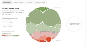 It gives four distinct views of what the budget looks like and the transition between the views is excellent as the existing bubble itself divides into the two types which helps the user look at the underlying data from a different perspective. The size of the bubble is proportional to the amount of money allocated. The color combination is also apt with green showing increase in money from 2012 and red showing corresponding decrease.
Reference:
http://www.nytimes.com/interactive/2012/02/13/us/politics/2013-budget-proposal-graphic.html
https://flowingdata.com/2012/02/15/slicing-obamas-2013-budget-proposal-four-ways/
https://www.nationalpriorities.org/analysis/2012/presidents-budget-fy2013/
This is an interesting representation of the spend data. However, when the bubble size gets smaller, it is not very easy for the user to understand the changes in spend. A simpler form of visualization might be more beneficial to understand the trend.