Today, businesses want to know what buyers say about their brand and how they feel about their products and the best way to do so is social media where users can express their opinion freely. Whether it is a launch of a new product or feedback of an existing product, user opinions or tweets are used to gather critical feedback to provide Brand Management and Customer Satisfaction.
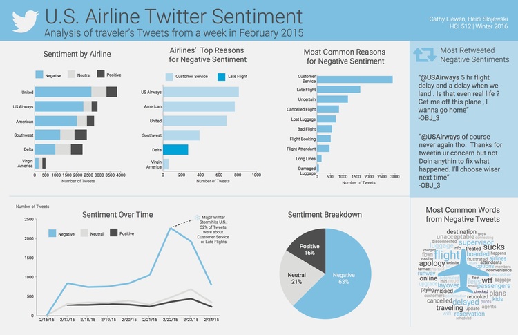
This dashboard consists of US Airlines twitter data. First graph shows which US airlines received the best to worst sentiment as well as the most tweets. In this case, United Airlines have been most positively tweeted about. The second graph shows distribution of top reasons for negative sentiment across each airline. The third graph shows the most common reasons for negative sentiment which are Customer Service and Late Flight. The line graph shows sentiment over a period. The pie chart helps us to understand distribution of tweets by sentiments. The word cloud of Most Common Negative Words further supports the reasons for the high frequency of negative sentiment in the tweets in the data.
Hence, based on this dashboard, one can understand common reasons for customer dissatisfaction and take corrective measures.
Reference: http://www.heidislojewski.com/blog/