Jakob Nielsen has created a lovely, easy to read biography section for himself that begins with an exhaustive list of praise for his work. Each of which is linked to an outside source (which is very important and shows the credibility of Nielsen’s praise). By the time the reader glances at how long the list of praise is, it is clear that Nielsen is incredibly credible. I myself cannot help but be endeared to this angelic, Danish face:
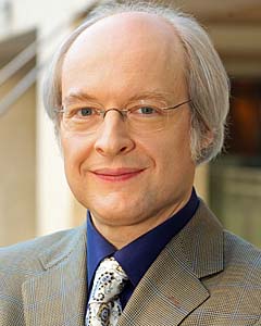
Look at that smile.
Nielsen’s biography goes on to explain that much of his career has been dedicated to internet usability. He has been working in the field for a long time, and you can tell by the dates of his articles. Sarcasm aside, his work has spanned decades (1989 to the present) and a true understanding of how users treat the internet is apparent. Possibly the most heartwarming moment in a glance through Nielsen’s biography is the humbling “Parodies” section in which he actually links to articles and websites that have made fun of him.
So with all this in mind, I take Nielsen’s articles “How Users Read On the Web” and “F-Shaped Pattern for Reading Web Content” absolutely seriously. In How Users read on the Web, Nielsen employed actual experimentation to investigate exactly what writing styles and tricks, ensured that users read through a page and took it seriously. He suggests that website creators make text meaningful by highlighting key words, creating sub headings, using bullets, and keeping paragraphs concise and to the point. Generally he suggests, keeping things to the point, because users do not have a very lengthy attention span while on the web.
This brings up, Nielsen’s article on F Shaped reading patterns. Through his experimentation, Nielsen has found that users read a web page in a roughly F-Shaped pattern. This shows that readers only briefly scan a page. This means that content should be front loaded onto a page as to grab the readers’ attention.
All in all, Nielsen’s information seems very much accurate. As a web user, it seems very clear that web reading is often terse and not always an accurate read. The Seattle Art Museum has a lovely informational page on their various programs. This website follows many of Nielsen’s rules. It keeps all of the sections separate with meaning full subheadings. All of the information is to the point. This biography on my favorite politician, Patty Murray, is unfortunately an example of a not very readable site. The text is very long without much breaking it up and very few web users are going to take the time to finish it.
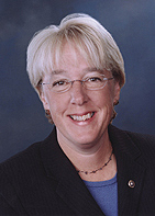
As a side note, Patty Murray is amazing and you should take a look at what she has done.